Discovery
•
Ideation
•
Design
•
Dev Handoff
•
Reflection
•

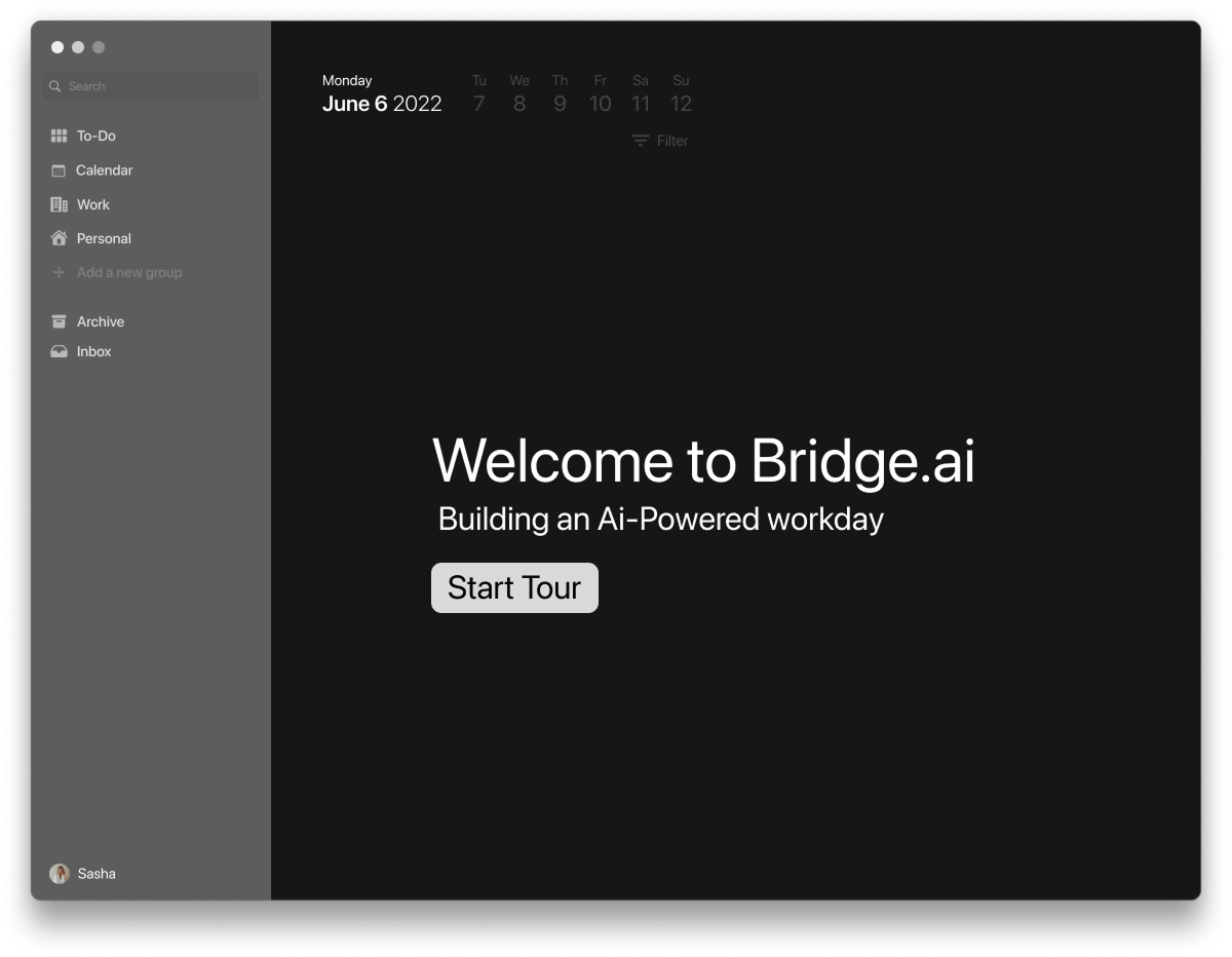
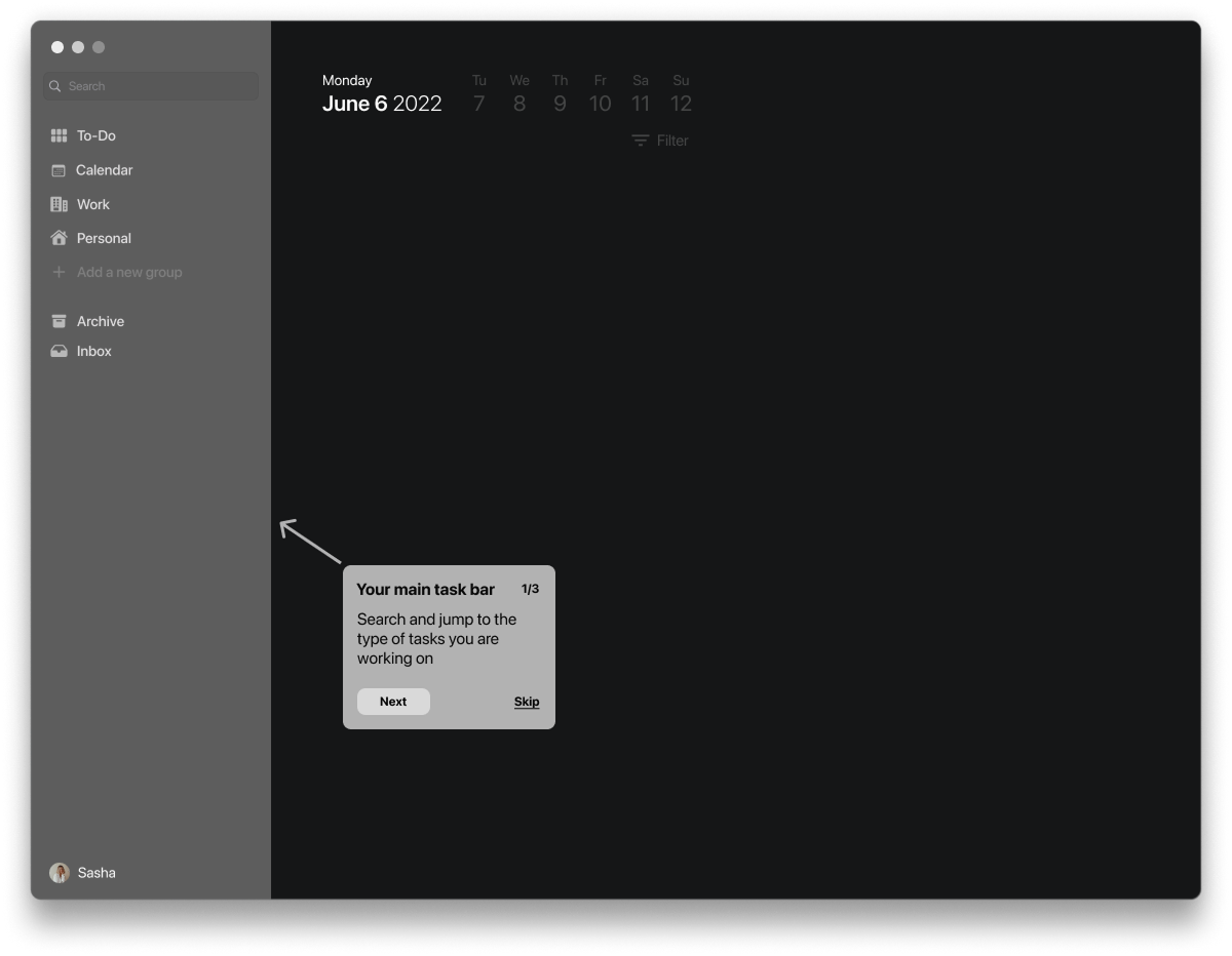
Bridge.AI is productivity desktop app bridging ideas of productivity and artificial intelligence to create a unique task oriented list that evolves how a user can control their time and attention
By pairing a minimal, macOS-native UI with machine learning driven task intelligence, The design enabled users to move through work with fewer interruptions, less manual organization, and clearer task prioritization
increase in users opening the app multiple times per day following the introduction of real-time task progression feedback.
in time spent reorganizing tasks due to intelligent nesting
in users completing their daily task lists after introducing ML-prioritized task ordering
in reported task overwhelm after restructuring task views into clearer parent–child hierarchies
increase in user-reported “feeling focused”
in users completing tasks in a single uninterrupted work session
in average session duration
cross-app task syncing usage after simplifying integrations
in task abandonment due to clearer task hierarchies and progressive disclosure


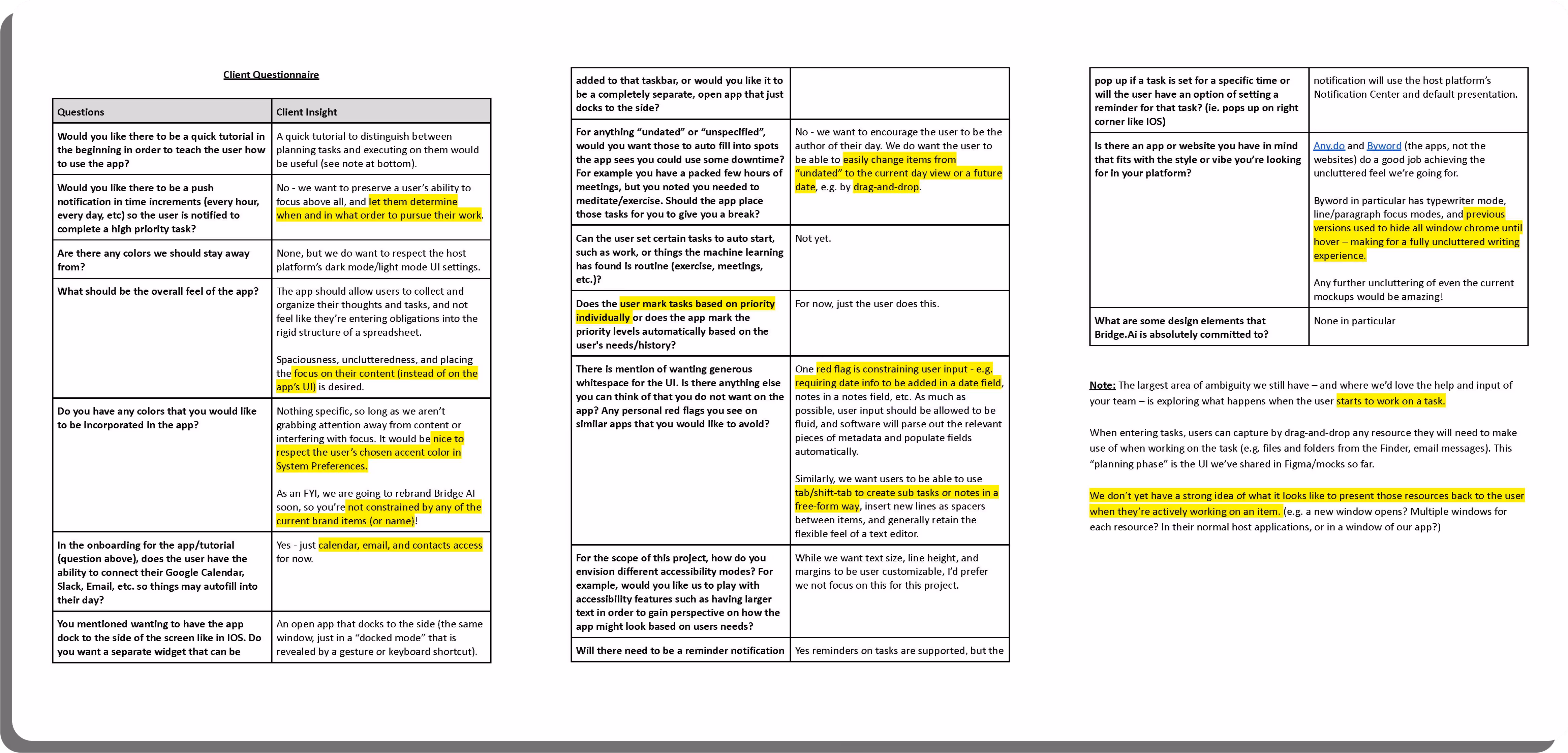
Before starting any design process, the team sat down and came up with questions to the client that focused on what the client wanted Bridge.ai to represent. We then send our questions to the client and they answered every question we had.
Our goal was figuring out how to build a functional UI that illustrated a clean and efficient work flow. We received a sample of the client's platform and built upon what they already had.
We decided that we needed to do a competitive analysis on other task centered apps so we could see how we could incorporate ai elements in the design process.
Below is a brief examination of the research we complied
Thanks to the insight we got on our client questionnaire, the team drafted 32 user stories. Each user story is categorized into priority, as well as function.

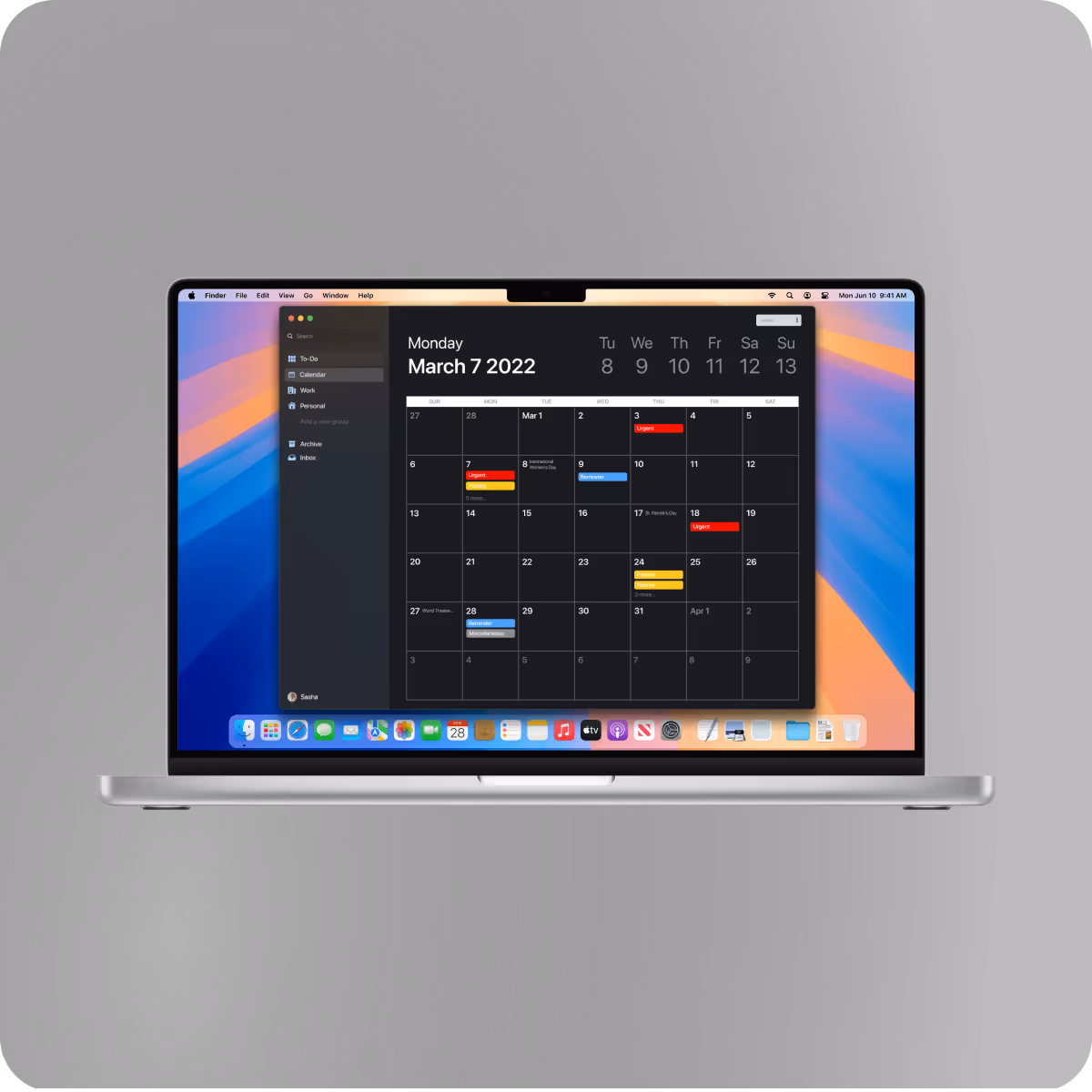
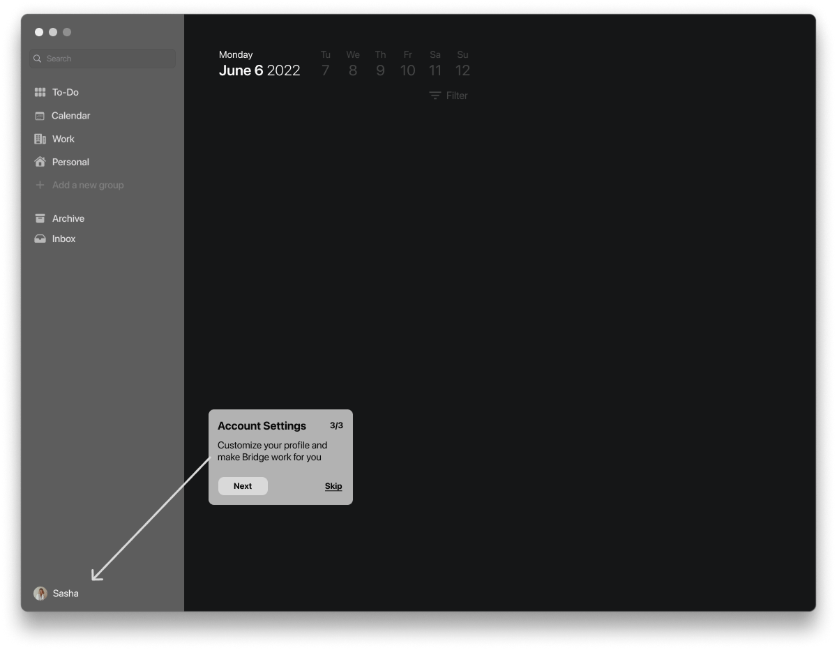
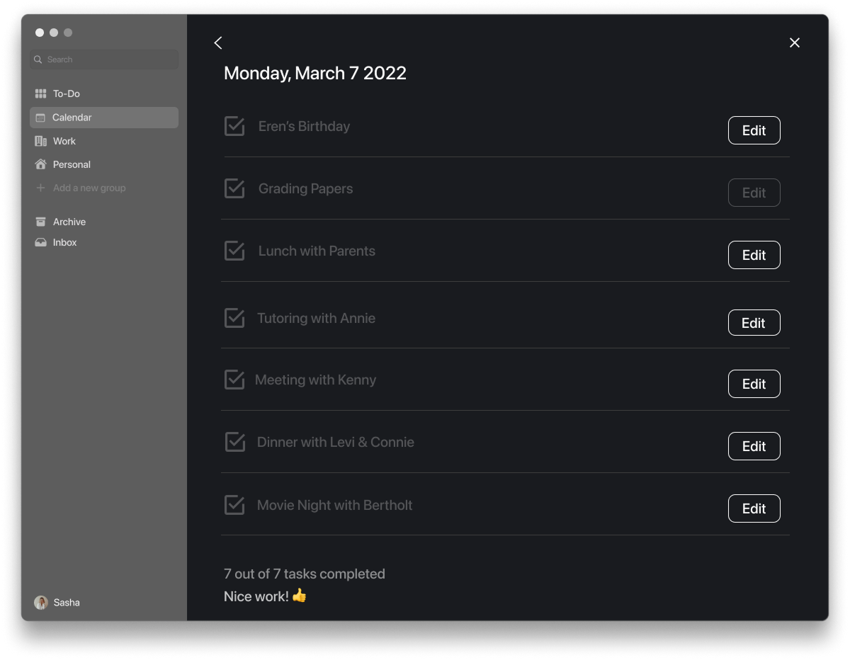
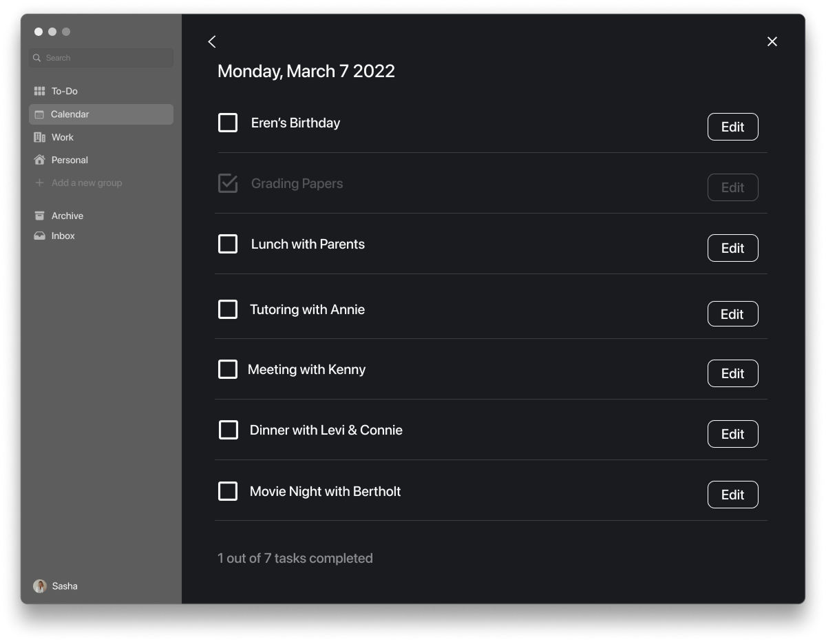
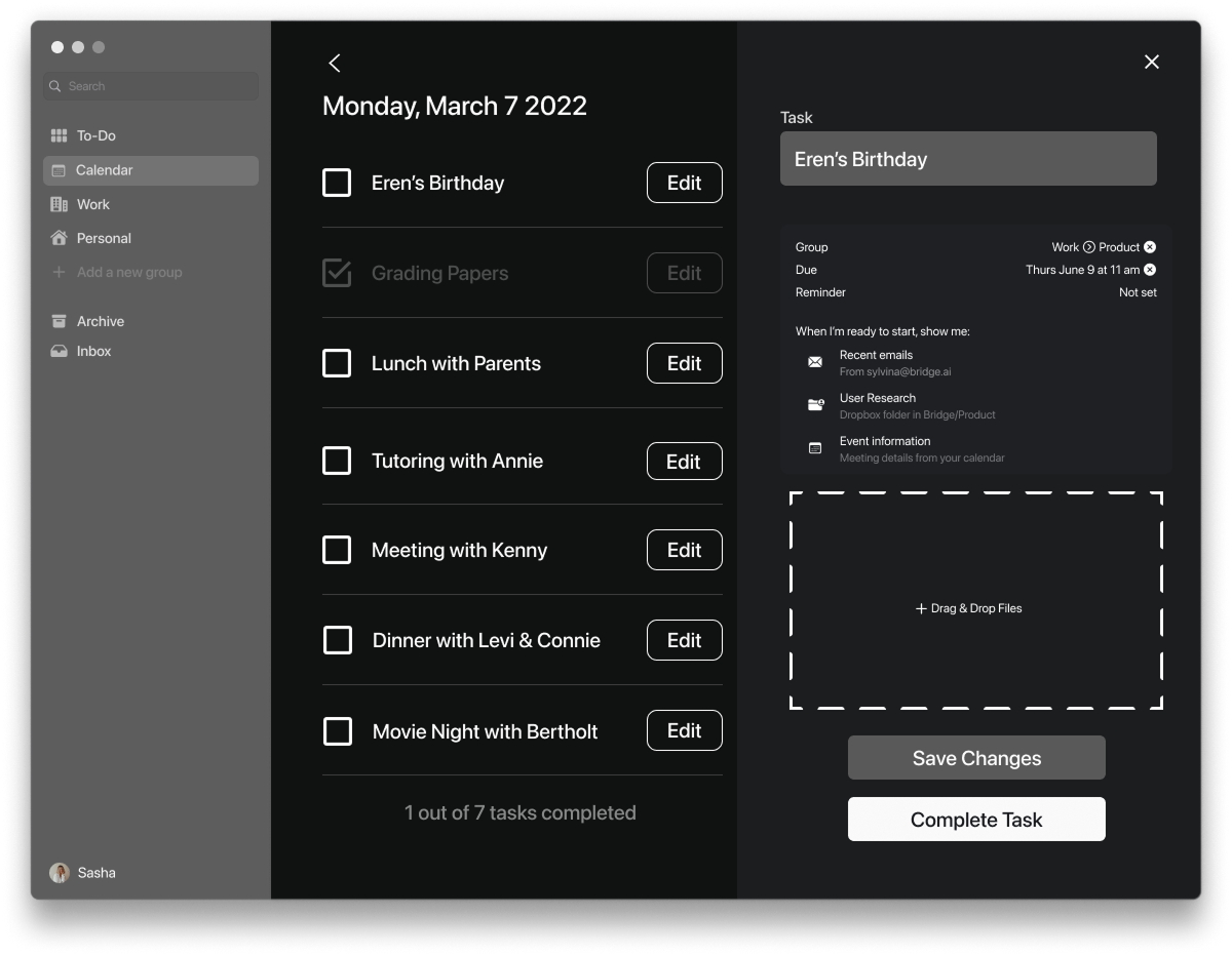
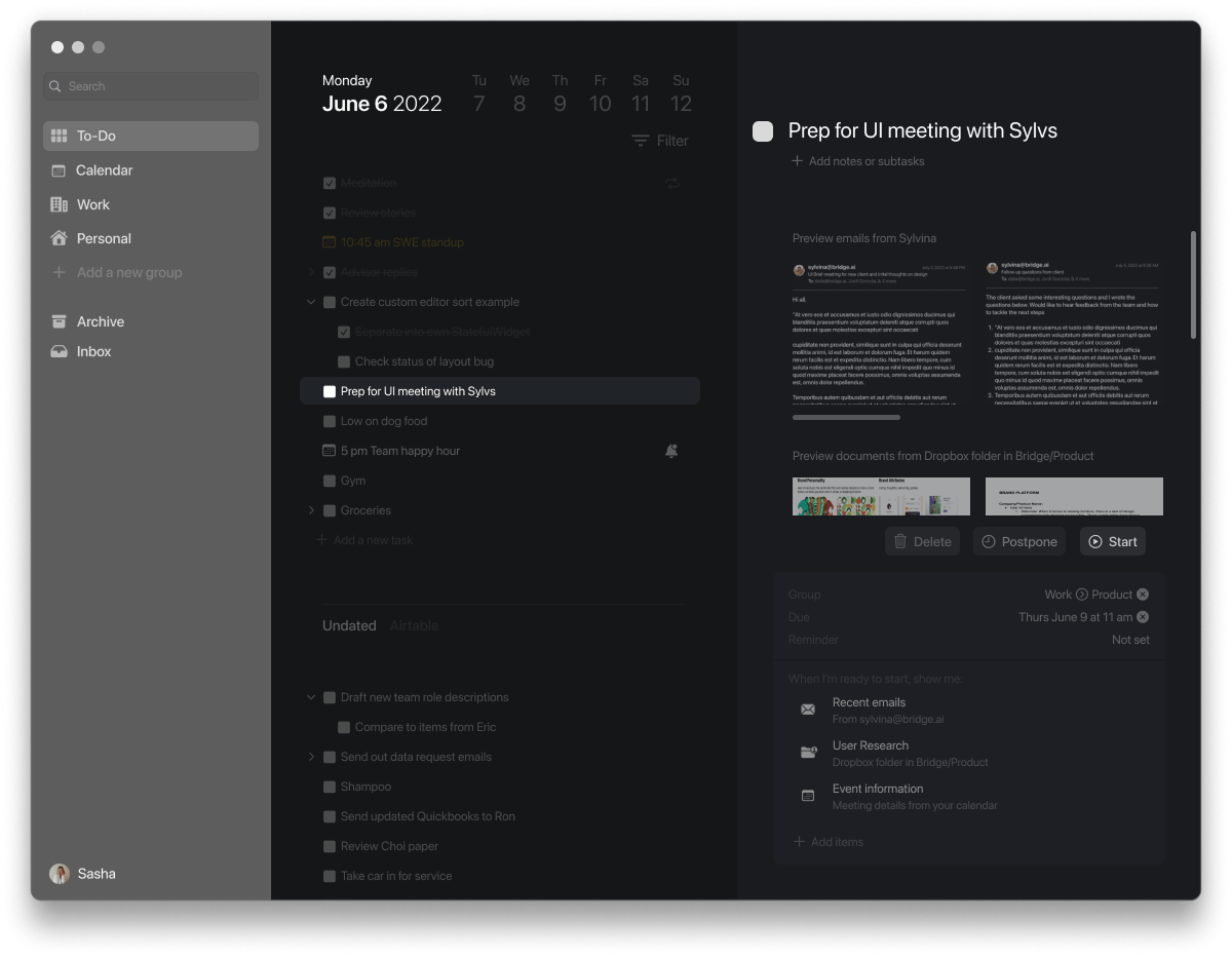
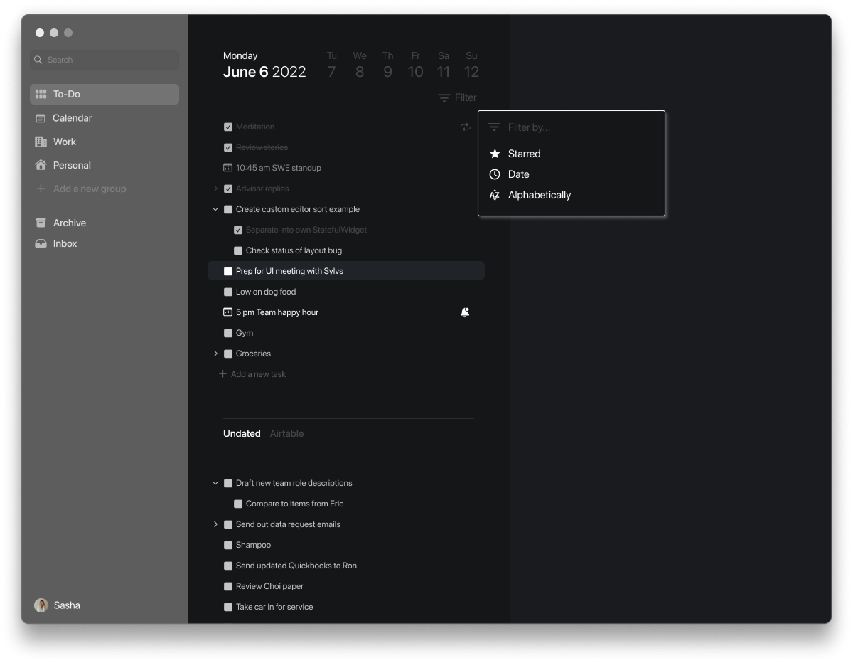
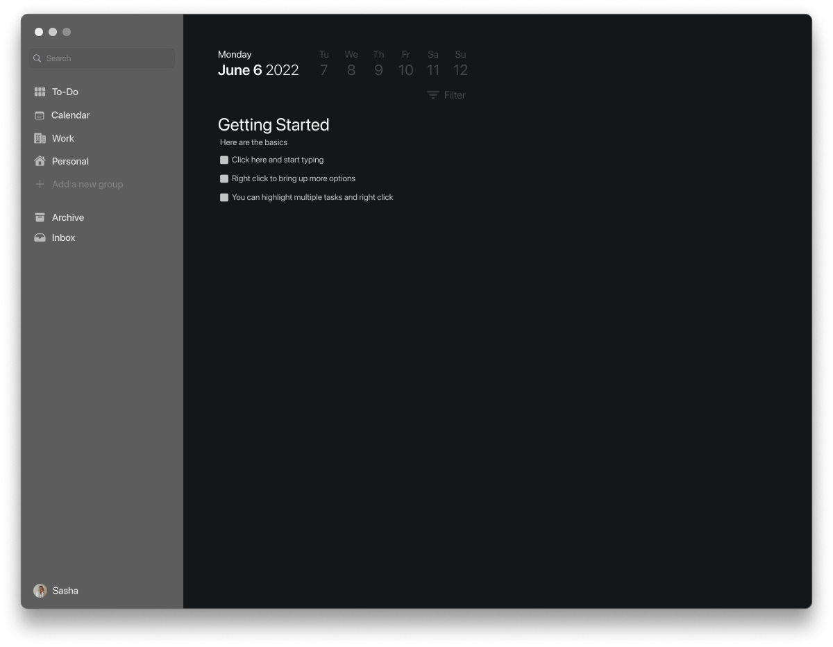
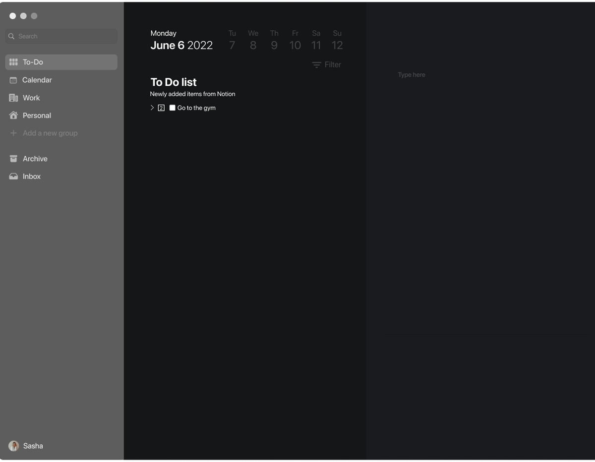
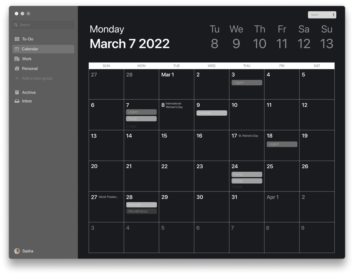
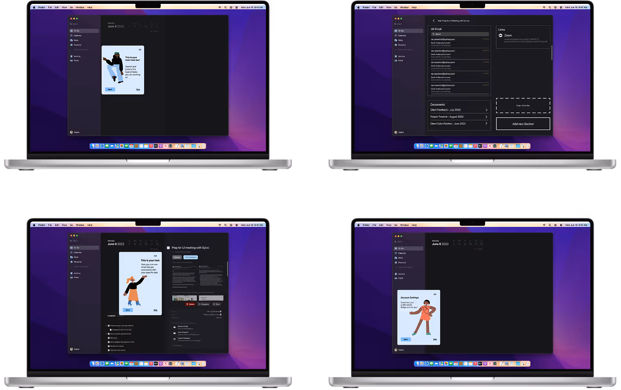
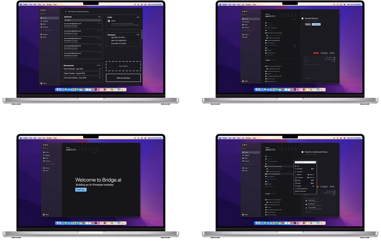
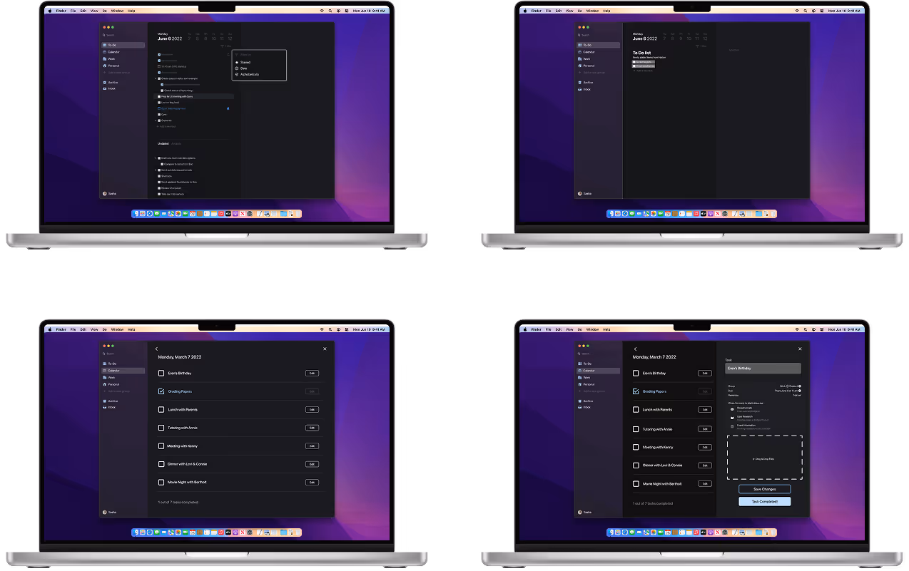
Our client made wanted us to have creative freedom but also wanted us to keep macOS in the center of our design. We decided to go for a clean, simple, and open space look. We focused much of attention to the canvas section of the app, which is how a user create a new task.
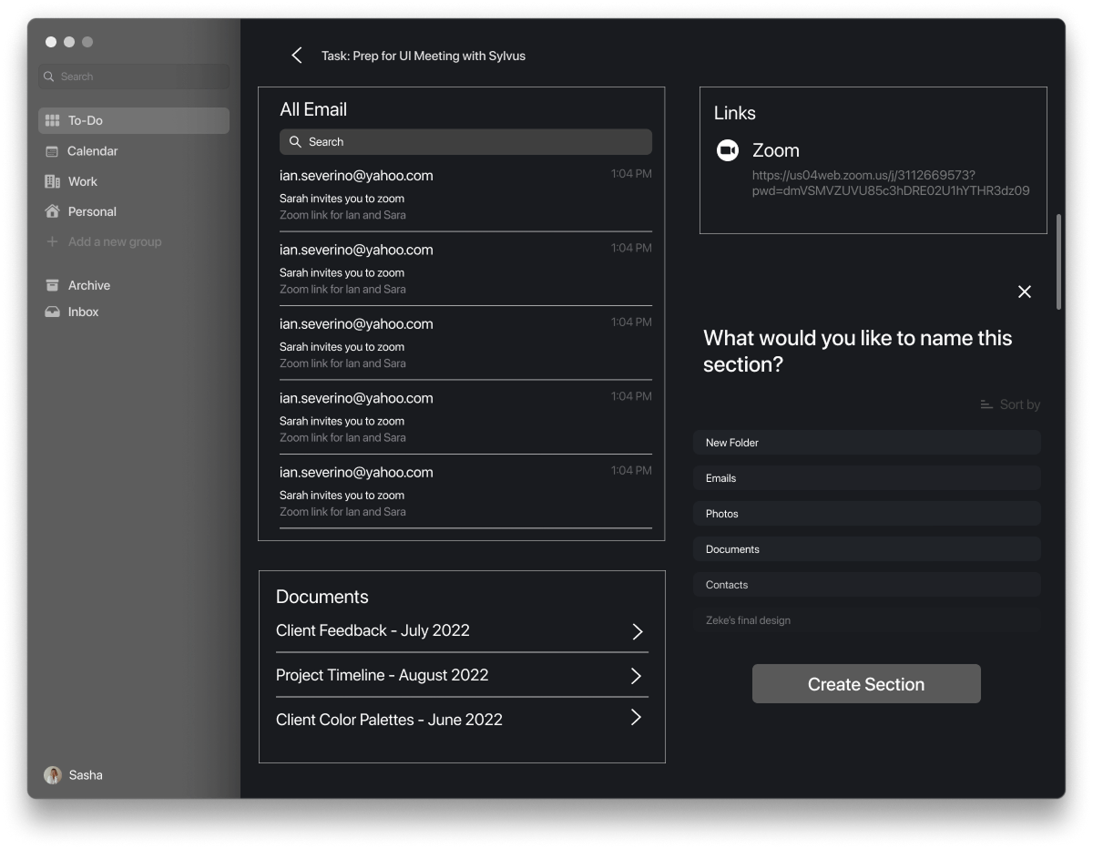
Other important functions we considered and designed were:
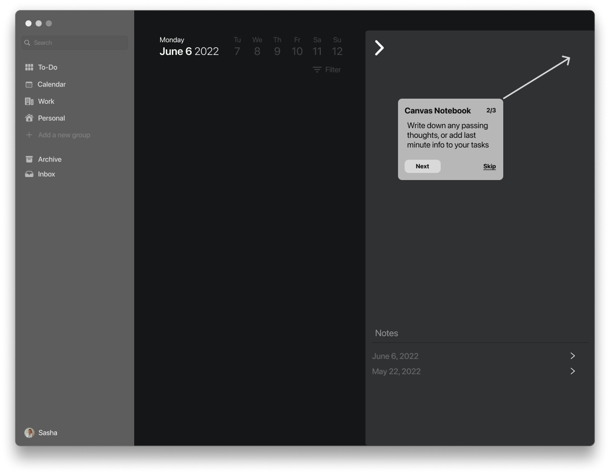
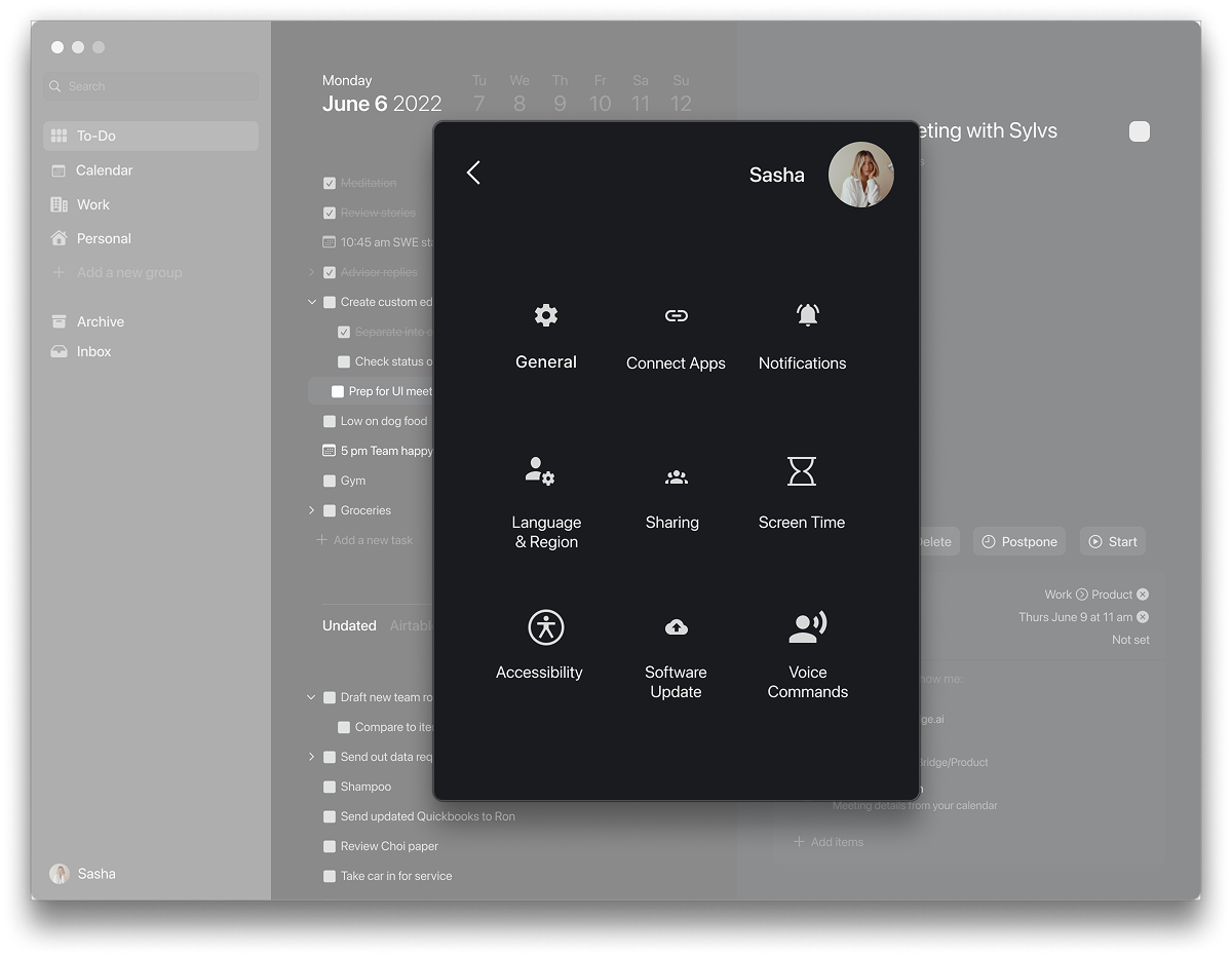
Once the client came back to us with comments, we worked to find solutions to any concern they had. One concern was that they felt the canvas section and profile notifications of the app interfered with the already existing software of the app and macOS.
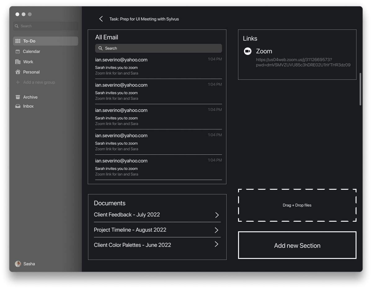
We focused our energy on figuring out ways to make the UI align with the AI values by designing ways in which a task contains important and vital information for the completion of the task and the user. Overall, simplified, and cleaned the app to be more desktop friendly.
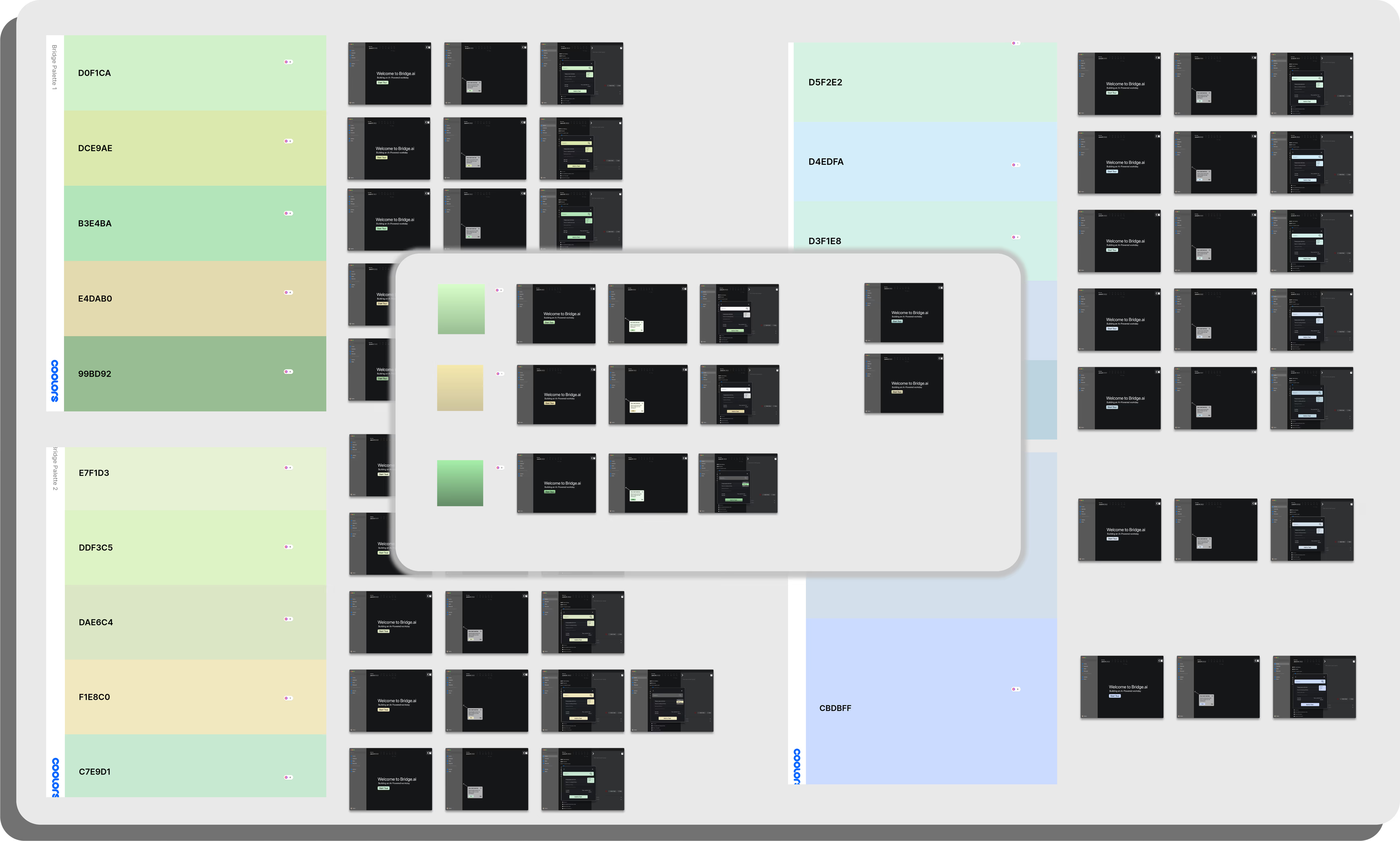
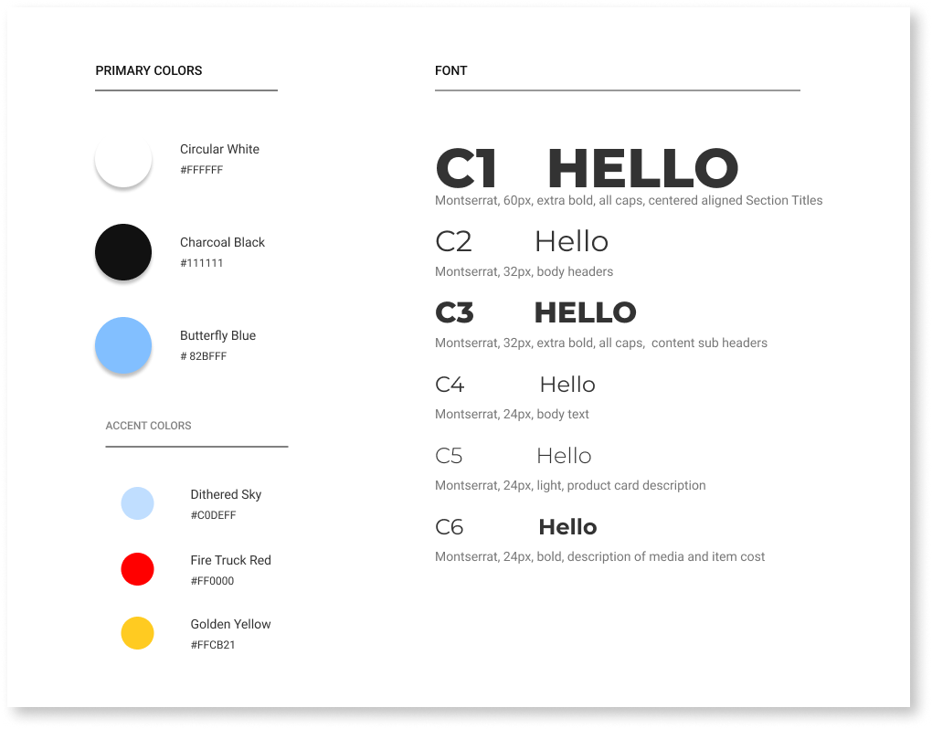
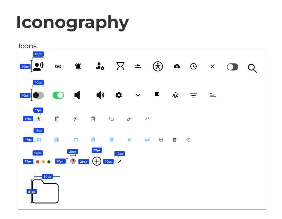
Though we based all of our designs on macOS standards so that Bridge.ai felt integrated to the apple ecosystem, we did also want to find ways to express ourselves through color, typography, and iconography within our restrictions
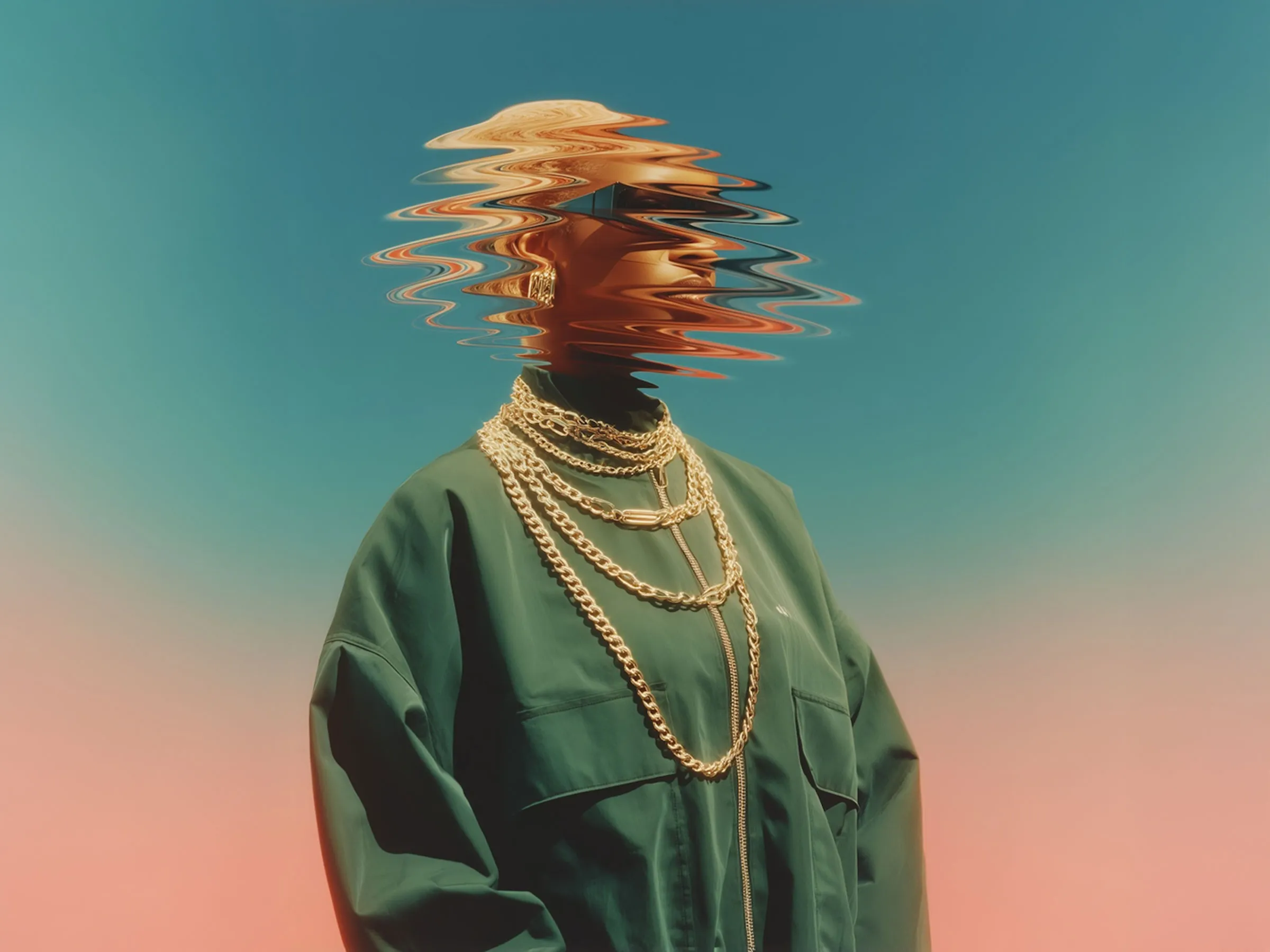
We had fun trying on new colors and working with illustrations that made it feel like bridge was a dedicated friend helping you out throughout the day rather than it feeling like an anonymous source of information.
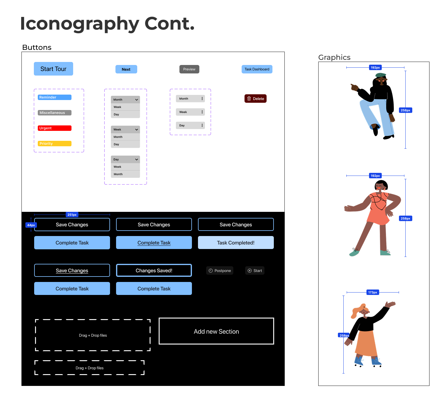
Going into Hi-Fidelity screens, we made sure that all screens were appropriate to the client's vision. We made sure all the assets were consistent and added sparks of personality of the brand through graphics and color choices.
We based the colors on iOS guidelines but also maintain a certain freedom when deciding which colors to use in order to pass accessibility standards.
Once we got approval from our client, we created annotations and measurements to the developers to ensure that our designs are legible and translated well.
This project relied heavily on research, experimenting, and collaboration. It was a constant effort for not just myself, but also the team to keep ourselves accountable and to push ourselves to achieve a product that looks so simple yet contains complex functions
I found that my leadership skills greatly improved throughout the process as I helped delegate tasks and maintain a steady workflow where we met everyday to make sure that we were on teh same page and being as cohesive as possible.
I found that one of the hardest design challenges is the idea of concrete minimalist actions where the best designs are designs that seem obvious. This project definitely made me face this challenge head on and believe that my skills as a UX designer as vastly improved through my understanding of space, color, and flow. Forever grateful for my team and deeply appreciative of the learning journey that I embarked on