Discovery
•
Ideation
•
Design
•
Prototype
•
Reflection
•
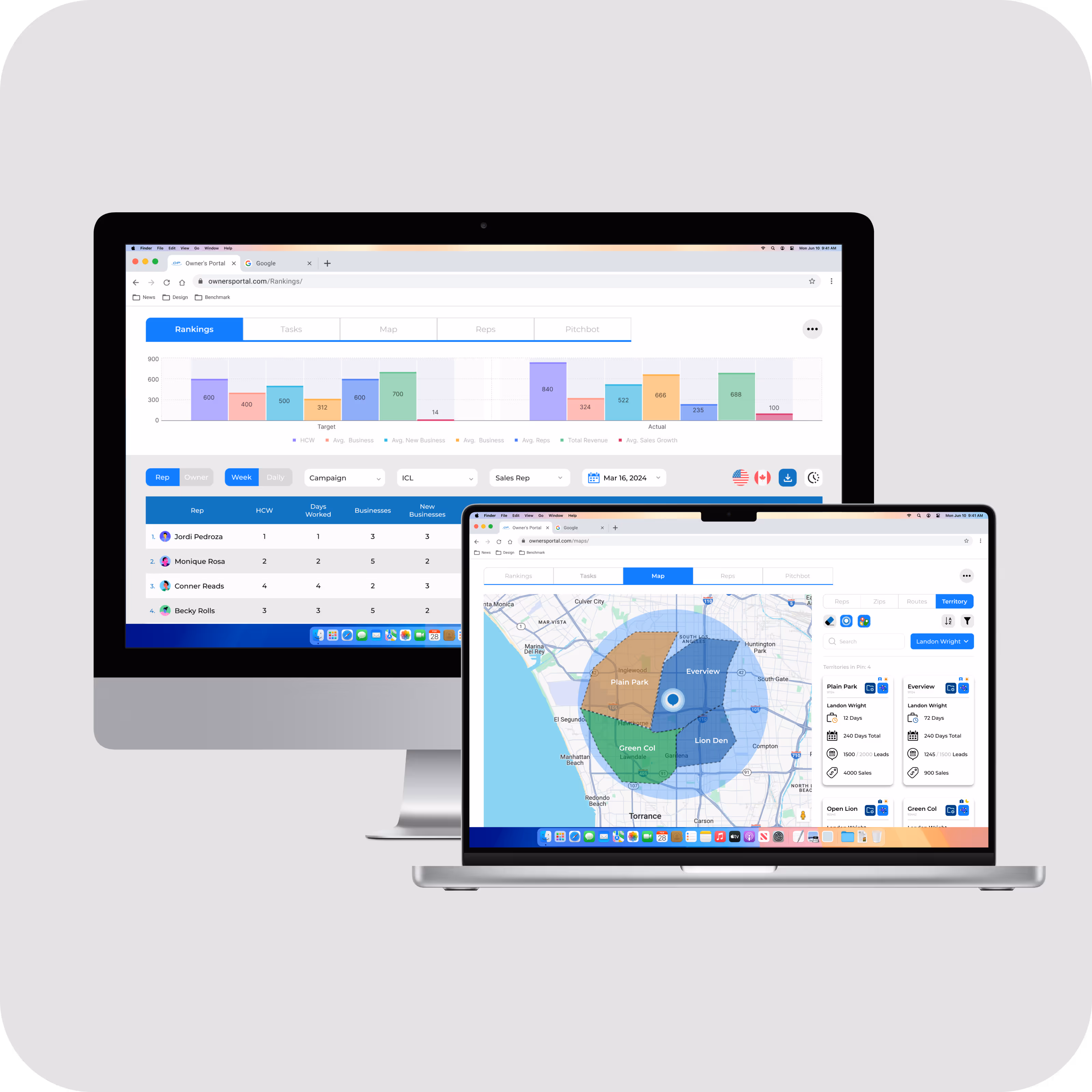
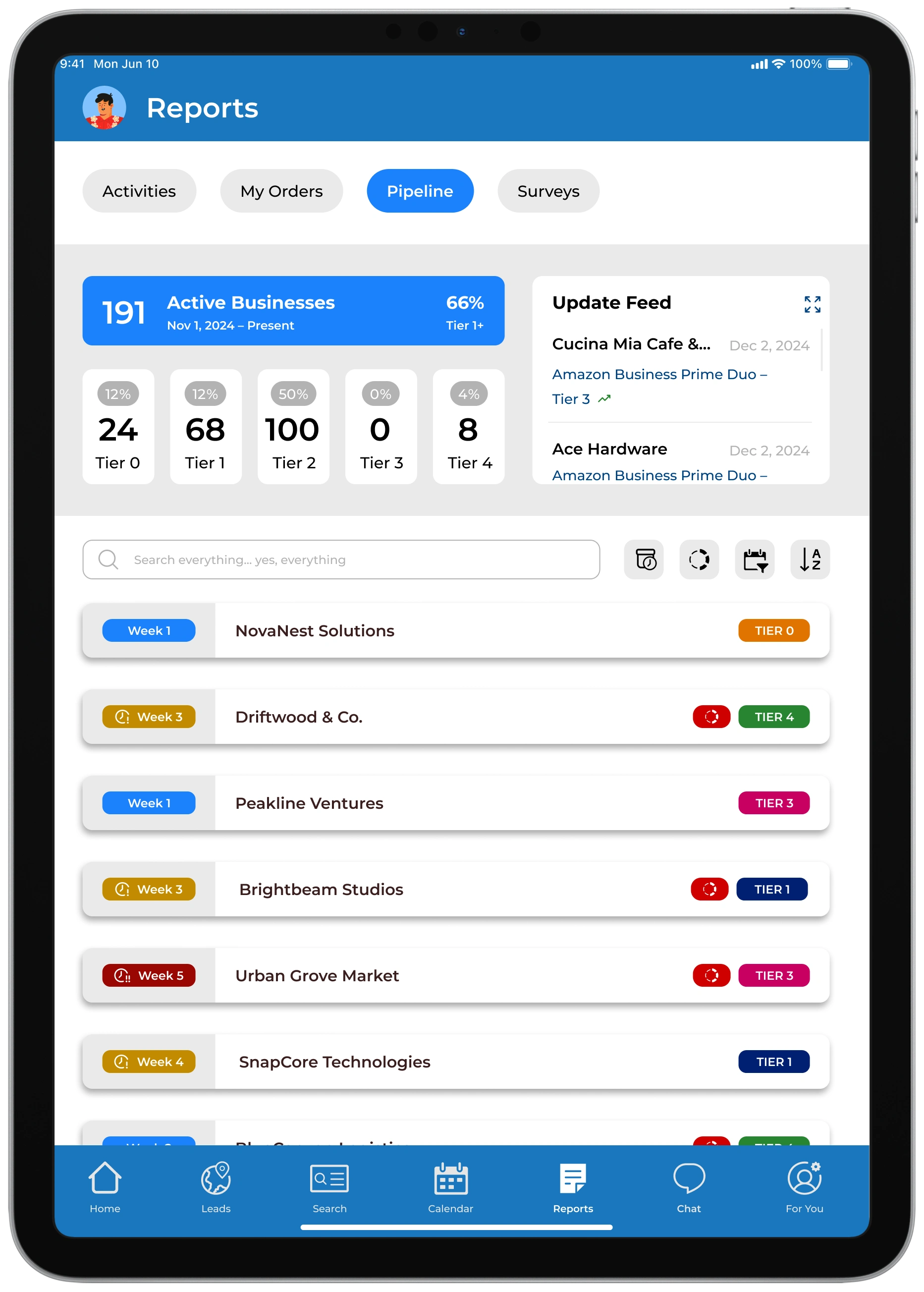
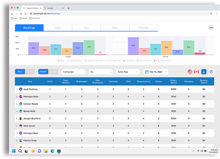
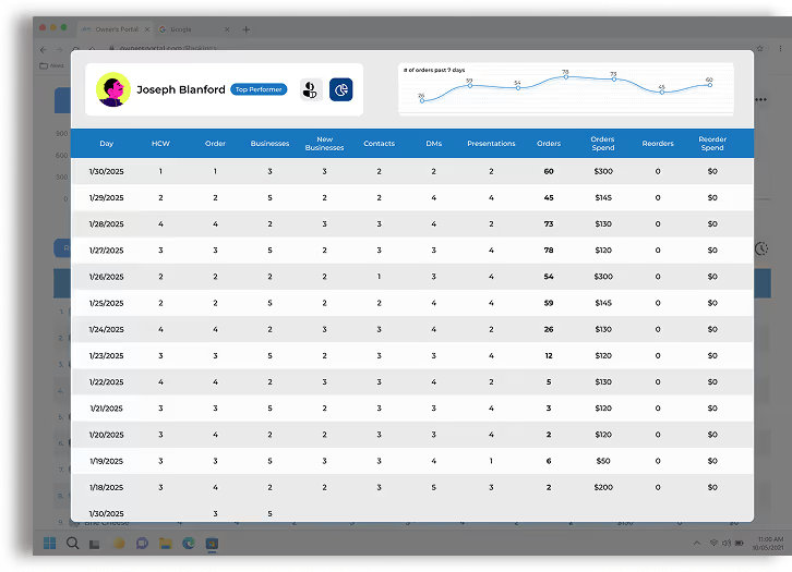
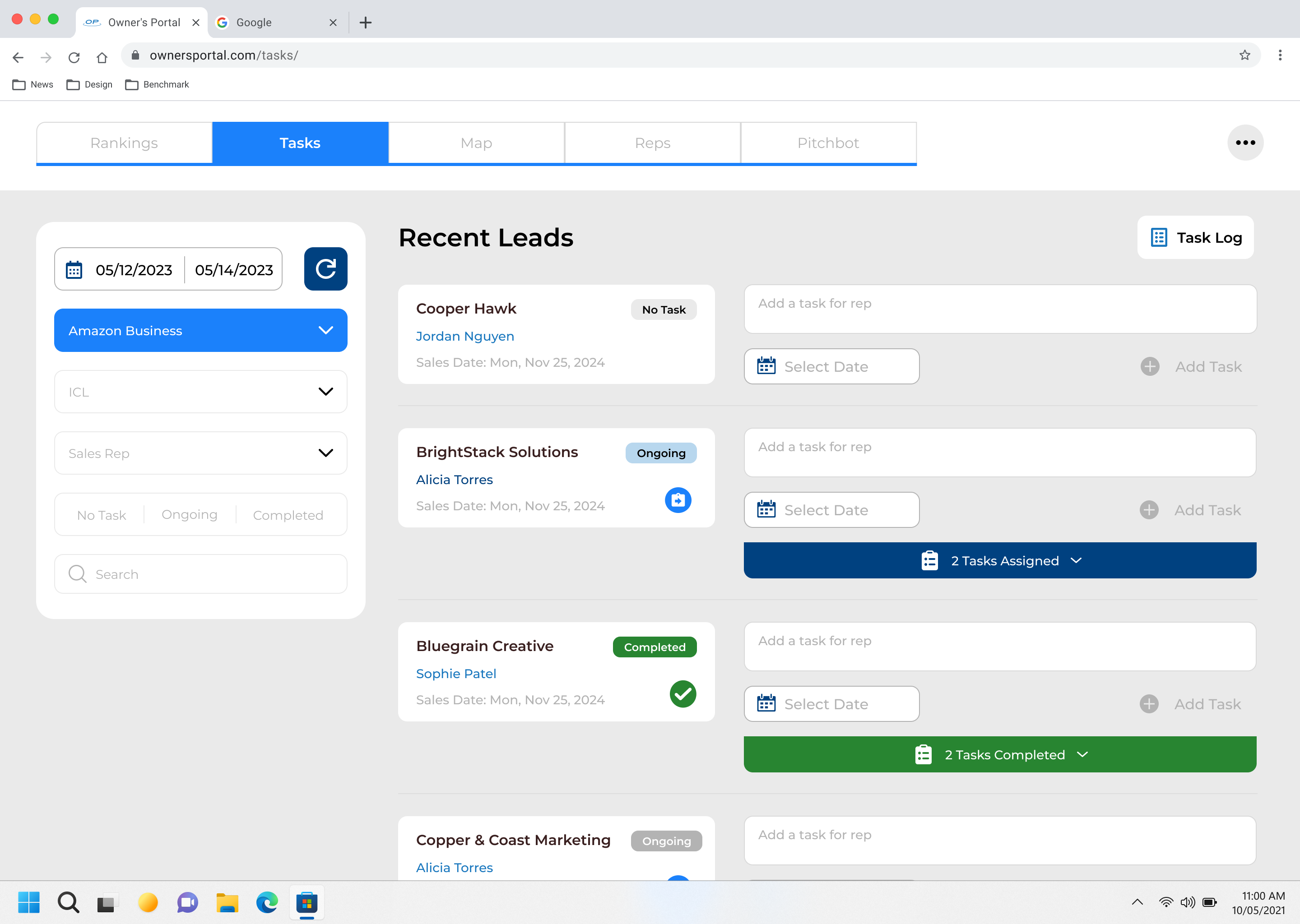
The Owners Portal is a dynamic and intuitive sales dashboard website specifically designed to empower office managers with seamless management tools for their field representatives
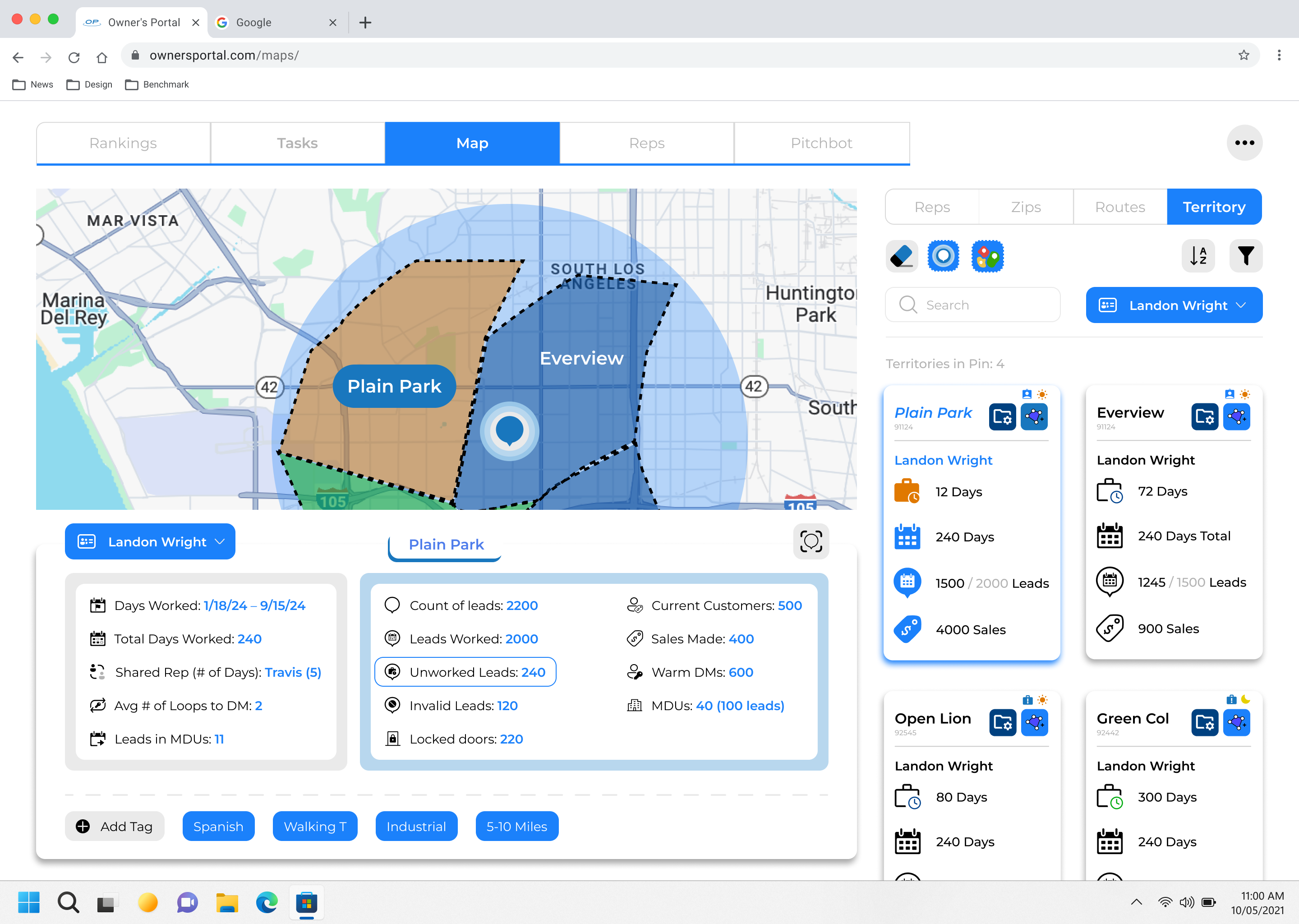
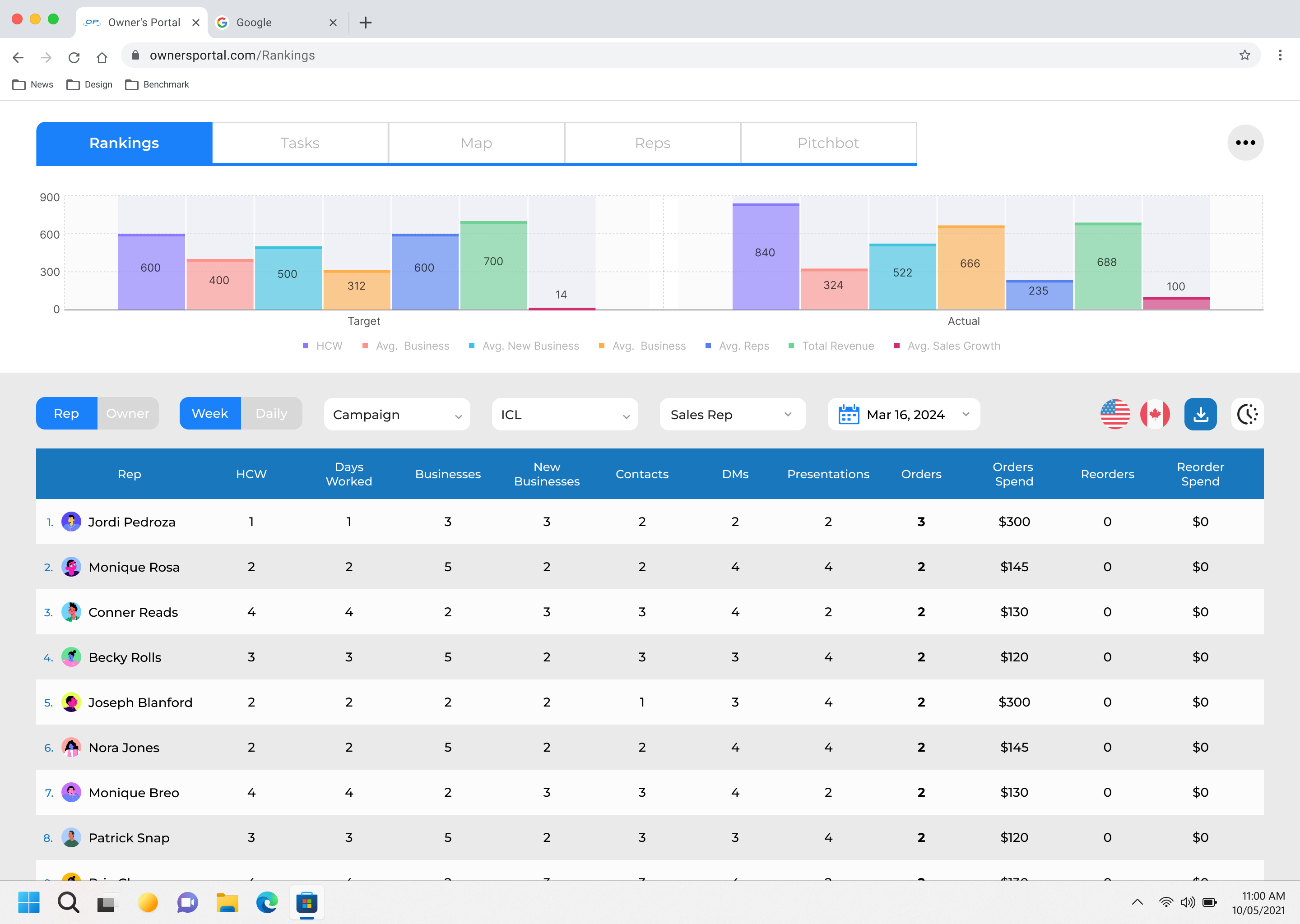
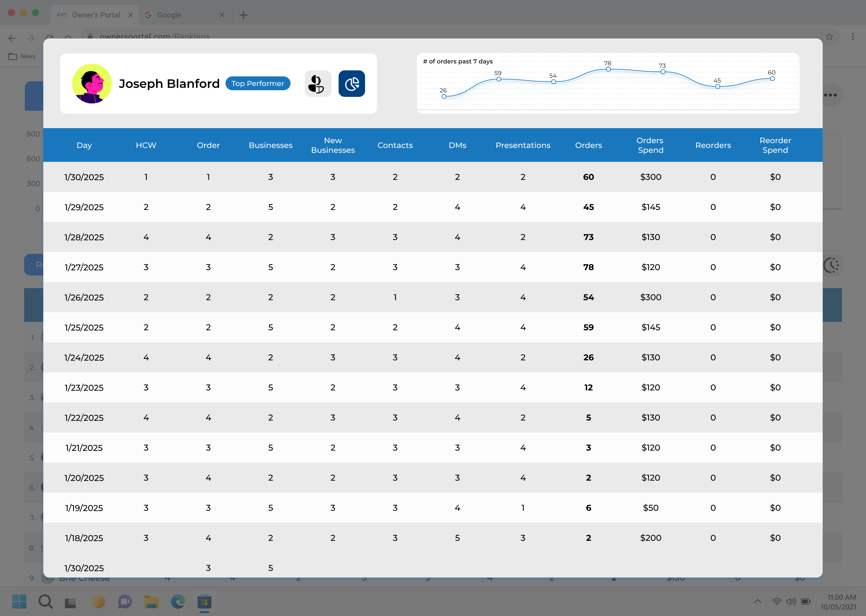
Owners and managers can easily assign territories, track the progress of individual representatives, and analyze office performance metrics
By giving managers a clearer, more actionable view of rep performance, the Owner’s Portal improved daily operations, boosted team motivation, and helped drive sustained increases in sales
in month-over-month sales completion rates
in collaborative interactions between reps and management
in engagement with office rankings and performance standings
increase sales and lead logging accuracy
task completion across the board
in daily active usage
in time spent locating lead statuses, performance summaries, and daily goals
in reps reporting that they “feel in control of their sales pipeline”
in duplicate lead creation
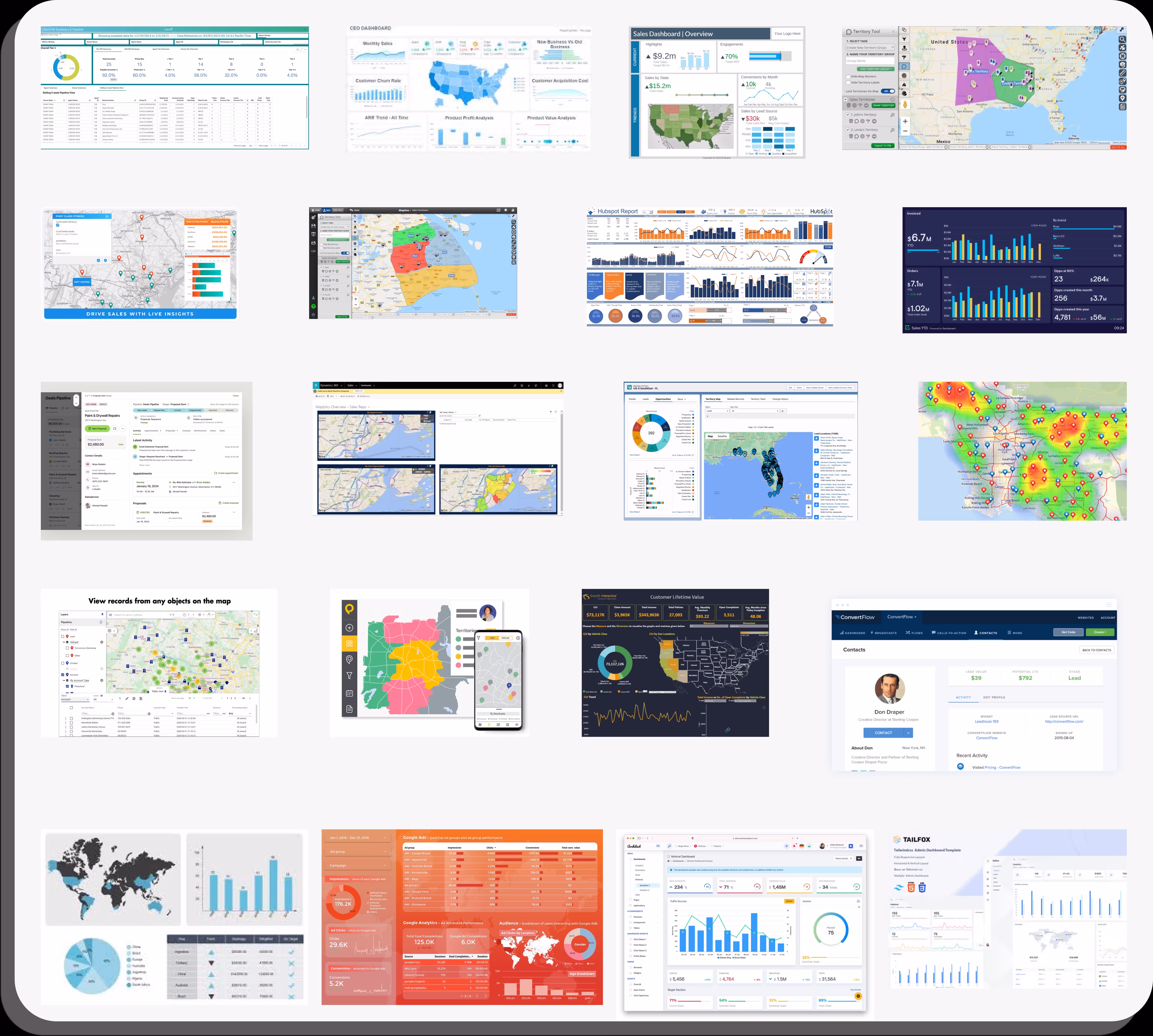
Sales Dashboards exist on multiple scales throughout businesses.
What I was most intrigued by was how to make sales dashboards that were scalable based on a change in foundational campaign type

Rigid Boundaries: Constrained on how data is filtered and displayed.
If there was a task specific insight that needed to be investigated, it would be hard to track it.
Limited Granularity: tend to favor macro-level data.
Limited ability to drill down into individual employee data
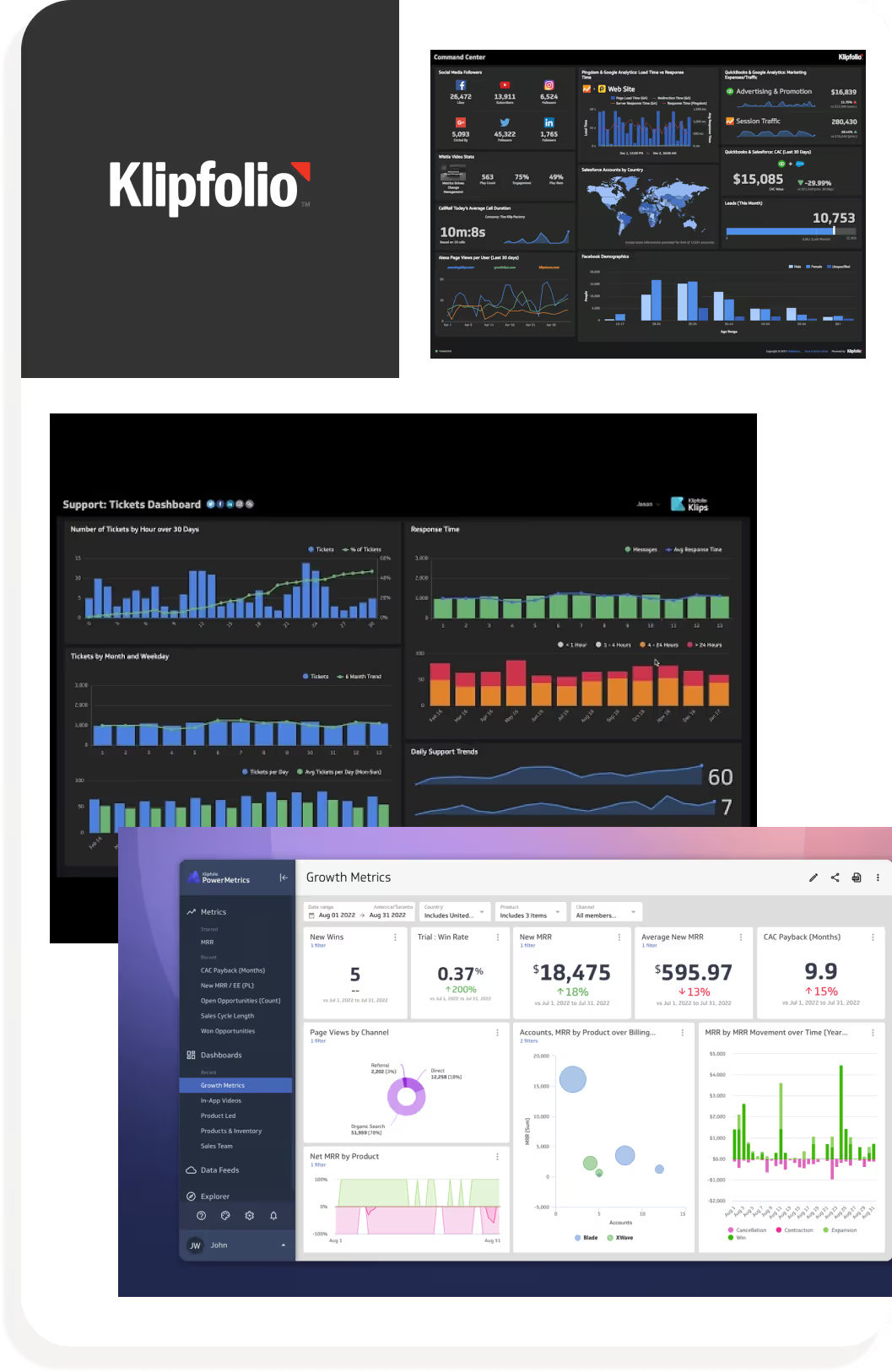
Data-driven organizations needing high-level analytics and strong visual customization but less focused on rep-level granularity.
Rigid Boundaries: Constrained on how data is filtered and displayed.
One-Dimensional Reporting: While it excels in aggregate reporting, it lacks depth in user-level analytics
Reduces its value for performance management.
Teams needing a polished, all-in-one overview of business metrics without requiring deep comparative or individual analytics.
Complex Setup: User needs a bit of technical knowledge to create a dashboard
not the most accessible
Steep Learning Curve: felt the onboarding process wasn't friendly to new user.
Felt "Jump into the pool and figure it out for yourself"
Teams with technical expertise or data analysts who need extensive control and real-time tracking across custom data sets.
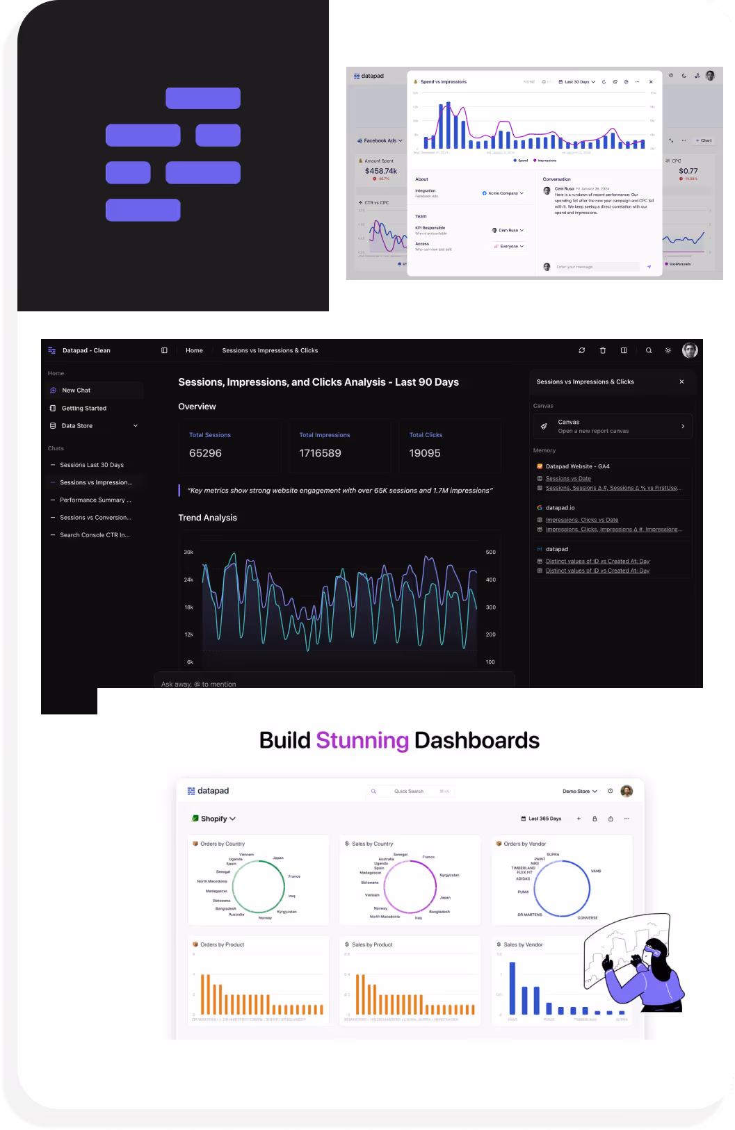
Limited Data Complexity: struggles with advance datasets so makes it hard to do in-depth analysis
Smaller teams seeking a straightforward, simple dashboard tool for light tracking and real-time notification
We decided to have longer interviews with office owners, reps across different campaigns, and territory management team at Cydcor to discuss any pain points, issues, and desired improvements they would like to address for a more streamlined management system
Other important functions we considered and designed were:

Owners and reps feel that they stretched thin upon multiple areas in their business.
A more intuitive, proactive, and integrated system could help owners feel more in control of both performance and team motivation while reducing reliance on manual tracking and gut instincts.
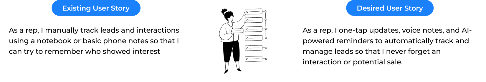
Based on our conversations, we transformed frustrations into clear, outcome-focused user stories.
The goal is to create intuitive data hierarchies, streamline workflows, and interface components that support how owners want to visualize performance, manage teams, and make informed decisions in real time.


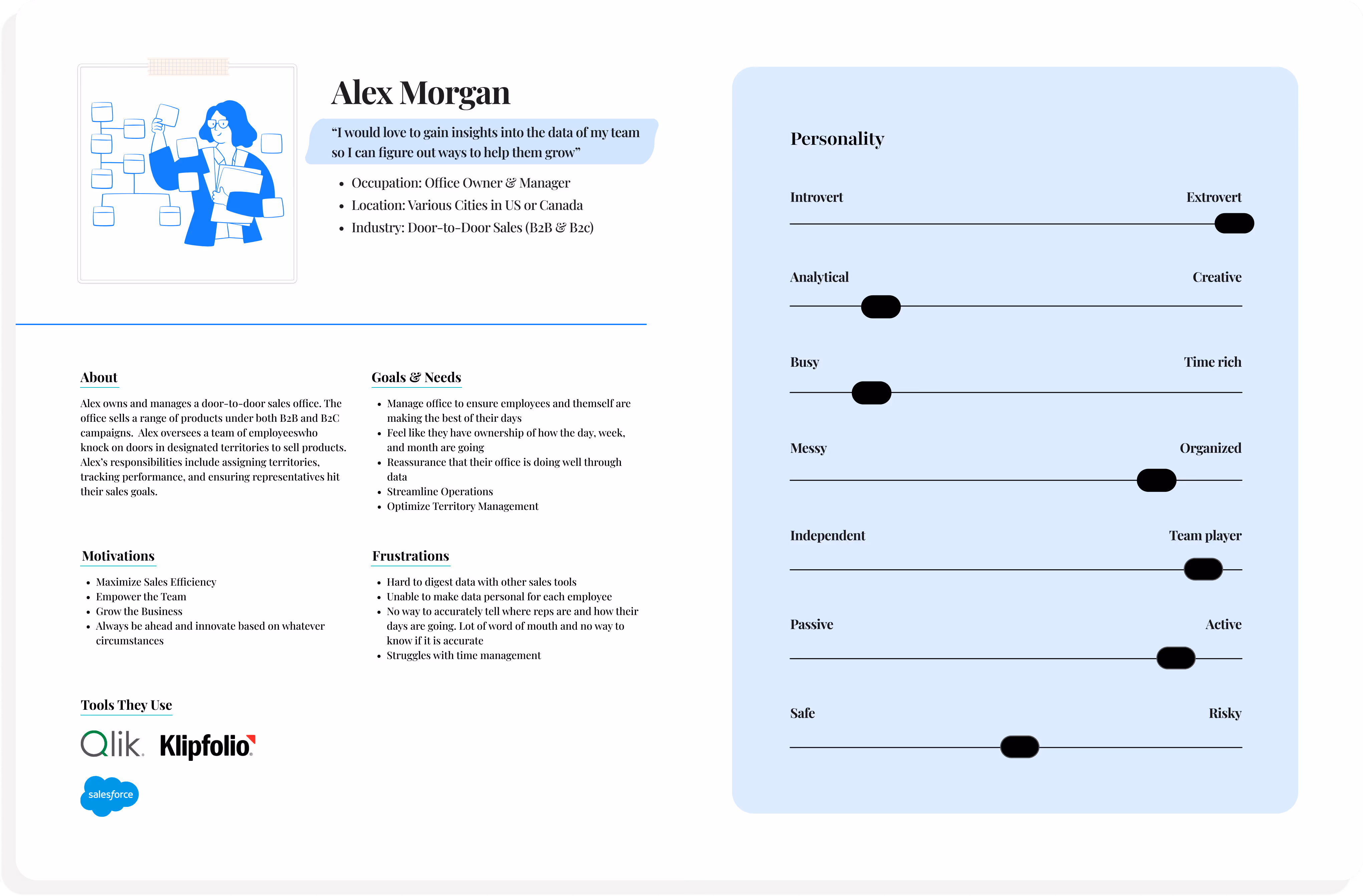
We created an office owner persona based on interviews, competitor analysis, and user feedback.
This persona helped us clearly define key pain points, goals, emotions, and intentions especially around information overload and rep performance tracking. I
Ultimately, it served as a guiding reference throughout the design process as it kept our focus grounded in real user needs as we built the portalt
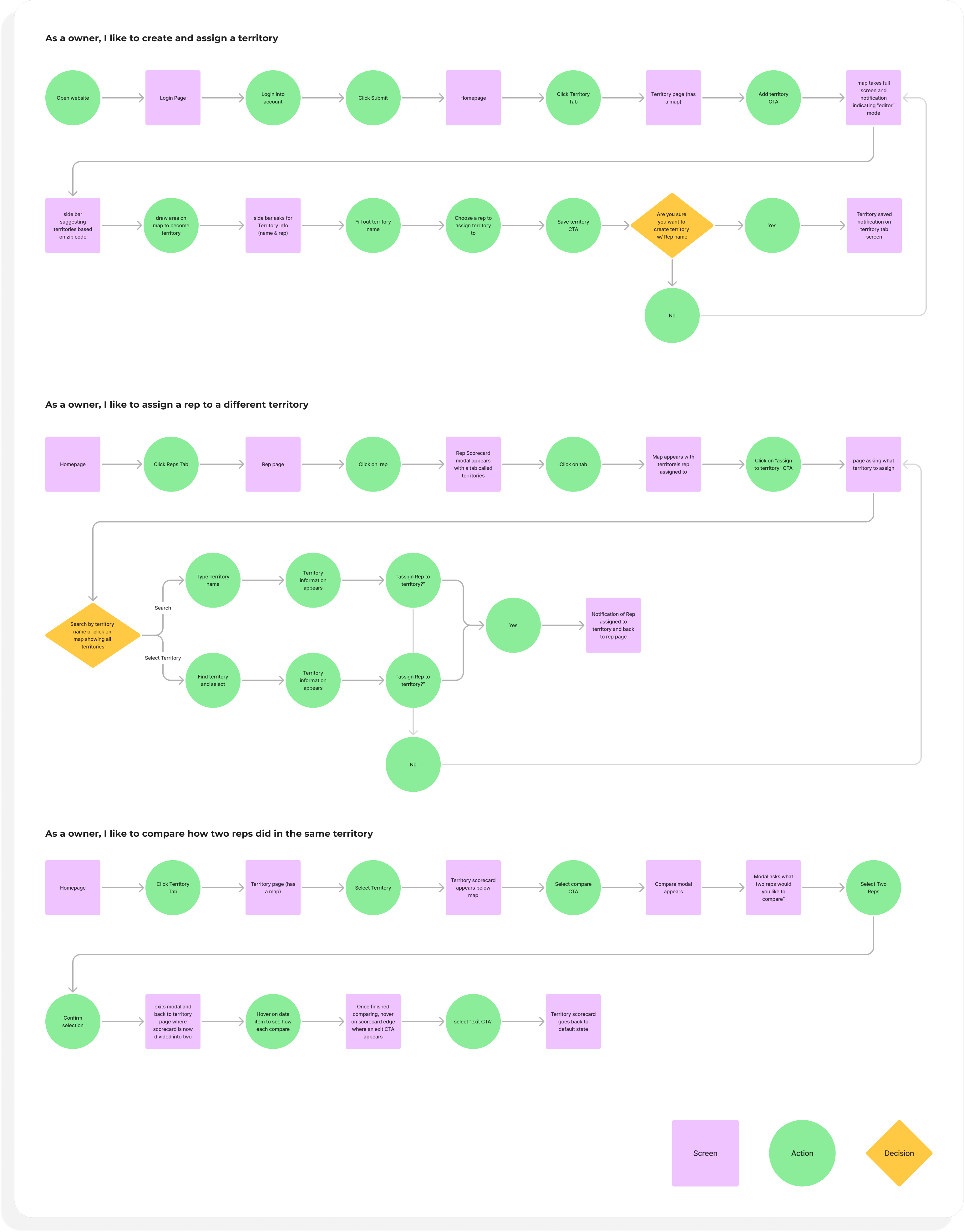
From the research, the team and I decided to focus on what we believed were fundamental flows that a user would need to properly manage reps.
These are flows are the backbone for how we approached data presentation– digestible and targeting struggles we heard from owners
Ultimately, it helped us guide how we can support day-to-day team oversight and decision-making
I began the design process with low-fidelity sketches and wireframes to accelerate decision-making through visualization without losing time.
The sketches are rough ideas of how we wanted the structure of the portal to look like and how to focus on key elements we found to be pressing based on interview feedback
I began the design process with low-fidelity sketches and wireframes to accelerate decision-making through visualization without losing time.
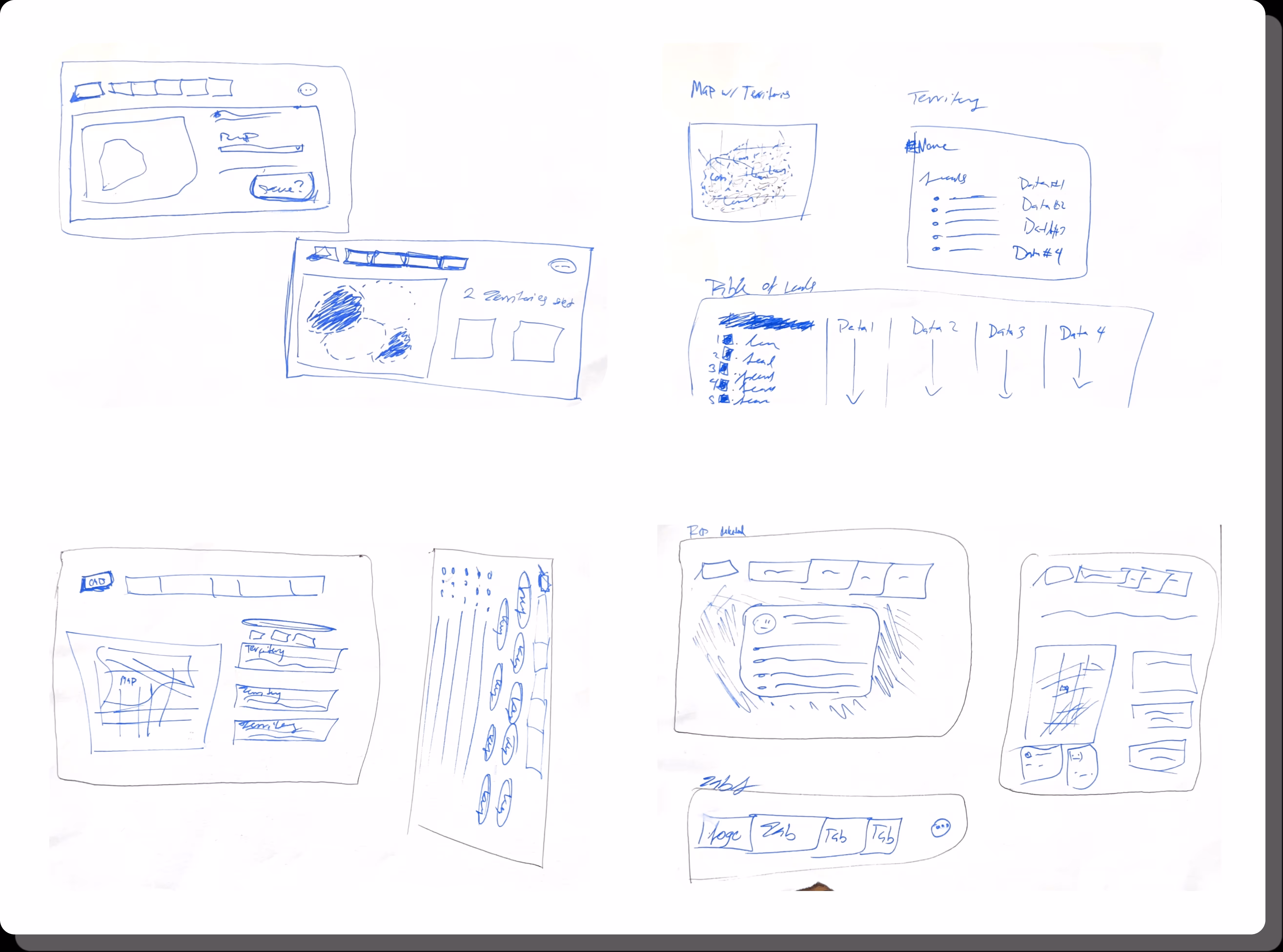
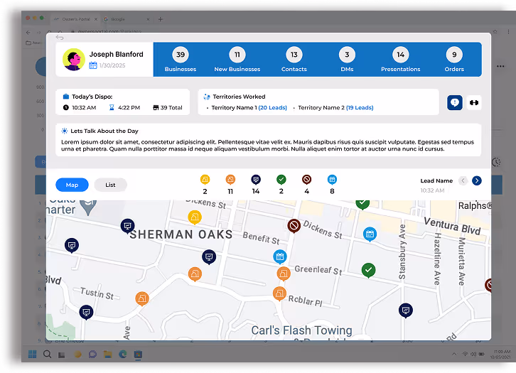
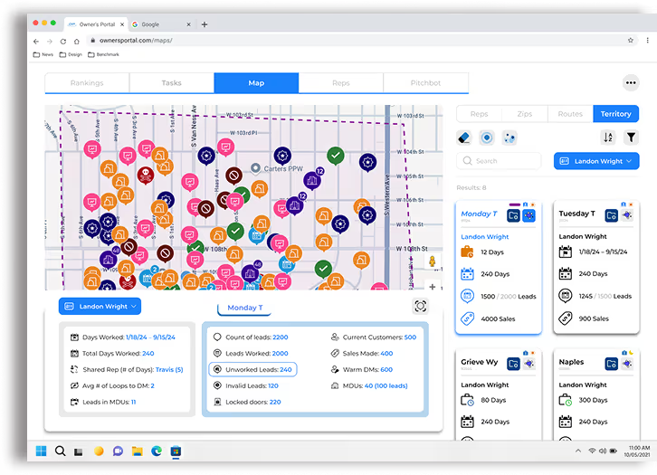
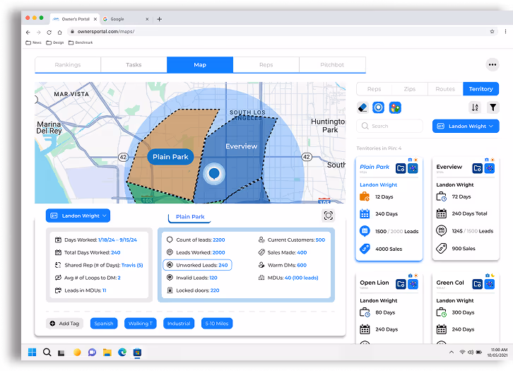
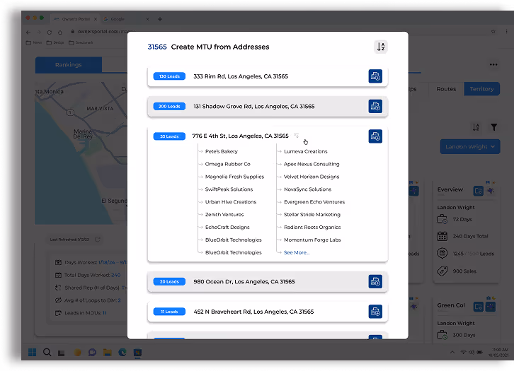
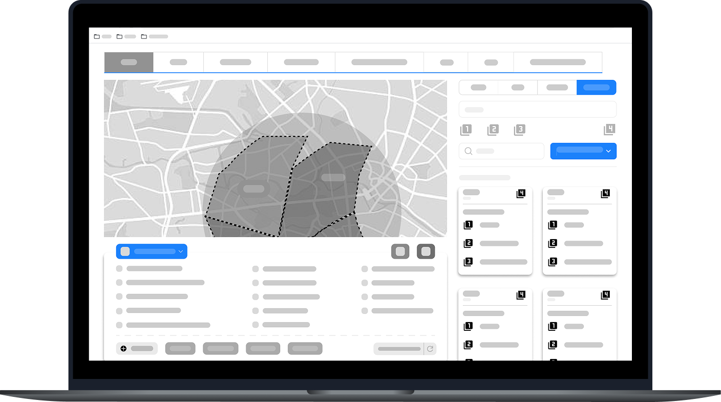
Whether it be analyzing one rep or analyzing multiple reps working the same territory
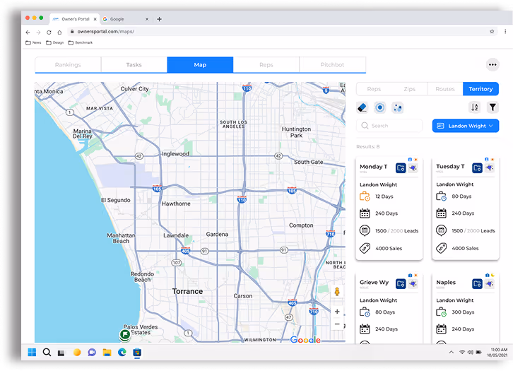
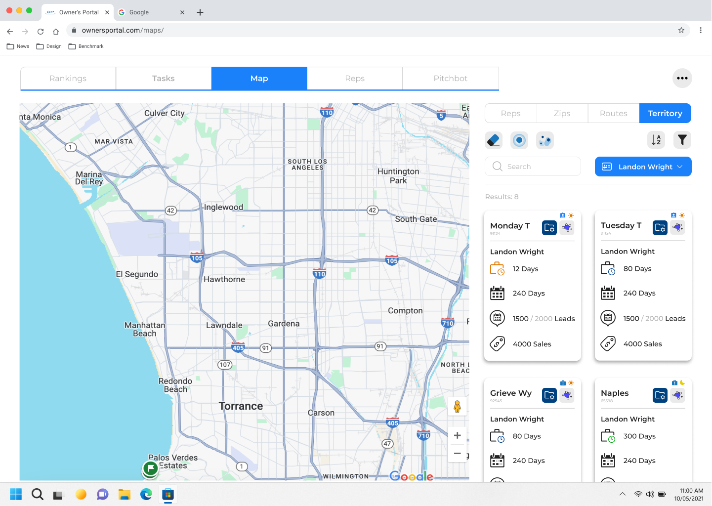
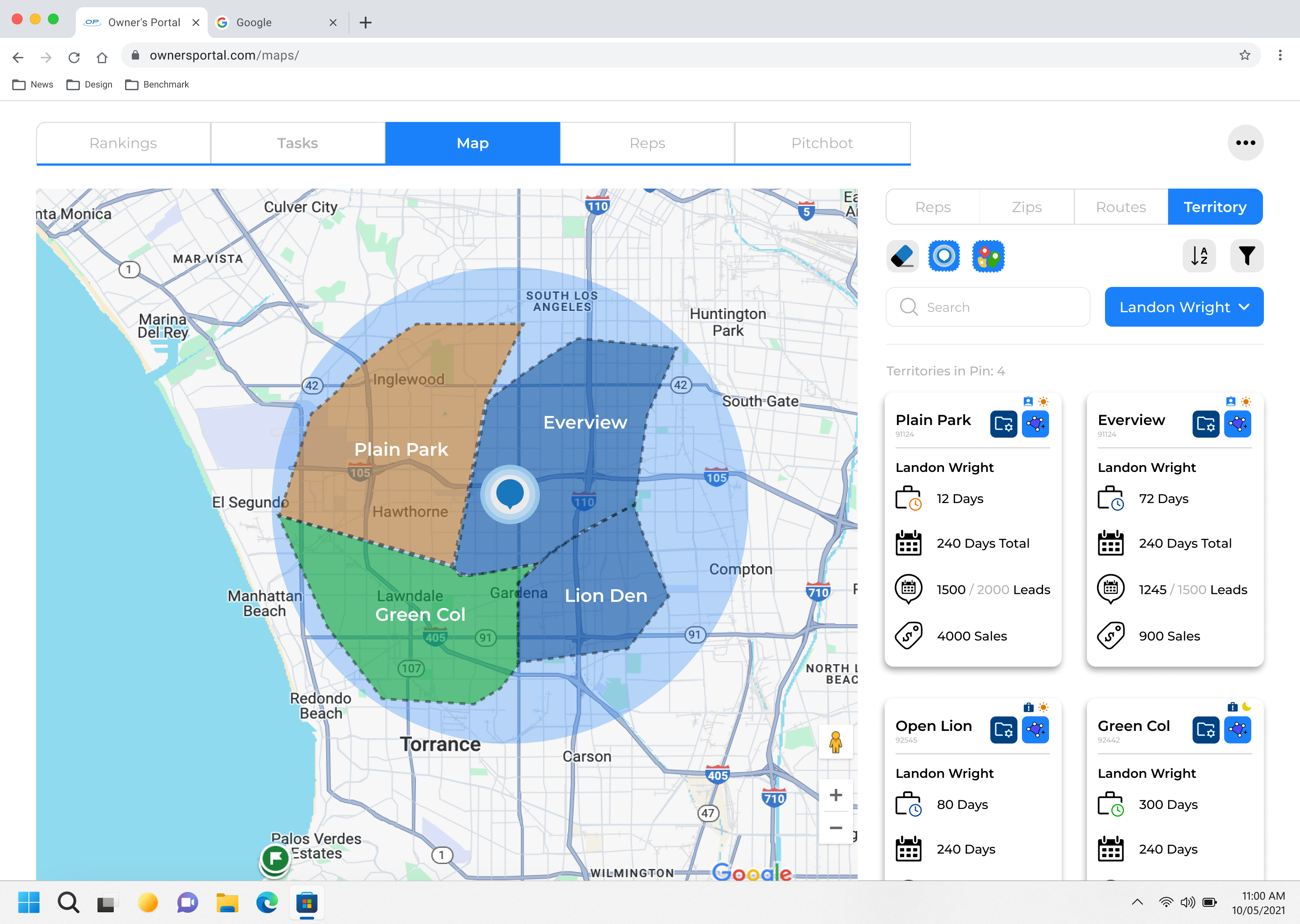
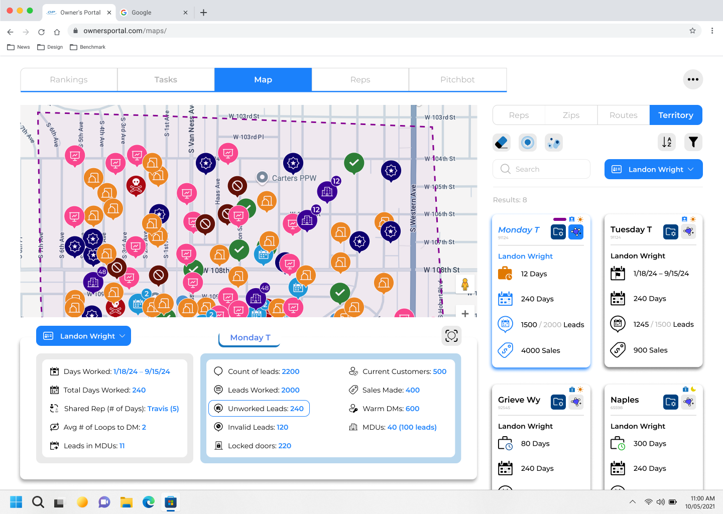
The map function needed to work as both an exploration of territory and a way to analyze rep performance
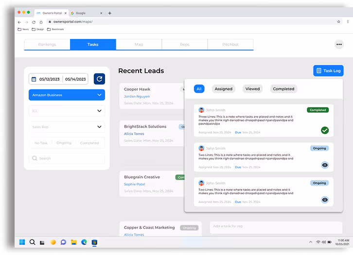
Need to find a sweet spot on showing an excel table with rep performance can both be easily digestible while not taking too much space
How many tabs are we going to create and is there a way to consolidate tabs
What are commonalities among data structures that can be combined as one as well as do we need to differentiate stacks of data that we thought were similar
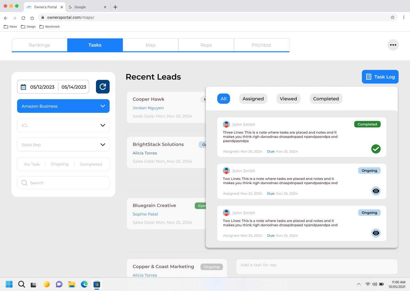
We need to include some sort of history function to help owners with lead tracking so they can better understand the rep's daily operations
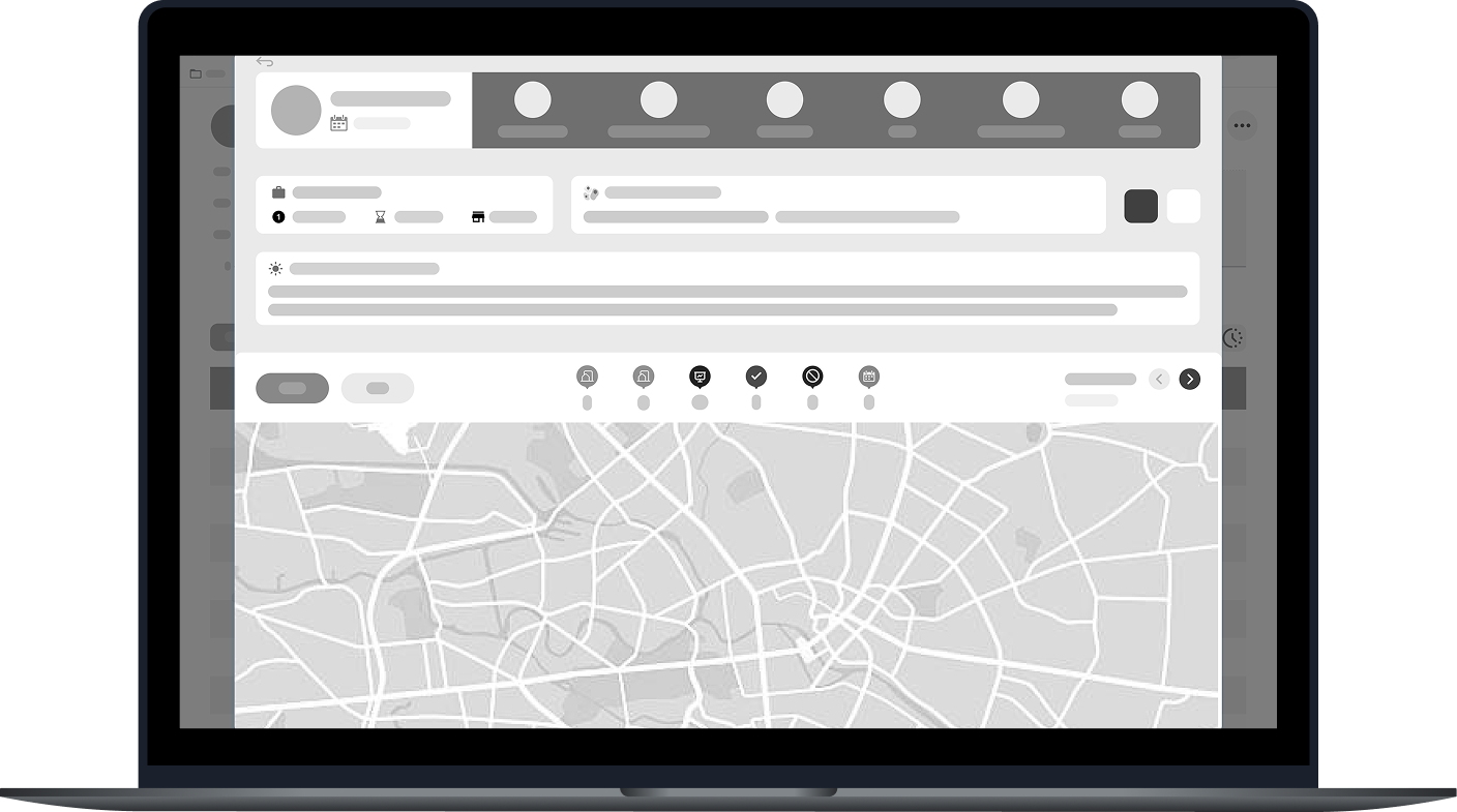
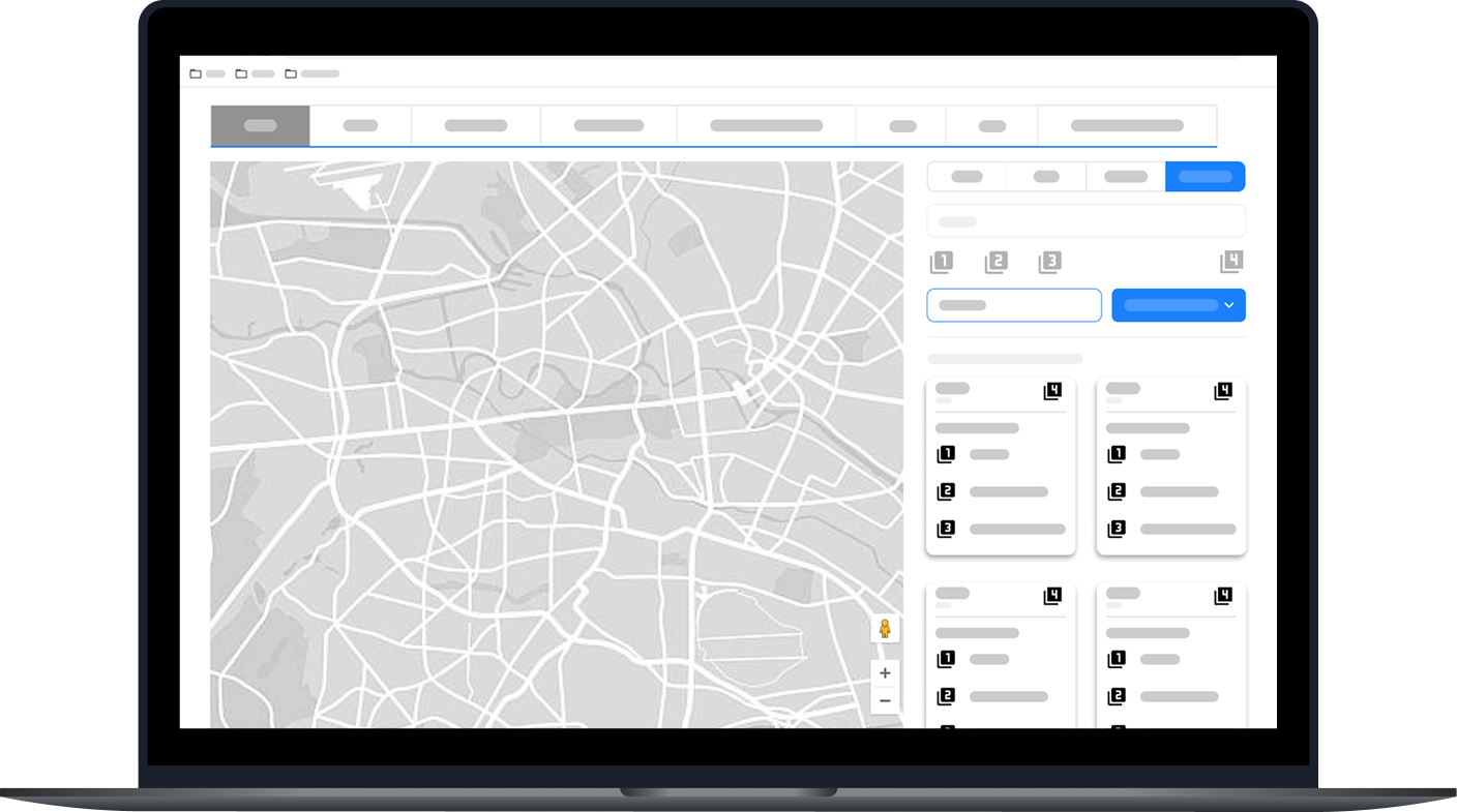
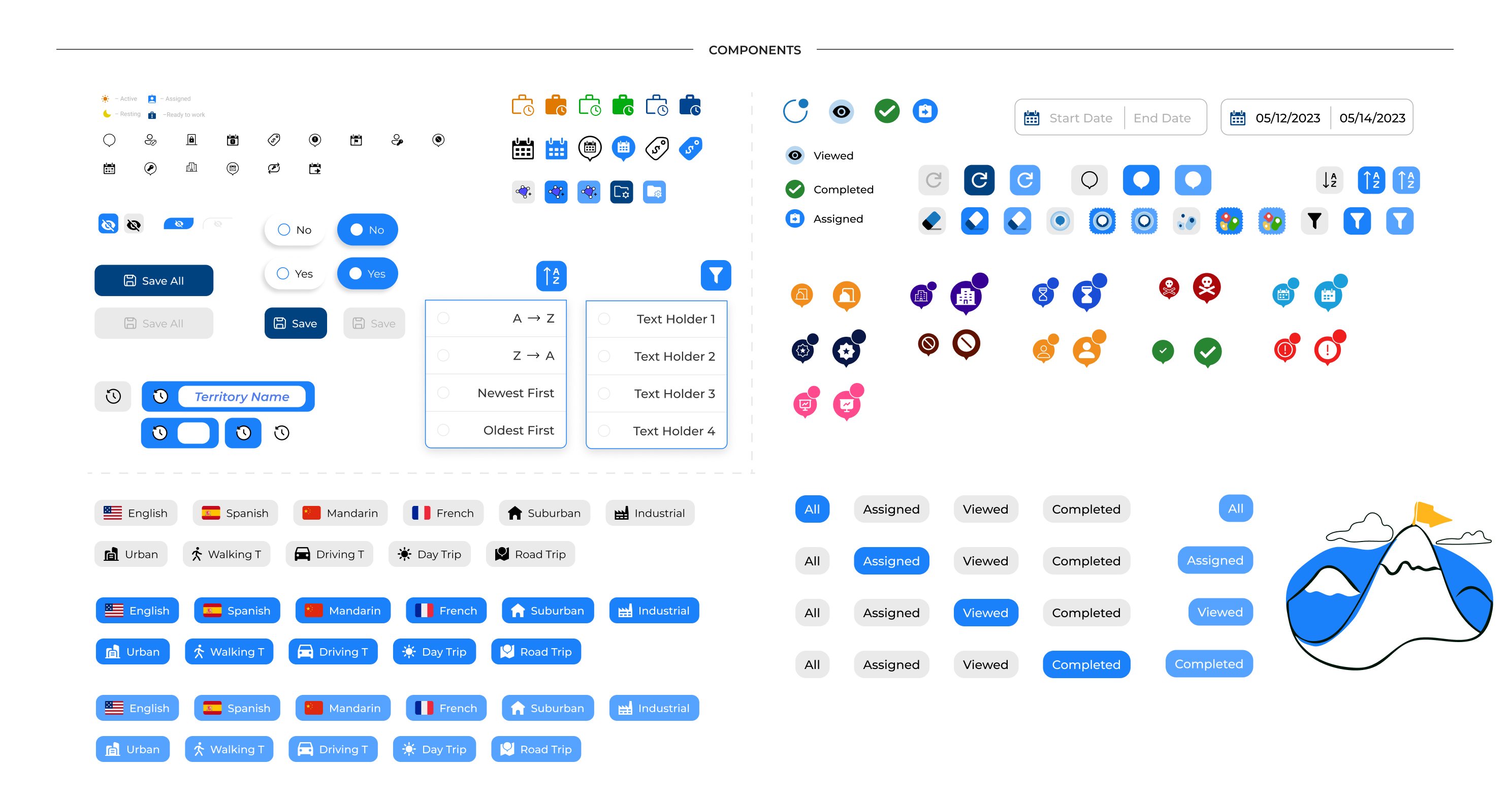
Building on our initial sketches, we began to build lo-fi wireframes to begin shaping the structure of the portal. I gathered our takeaways and began exploring layout solutions that would support both clarity and functionality.
We wanted to go for a clean and intuitive look while also paying attention to the variety of feature and content we believed an owner would need to feel successful.
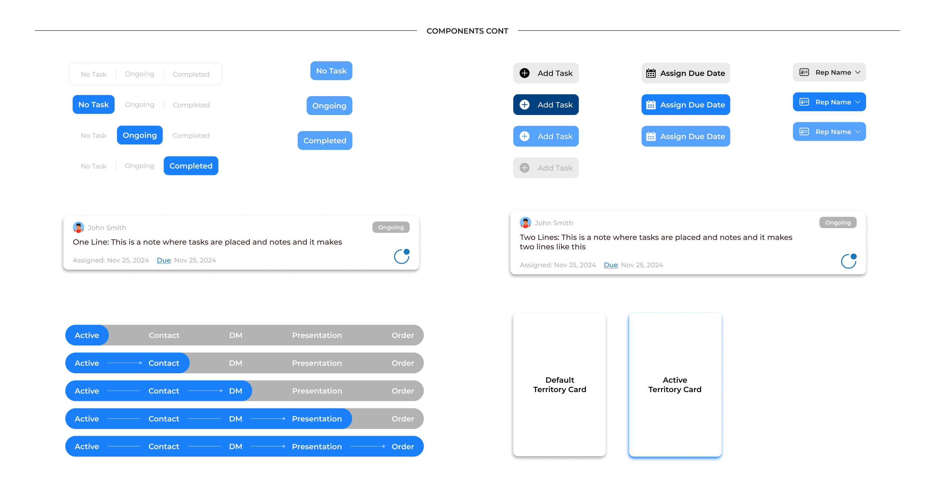
Some functions we considered and designed were:
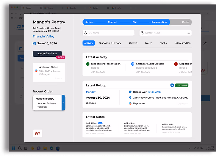
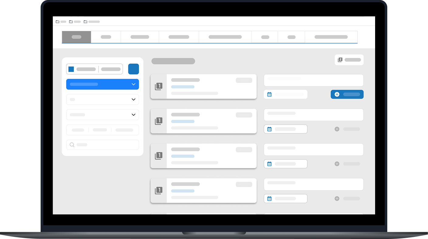
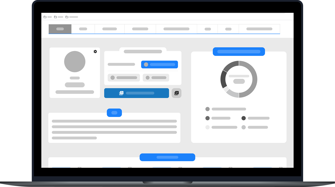
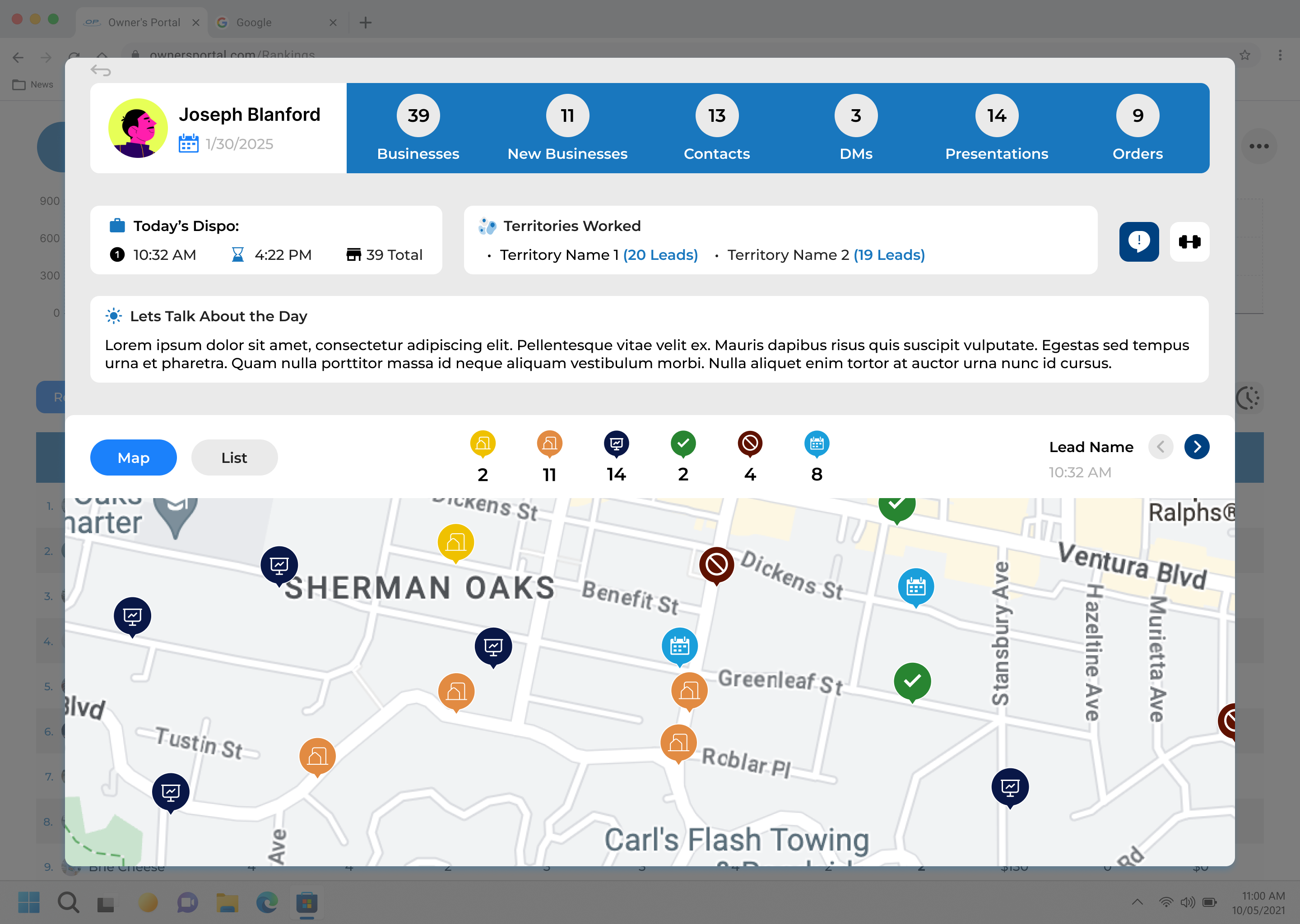
Profile pages for reps and territories
We eventually called them scorecards
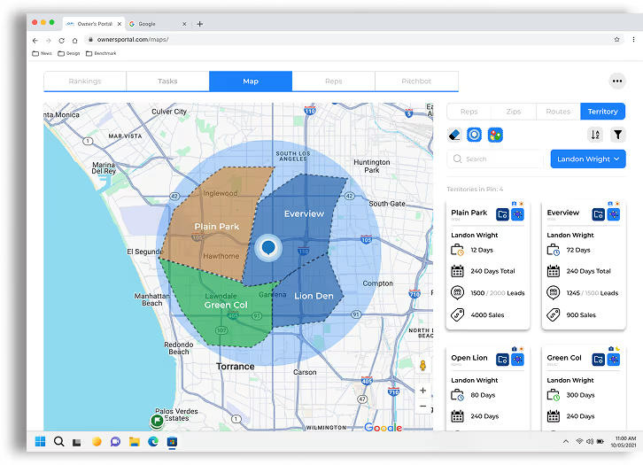
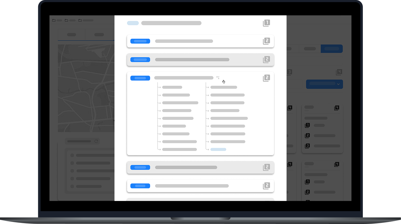
Selecting territories
Suggesting Territories
Creating tags for territories
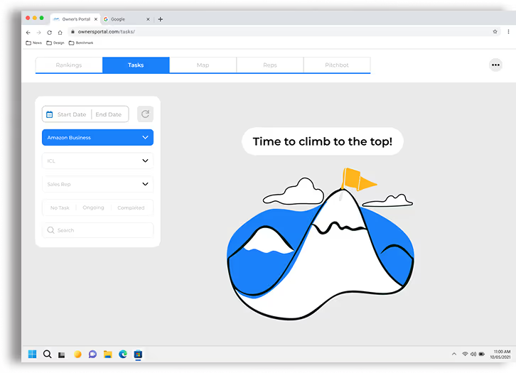
Creating tasks for reps
How we can present data with maps
Building a maps feature that feels expandable
Storage for training documents
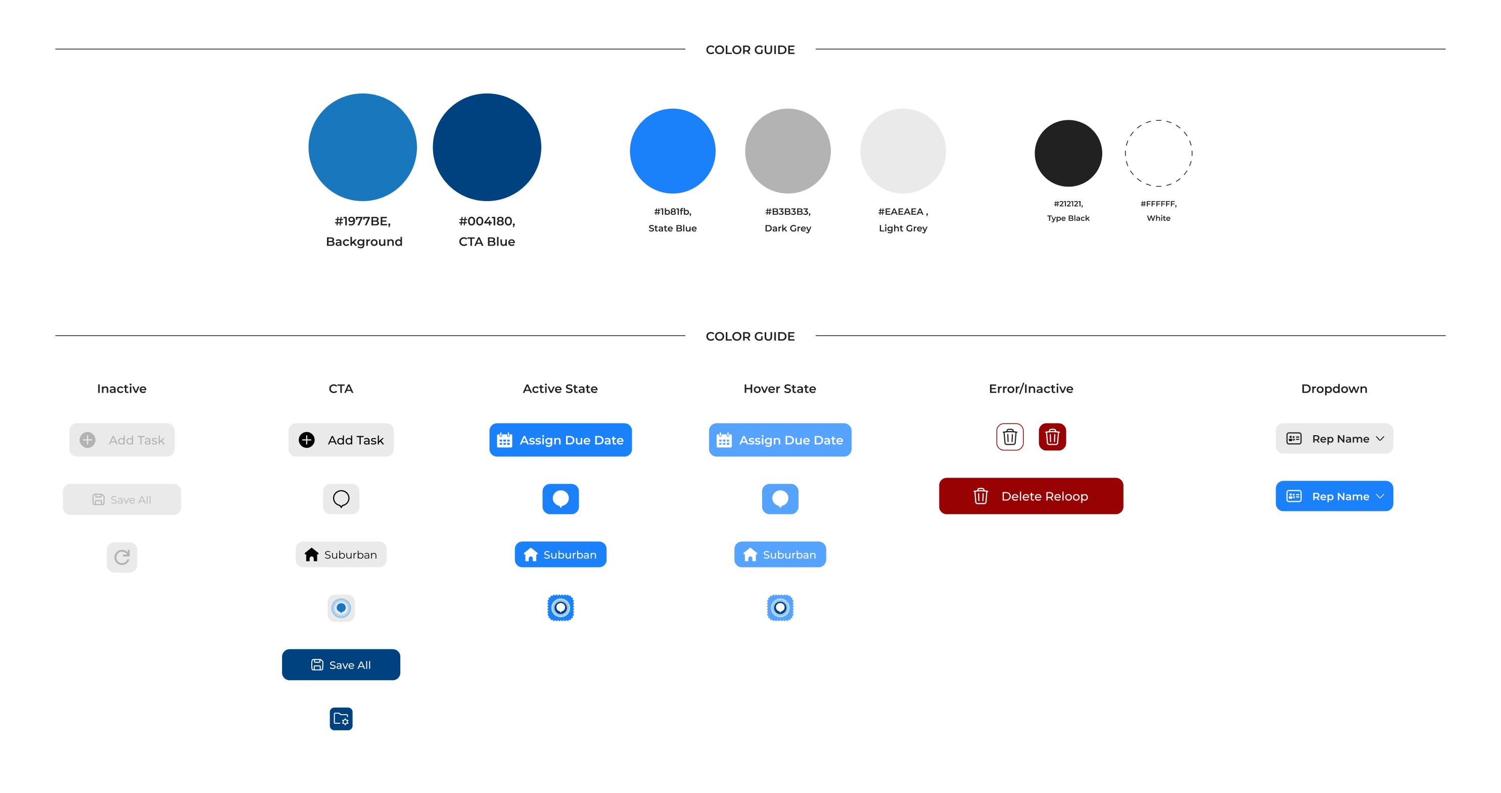
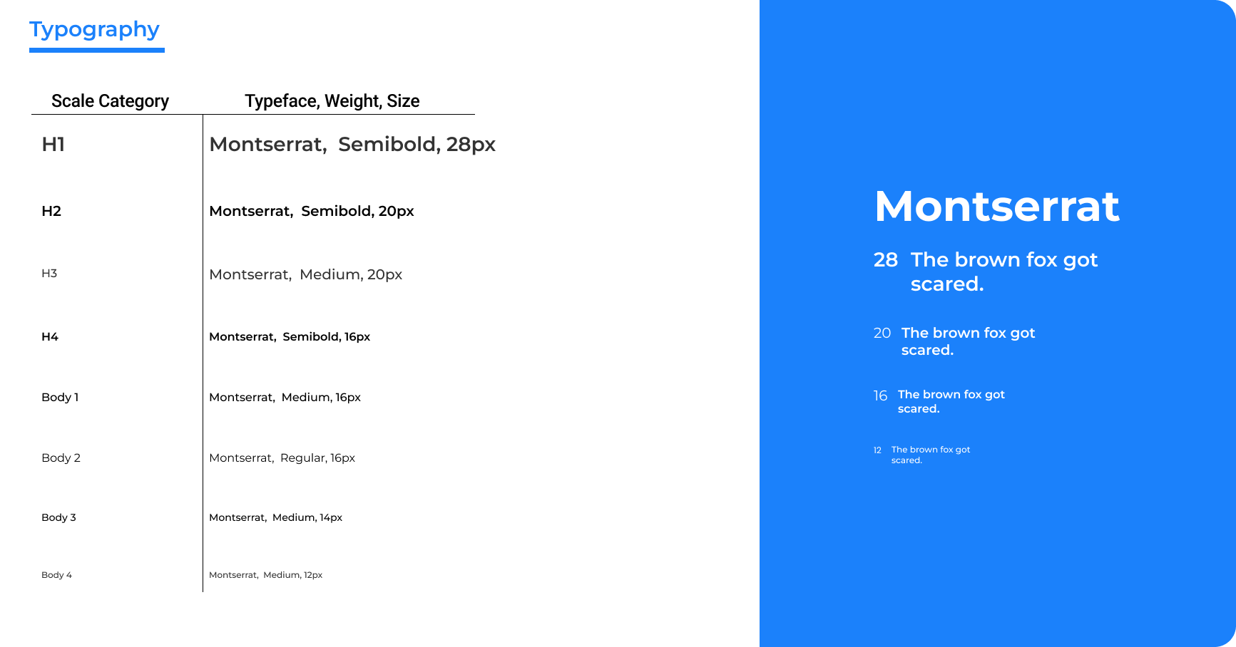
We had some direction from Cydcor about what the brand guidelines would be, but we were encouraged to push the envelope to figure out how we can make the portal stand out within the company's brands
I had constant discussions with the marketing and development team to discuss progress and experimentation. These conversations helped us critically analyze what we wanted the look of the portal to be and helped us finalize our style guide.
The guide contains desired color palettes, typography, iconography, input fields, components, and images and graphics.
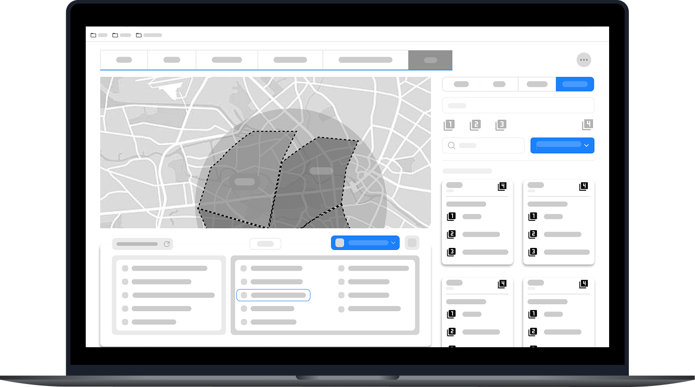
As we moved into high-fidelity screens for Owners Portal, we wanted to keep everything as simple as possible.
We understood that the desire to consume data as quickly as possible was a high want when we did our interviews, yet we wanted to make sure that users weren't overwhelmed. Furthermore, we wanted to create a bit of personality based on each owner by giving users freedom when exploring how they wanted to use features like the map in relation to their reps.
Ultimately, through experimentation, adhering to accessibility standards, supporting stakeholder's vision, and working with stakeholders, we strive to create a user-friendly experience for all owners.

For every stage of the design process, we would have a few beta office to try out new features. We primarily worked with offices around our headquarters and even went on field visits across the nation to talk to owners about how we can better service them.
Each office we went to, each person had something new to say that we documented and went back to the lab to create better versions of the portal.
We also created a separate email and slack channel given to only owners that allowed them to have direct access to us in order to report any bugs, changes, and desires they want implemented.
Below are examples of notes (gathered by myself and the team) highlighting key changes we identified to improve and evolve the user experience.eld.
This project wouldn’t have been possible without the openness and collaboration of the developers, field reps, and office managers involved.
Throughout the process, I found my greatest strength was in facilitating alignment across stakeholders, creating space for experimentation, and keeping the team grounded in user-centered design. By leading structured check-ins, thoughtfully delegating responsibilities, and prioritizing transparency, I helped ensure that our workflow remained steady and focused even as we adjusted to new challenges.
One of the biggest challenges we faced was navigating the unique needs of different campaigns (each with its own structure, priorities, and goals). Owners often had varying (and sometimes conflicting) expectations, which pushed us to think critically about how to create a system that was both flexible and intuitive. Balancing these voices while ensuring a cohesive product vision required constant communication, user validation, and iteration.
This project is still ongoing, and I’m excited to continue evolving Owner’s Portal and contributing to the future of myT.