Discovery
•
Ideation
•
Design
•
Dev Handoff
•
Reflection
•
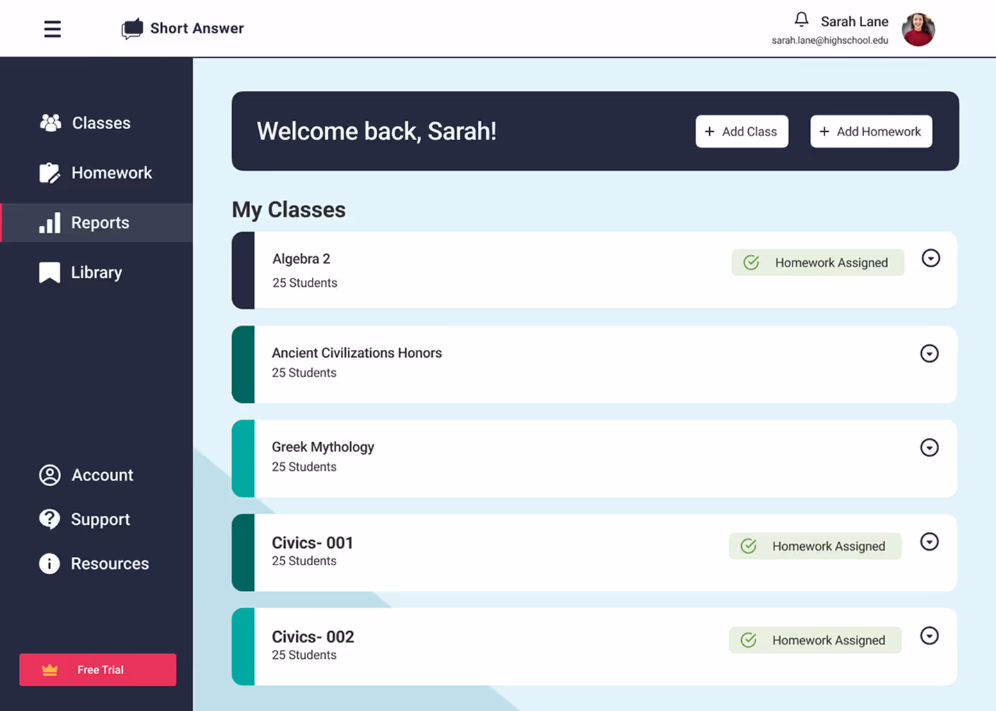
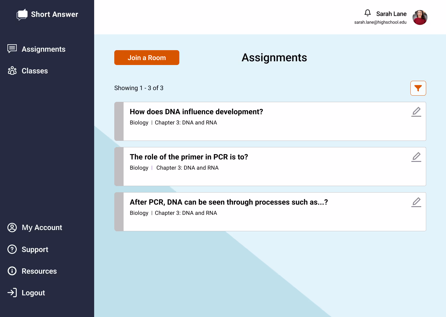
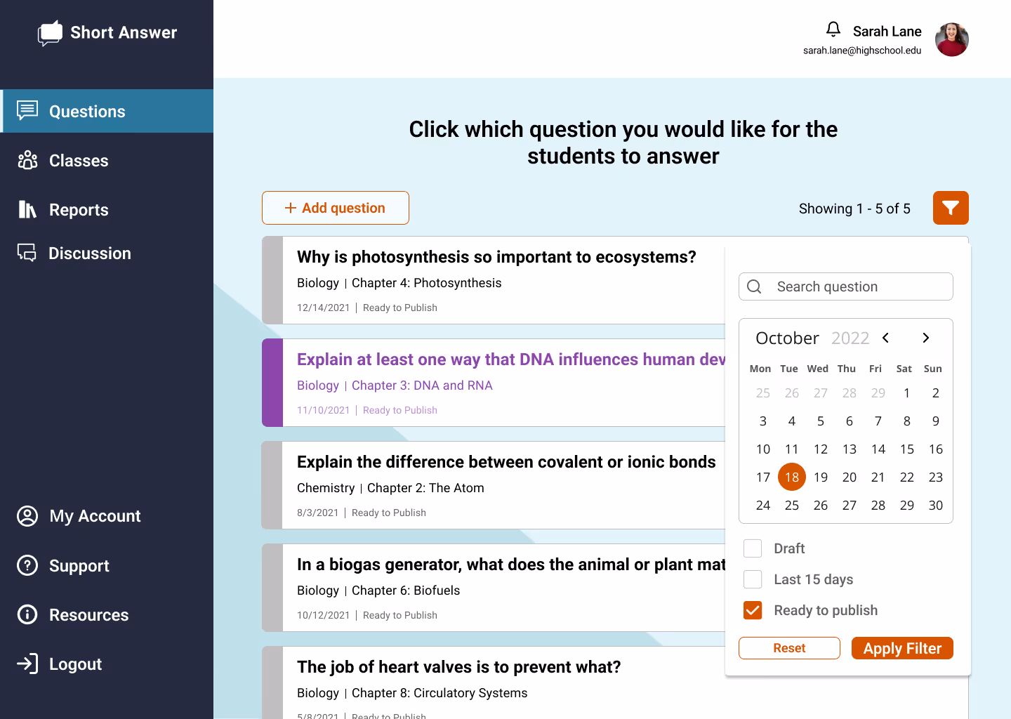
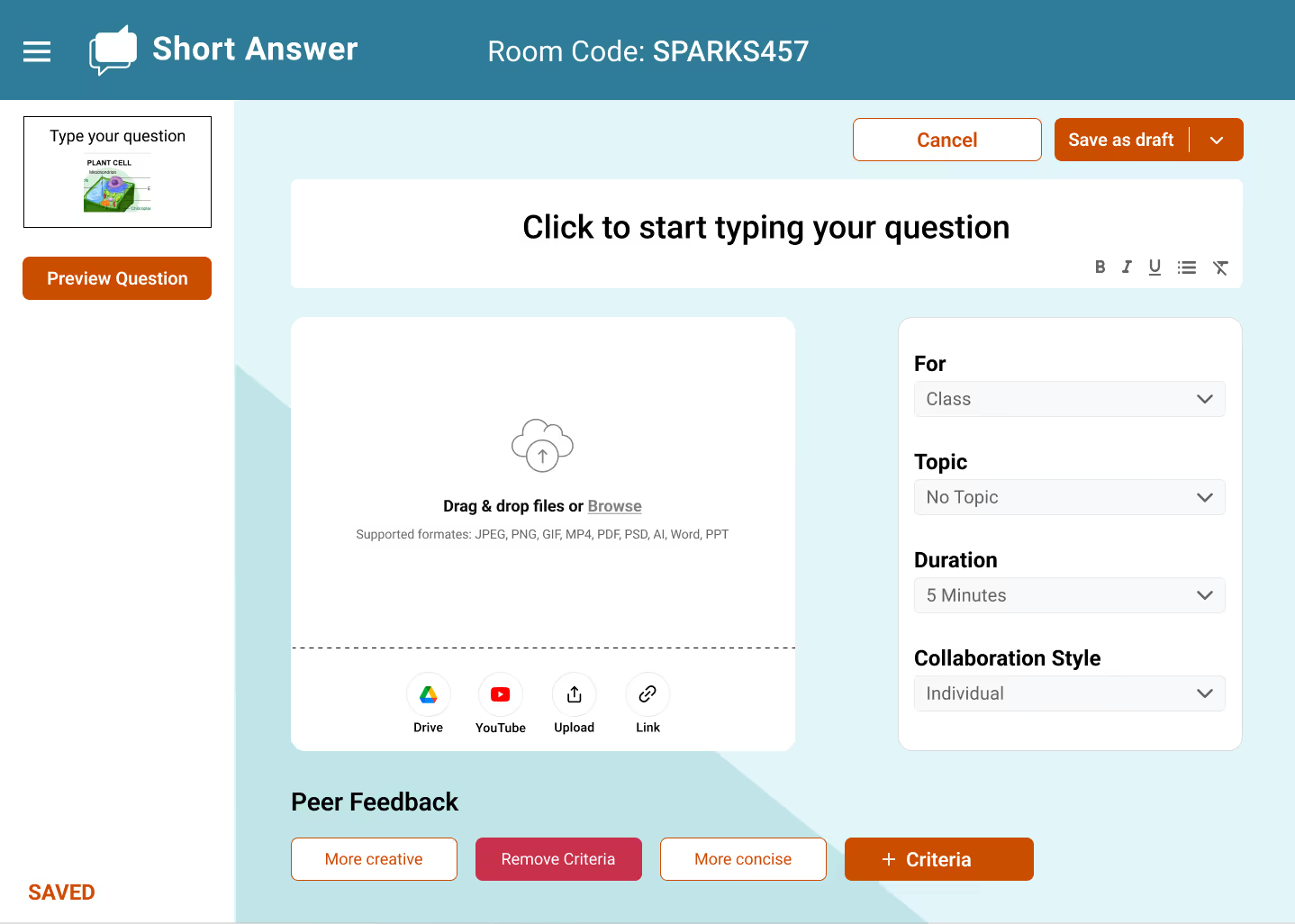
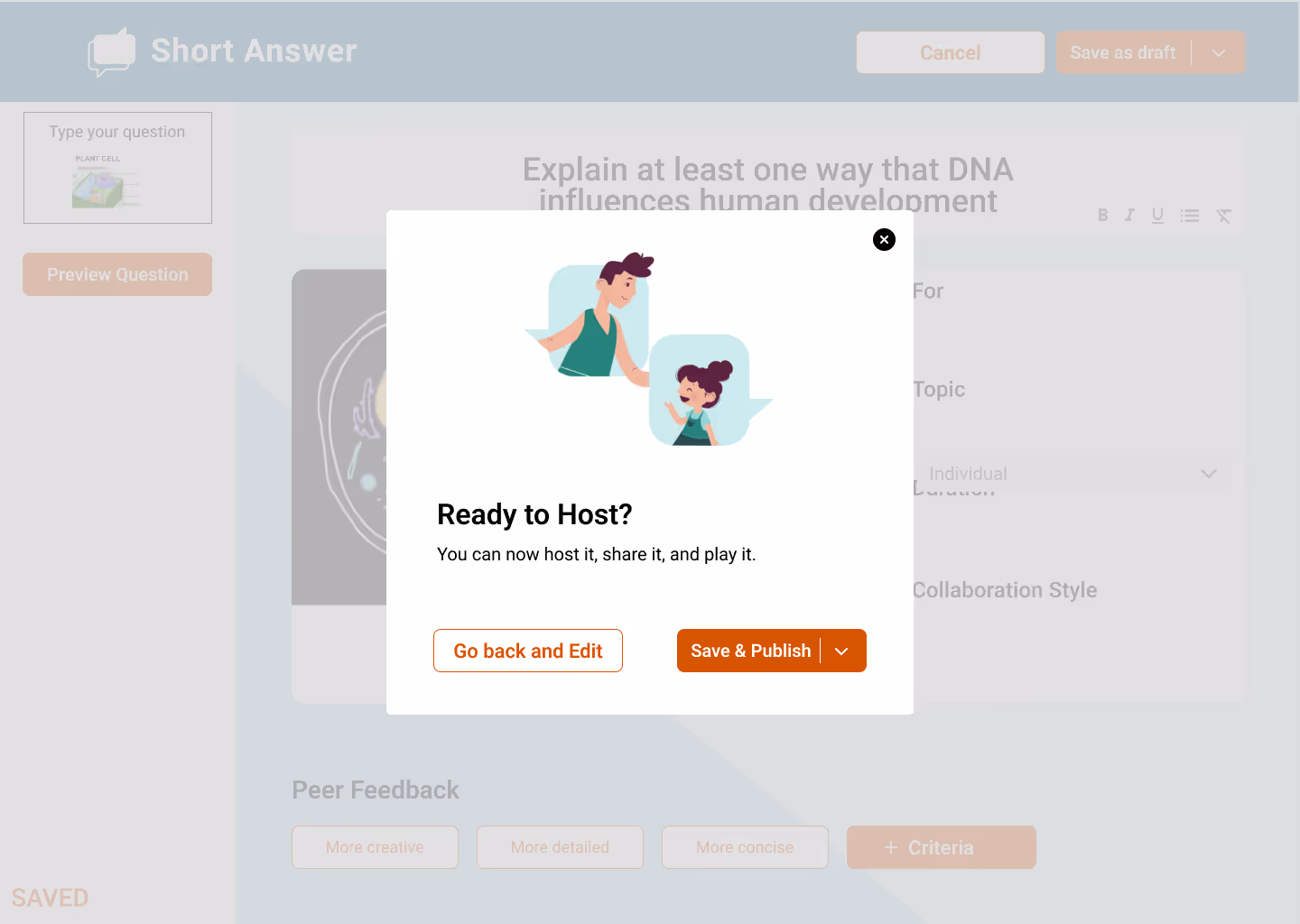
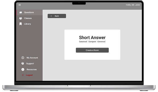
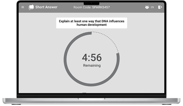
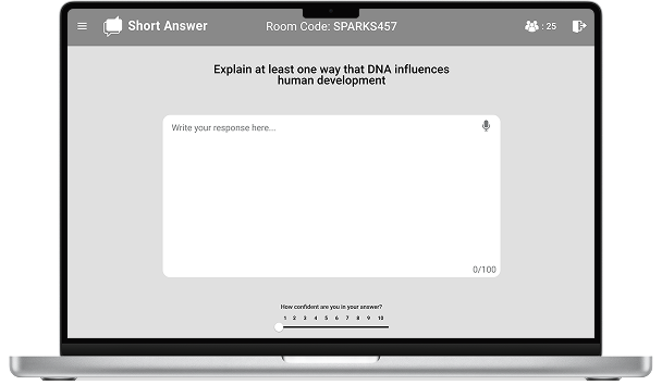
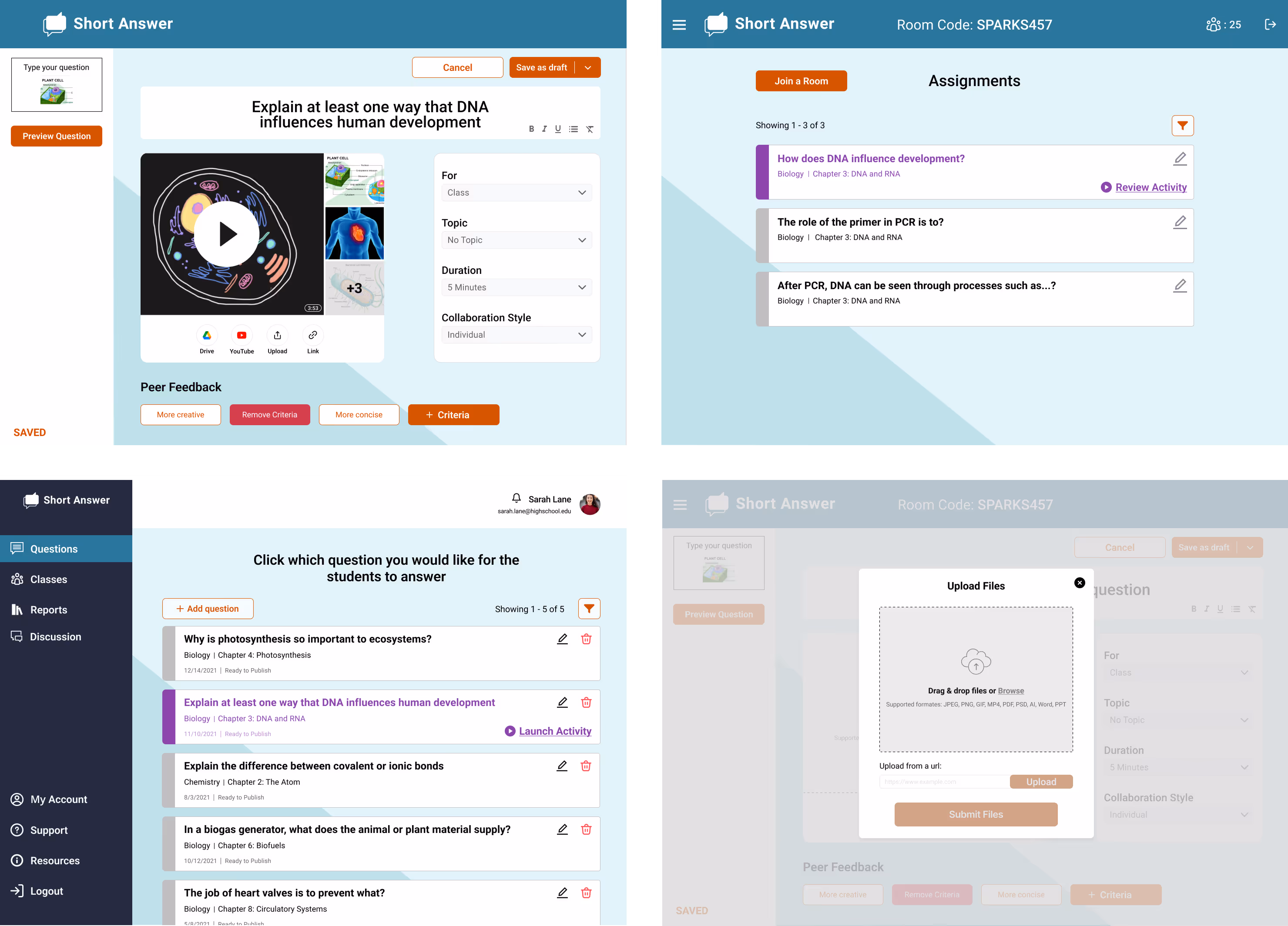
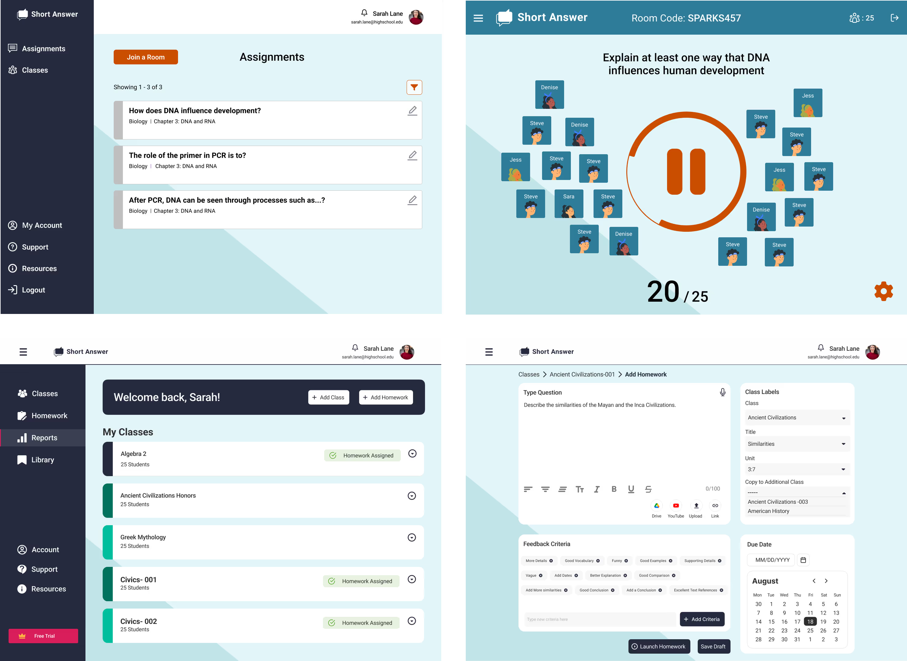
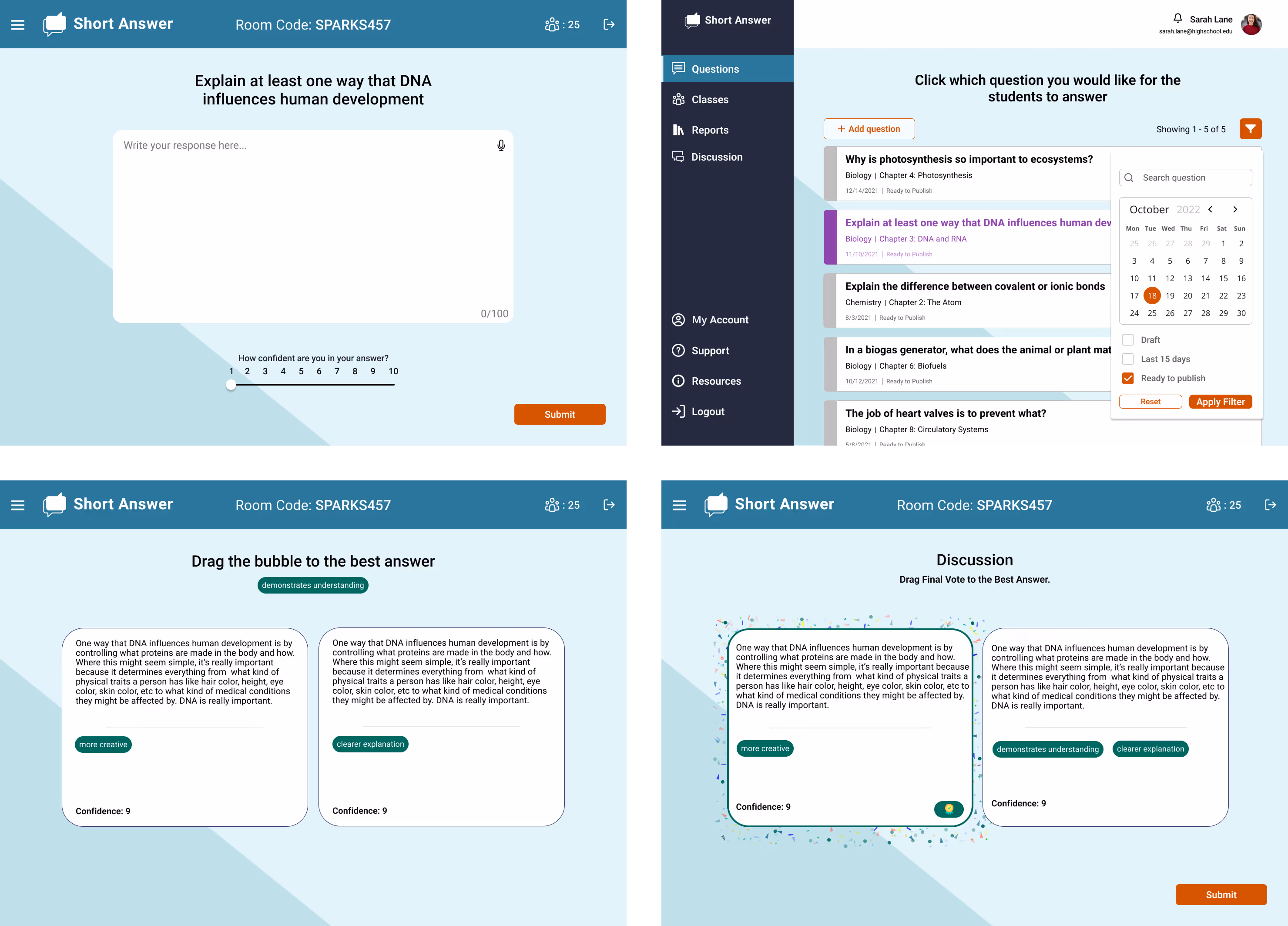
Short Answer is an educational technology web app for use in 6th-12th grade classrooms. The goal is to encourage students to think critically in the classroom by creating a collaborative, mutually supportive learning environment. By implementing real peer feedback in the classroom, Short Answer supports and strengthen students' excitement in the classroom
The project needed a team to create an app that emphasizes the company's vision and love for teaching
Through research-driven UX and thoughtful UI design, we helped transform Short Answer into an engaging, low-friction classroom tool that supports critical thinking, increases student participation, and empowers teachers to facilitate meaningful learning experiences
in peer feedback interactions per activity after redesigning the feedback flow for clarity and ease of use
in student confusion and misclick errors through clearer affordances and interaction cues
in teacher setup time following IA restructuring and simplified activity creation
in teacher support requests due to improved in-product guidance
in peer review participation by reducing cognitive load and friction in feedback tasks
in cross-subject classroom adoption enabled by adaptable UI patterns
in student participation from previously low-engagement learners
in repeat classroom usage driven by a more flexible teacher experience
in average session engagement time driven by distraction-free layouts


To begin our process, the team and I wrote 17 questions to the stakeholder in order to get vision as to what they desired, wanted, and needed for the website.
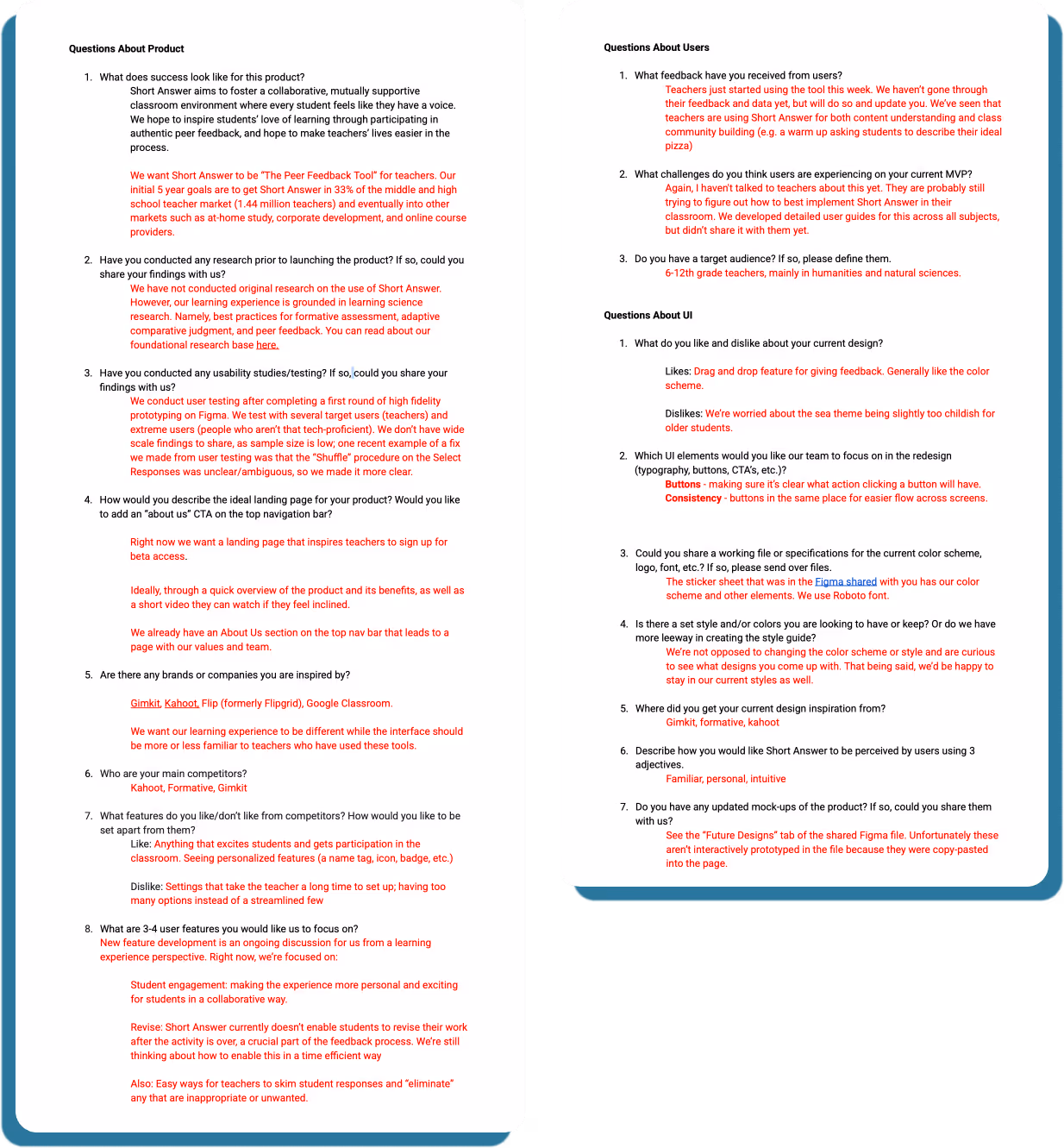
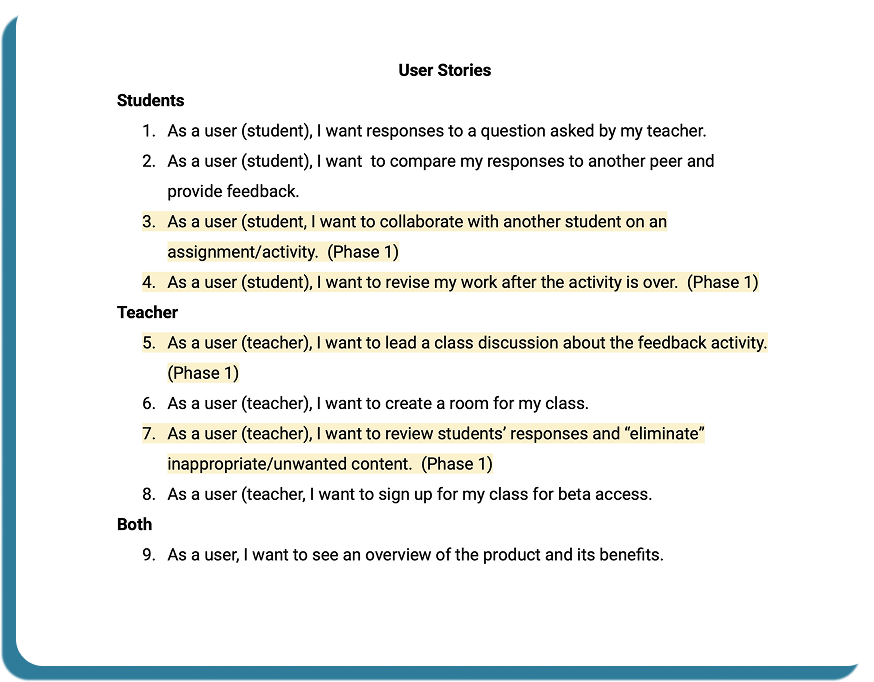
After discussing internally and with the client, we divided the user stories into 2 categories.
Creating these categories helped us understand what each user would need and want to have when navigating through the application.
Creating these categories helped us understand what each user would need and want to have when navigating through the application. We knew that the best way to navigate the design process was to split into teams and decide how teachers rely on students and vice versa. This proved to be a great area where we could experiment with our ideas
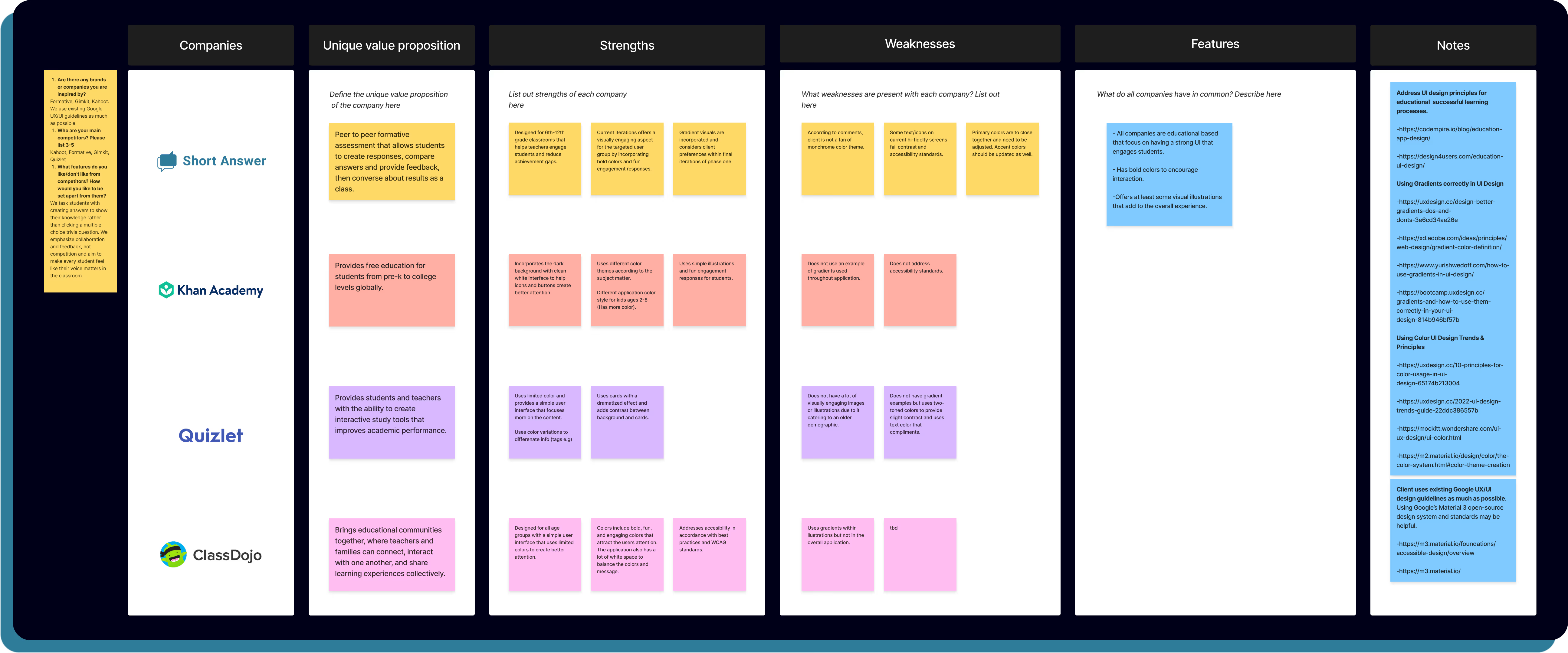
We conducted a competitive analysis comparing four classroom-based interactive learning tools to evaluate patterns in engagement, usability, and instructional flow. By analyzing features such as interaction models, feedback loops, visual hierarchy, and teacher-to-student control, I identified best practices and gaps that informed our design decisions.
By analyzing features such as interaction models, feedback loops, visual hierarchy, and teacher-to-student control, I identified best practices and gaps that informed our design decisions.
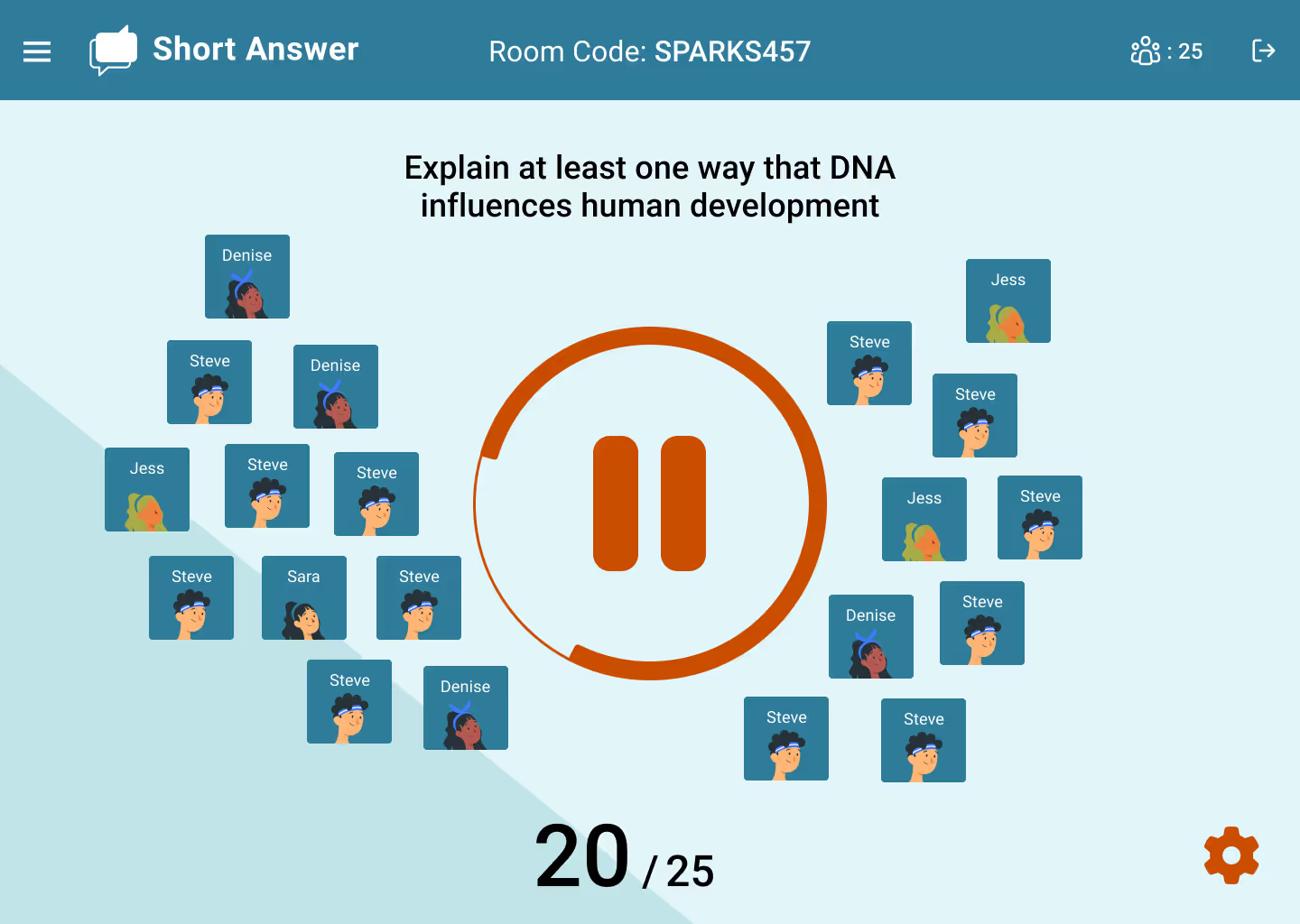
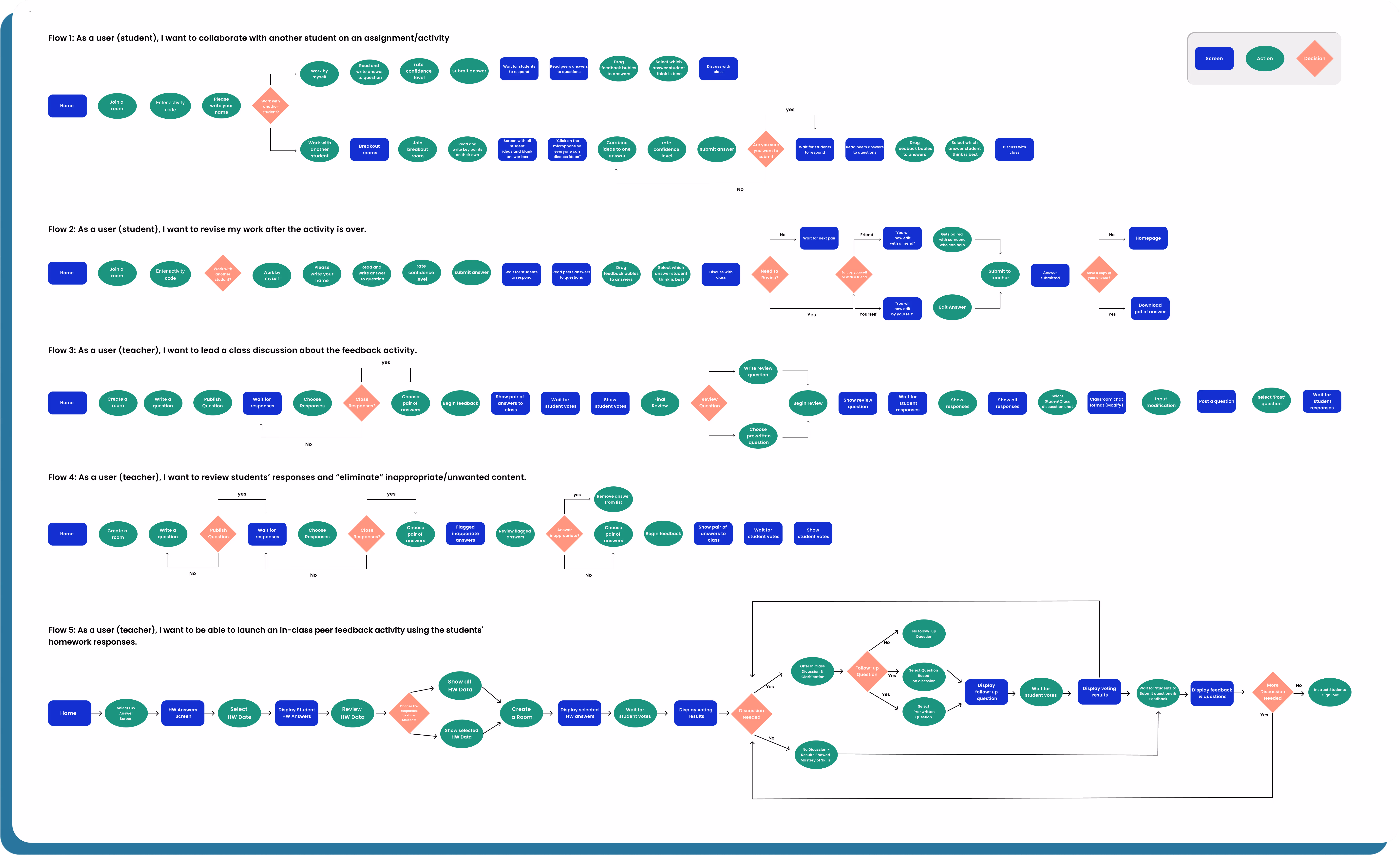
We created 5 user flows that showcase common routes a user can take while navigating the application.
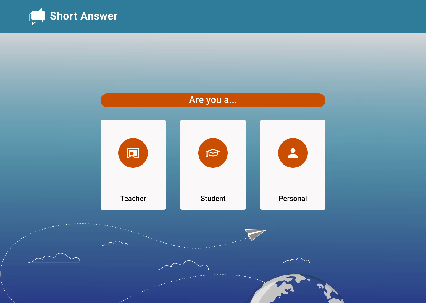
Two focused on how students could engage with the application and teacher. The other three were how teachers could create and lead discussions within the class room.
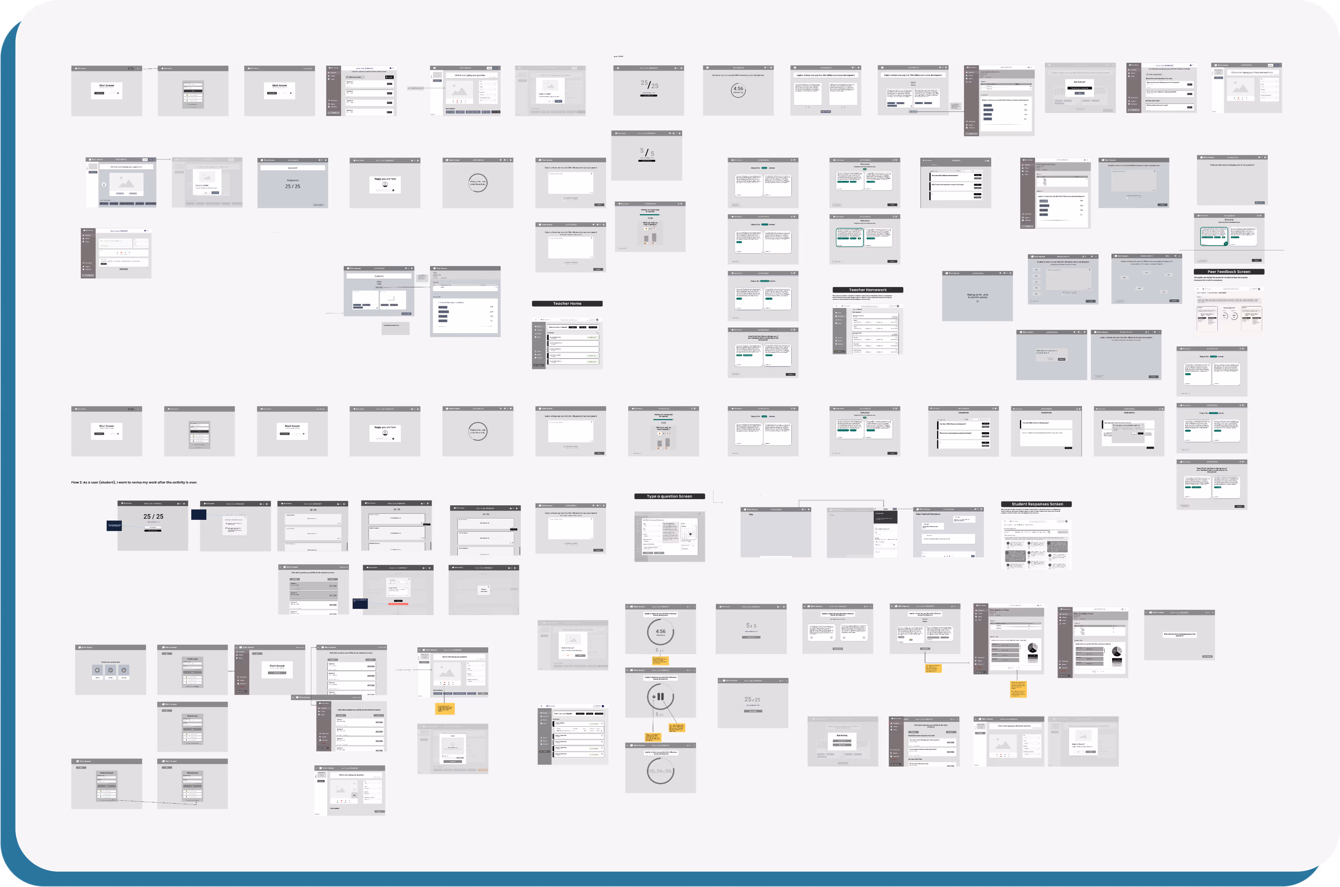
Our goal with Mid-Fidelity wireframes was to build a foundation in which the evolution of the design could expand in multiple directions that focused on student or teacher in mind.
As a team, we prioritize ease of use, accessibility, simplicity, and functionality throughout the process. We knew that some screens for teacher and student would overlap with some slight variance so we wanted to make sure everyone was on the same page, which always remained a top priority point throughout the process.
As a team, we prioritize ease of use, accessibility, simplicity, and functionality throughout the process. We knew that some screens for teacher and student would overlap with some slight variance so we wanted to make sure everyone was on the same page, which always remained a top priority point throughout the process.
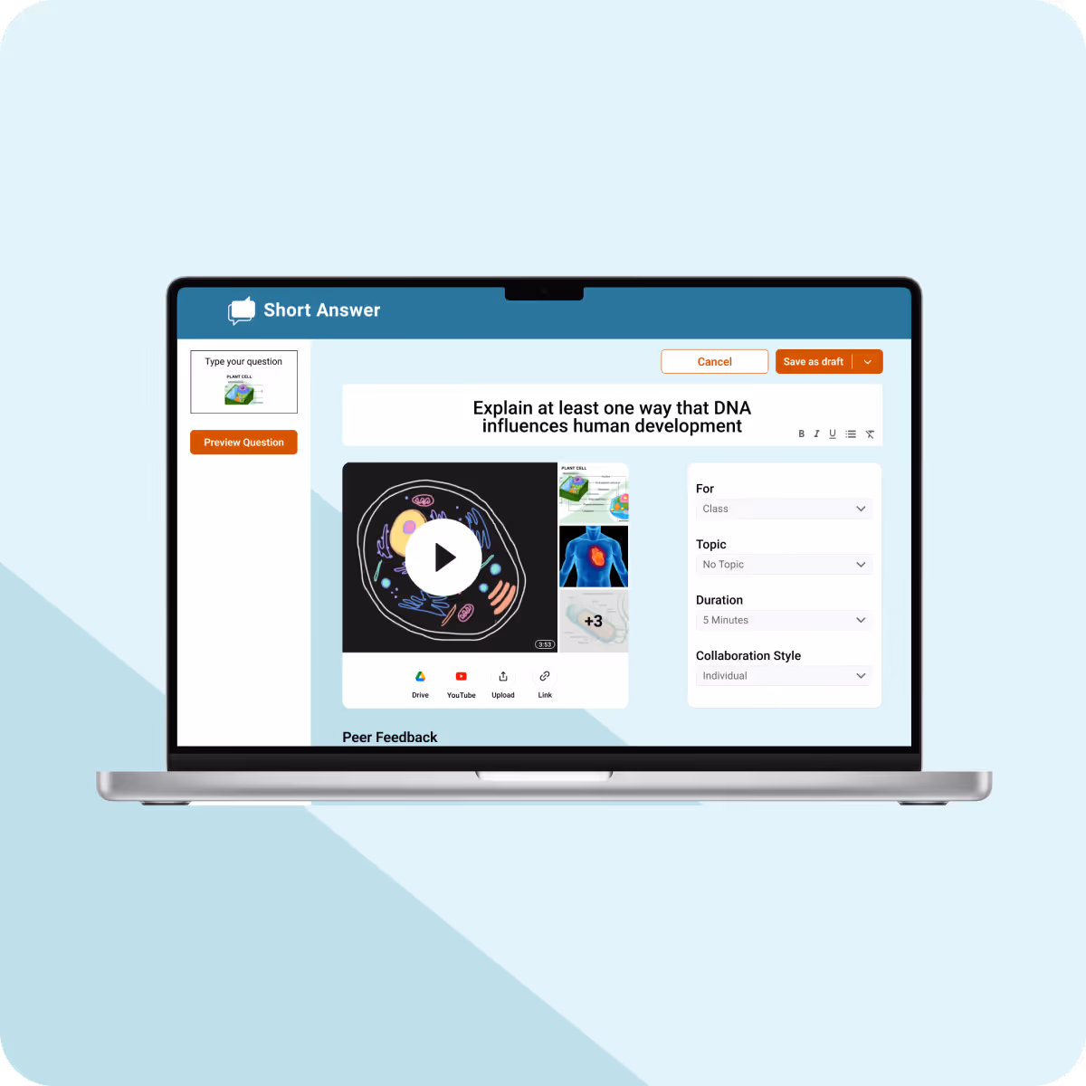
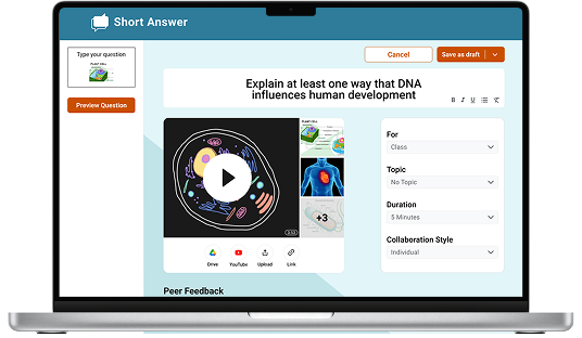
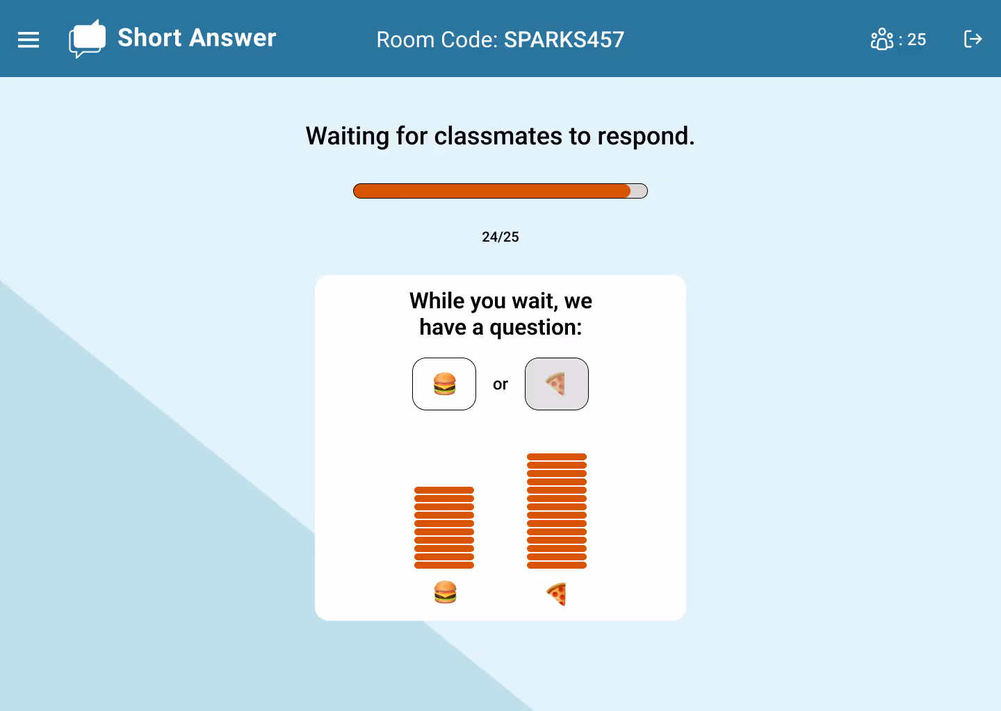
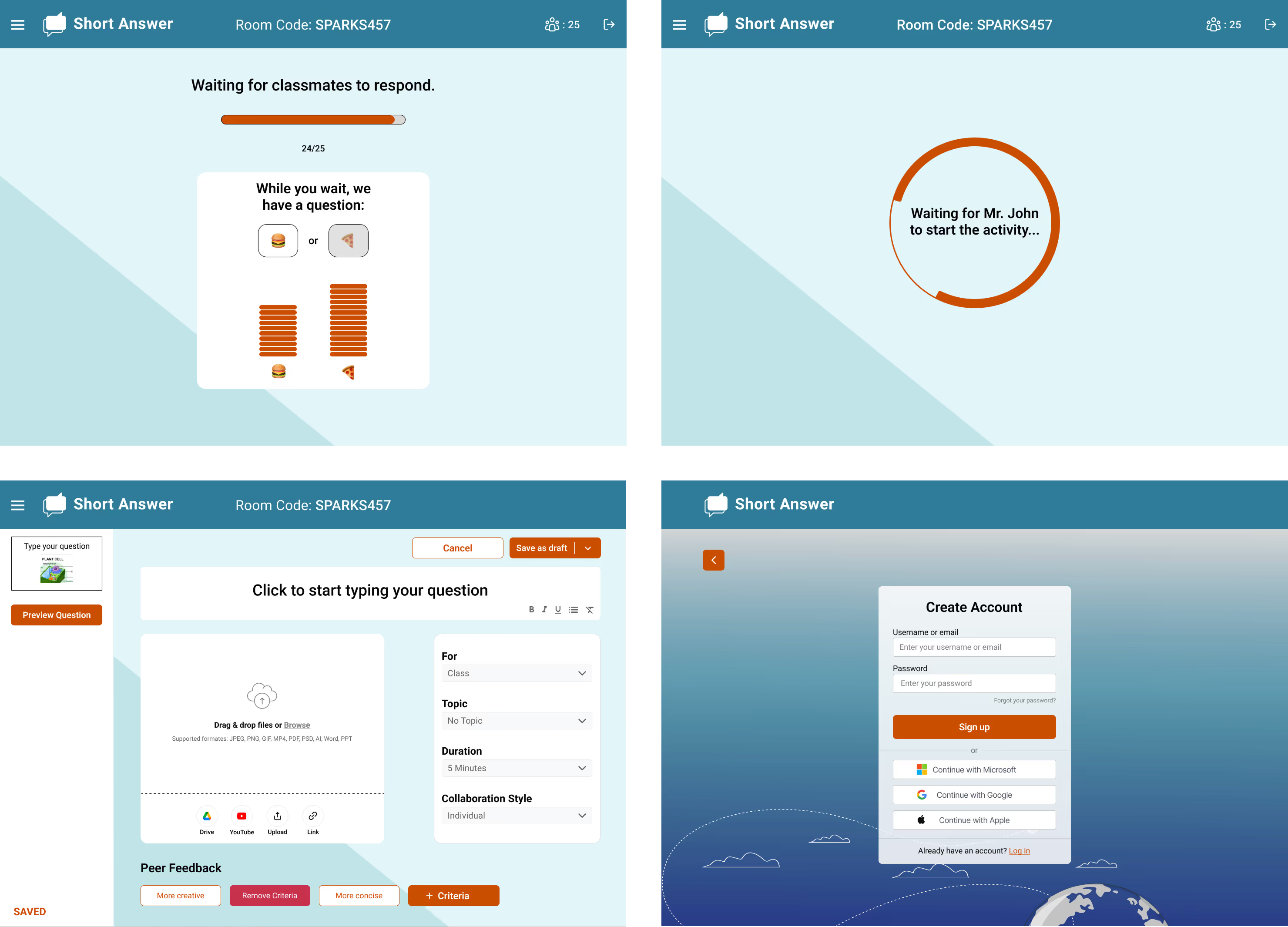
Additionally, I helped create all loading screens on the student flow and figure out what was the best way to present a set of questions to the class.
Our client gave us some direction by showing a previous mock up of the app but ultimately gave us full creative control to experiment with the Short Answer concept
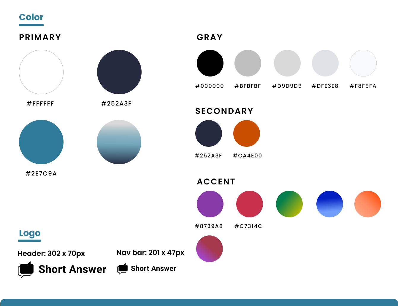
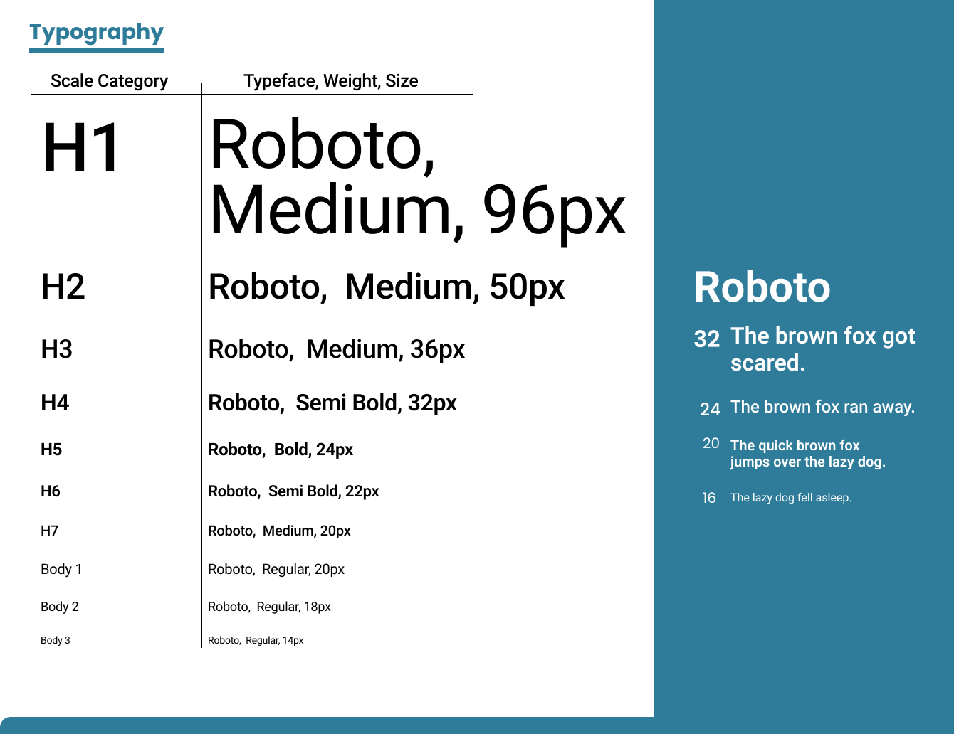
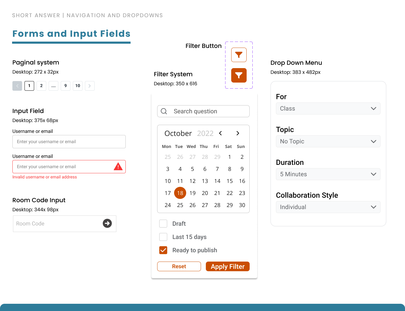
Our team scheduled a meeting with our client to discuss our progress with the web application and gave us feedback that we critically utilized to help us create and finalize our style guide.
The guide contains desired color palettes, typography, iconography, grid size, input fields, components, and images and graphics.
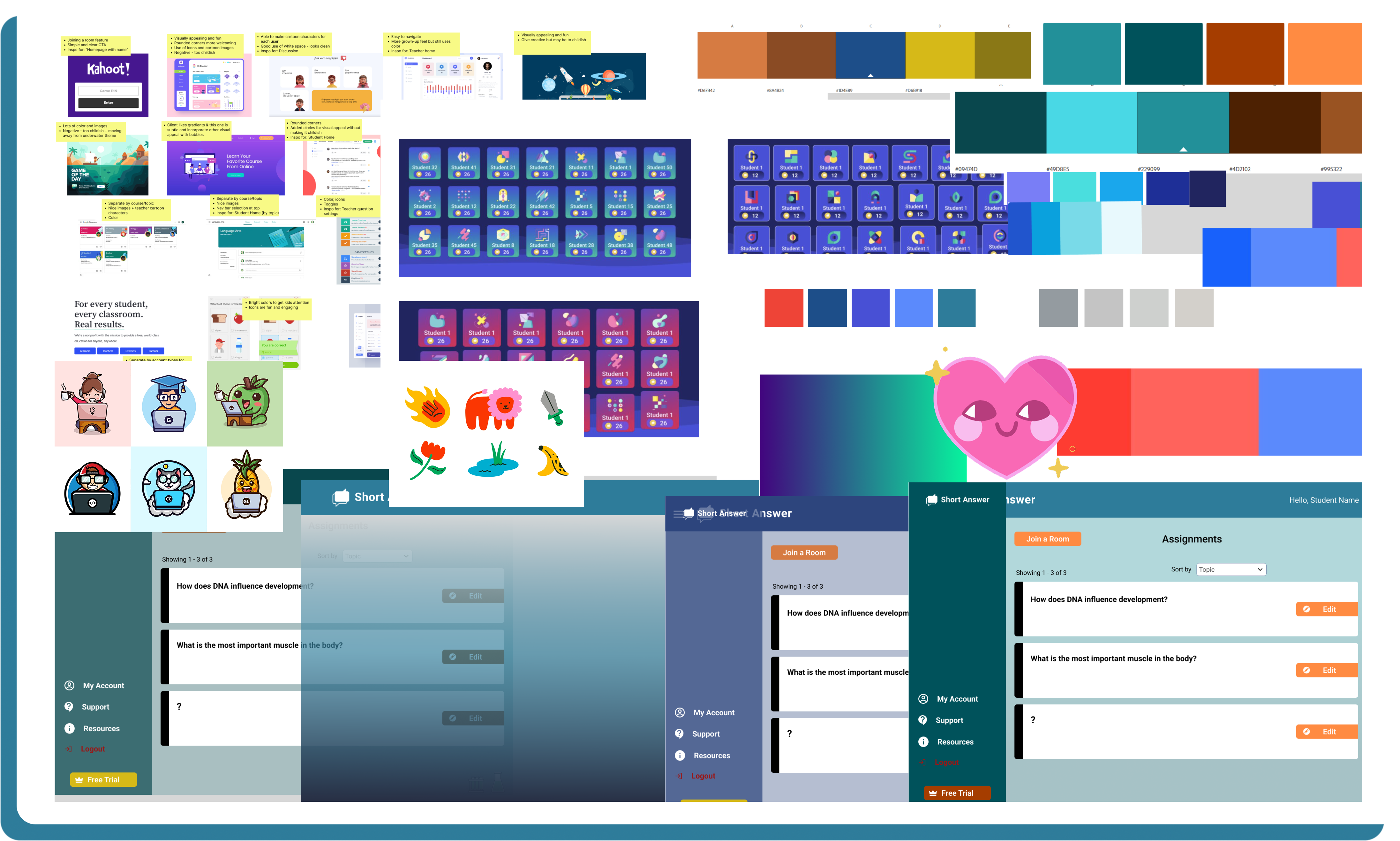

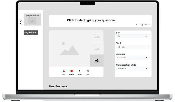
We created UI iterations to be approved by the client after finishing our style guide and wireframes.
We divided up into two-person teams and worked on our own iterations. We provided the customer with a range of options while maintaining the color scheme. We wanted the client to explore the options so they could fine tune what Short Answer is and what it wants to become
After discussions with client and the team, we were passionately designing to make our dreams into a reality I assisted in building out a component library, adding student icons, typography, visual data organizing, and the main elements that are used across the design pages.
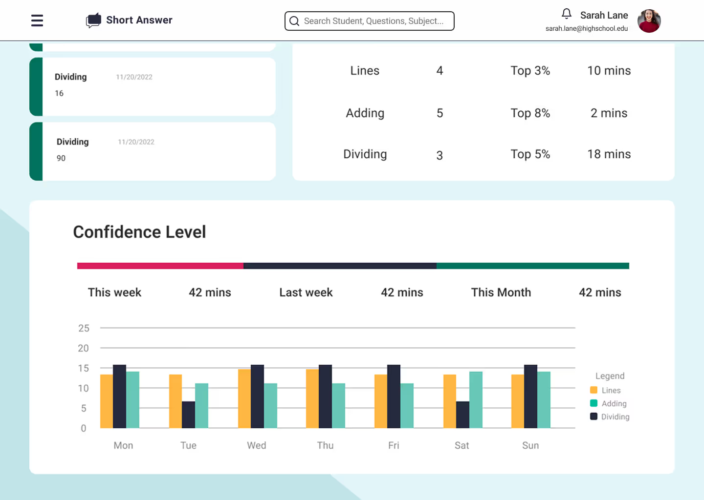
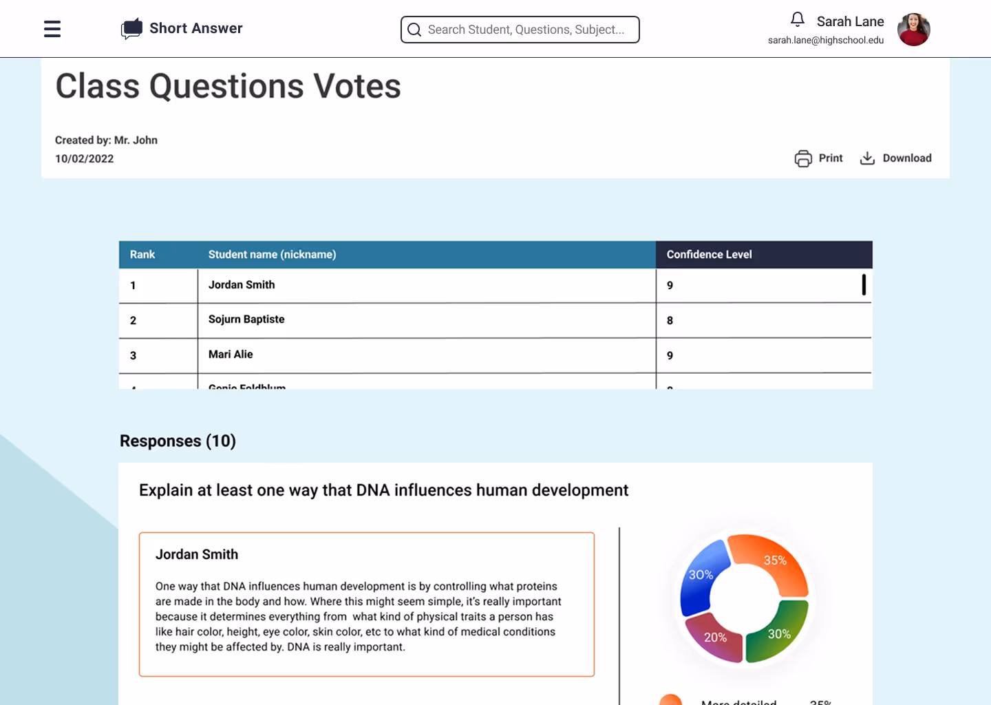
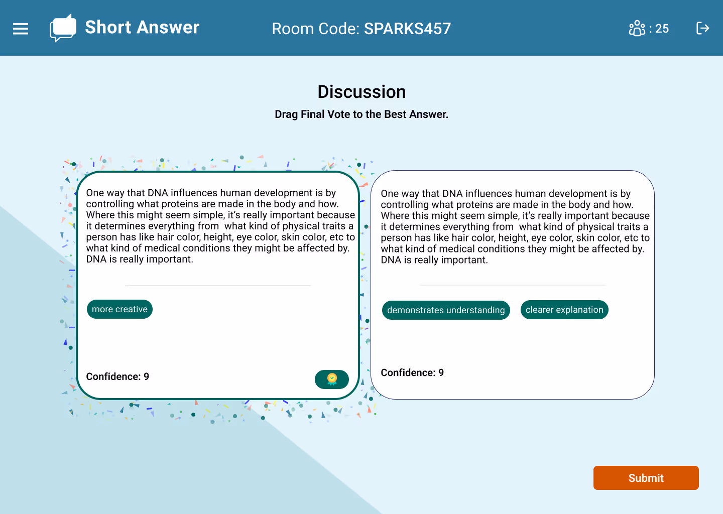
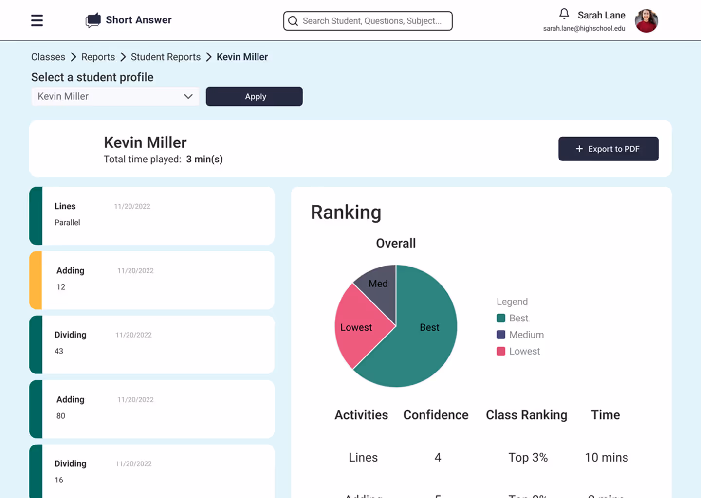
The team worked as a cohesive unit and worked with open arms throughout the process. I put specific focus and emphasis on how the teacher can engage with their class and gather data from how their class interprets questions. I also provided illustrations and visual elements that were used across all the pages.
Following client approval of the high-fidelity designs, we delivered a structured developer handoff that ensured design intent carried through to implementation. The handoff consolidated final screens, established navigation logic, and provided clear guidance on how each UI component should be constructed.
Built for both client review and developer execution, the file included annotated screen details, precise measurements to maintain visual consistency, and a complete sitemap showcasing all screens created during the project lifecycle
Working on this project was a monumental experience where I got to learn and grow as a designer. Pushing the ball up a hill can be daunting at times, but I am so fortunate that I got to progress with my team as I knew I can count on them as they knew they could count of me. The project highlighted the value of communication given each person’s schedule and demonstrated how to establish an advantageous workflow that is constructed by honesty and teamwork.
I felt that I demonstrated great leadership qualities as I helped facilitate work priorities and brought a sense of camaraderie through pushing and supporting my team to achieve work that they would take pride in. Every day was a new day to analyze critically about our progress and how we could achieve the client’s dream through implanting their feedback and discussion with the team. From a design perspective, I felt my background in graphic design helped tremendously navigate design decisions that greatly improved the overall quality of the product by giving more detailed notes as to why and when an asset on a page works for the overall goal of the product.
I have no doubt that the work I put into this project has evolved my ability to clearly communicate my ideas with not just my team, but also clients that put their trust in me. Its absolutely amazing to know that I helped create a resource that allows people from places far and wide to be more sustainable and more conscious of the world that we all live in. I am truly blessed by this opportunity and by delivering a project that elevated my work as a UX designer. I hope I can continue this path of education further and glad I got to be a part of this journey.