Discovery
•
Ideation
•
Design
•
Prototype
•
Reflection
•
myT is a mobile CRM app designed to help field sales professionals efficiently manage and track leads.
Through intuitive features for recording interactions and monitoring leads, myT empowers sales teams to enhance customer engagement, optimize follow-ups, and boost overall sales productivity.
Both the initial launch and further iterations produced great results as turn-over rates lowered, sales increased, and rep satisfication increased
in office turn-over rate nationally
in Lead Management efficiency
in closing performance using Cydni Chatbot
in time-to-log a lead
in follow-up task completion
lead-to-close conversion rate
in daily active users with over 2000 currently using myT
in support tickets
in revenue per rep
From a business perspective that other tools wouldn't work with our missions as we felt that we needed more control of how reps can track their leads given their campaign.
What we needed to understand is how other tools organized complex tasks and build upon these ideas
Therefore, we did a competitive analysis on other CRM lead tracking tools so we could see how we could envision our wants and needs can be shown through an intricate yet clean design process.
By comparing usability, interface design, navigation flows, user pain points, and user engagement metrics, we can pinpoint gaps in these tools and create insights to optimize myT.

After completing competitive analysis, I decided to talk to the development team and field reps to discuss wants for myT. I separated my insights into 6 categories:
Each category highlights development goals as we experimented with developing specific features
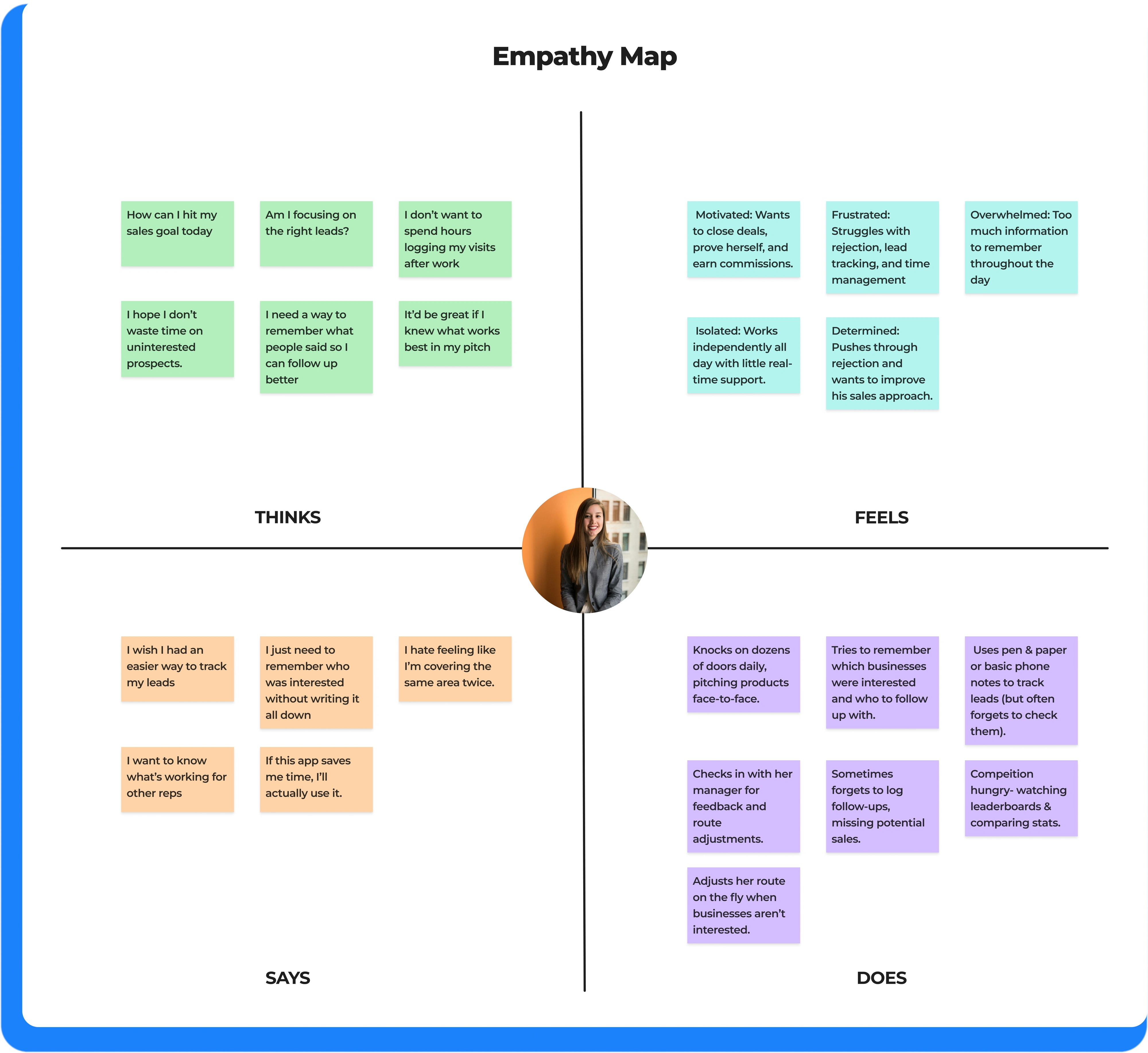
Through empathy mapping with our primary persona, Rachel, we revealed that reps struggle with lead tracking, time management, and remembering conversations, which frequently made them default to pen and paper.
These insights informed key design priorities, including one-tap updates, voice notes, AI-driven reminders, automated follow-ups, and smarter route planning. We also explored gamification to support motivation and engagement. These findings helped us shape myT into a more intuitive and reliable tool for reps in the field.
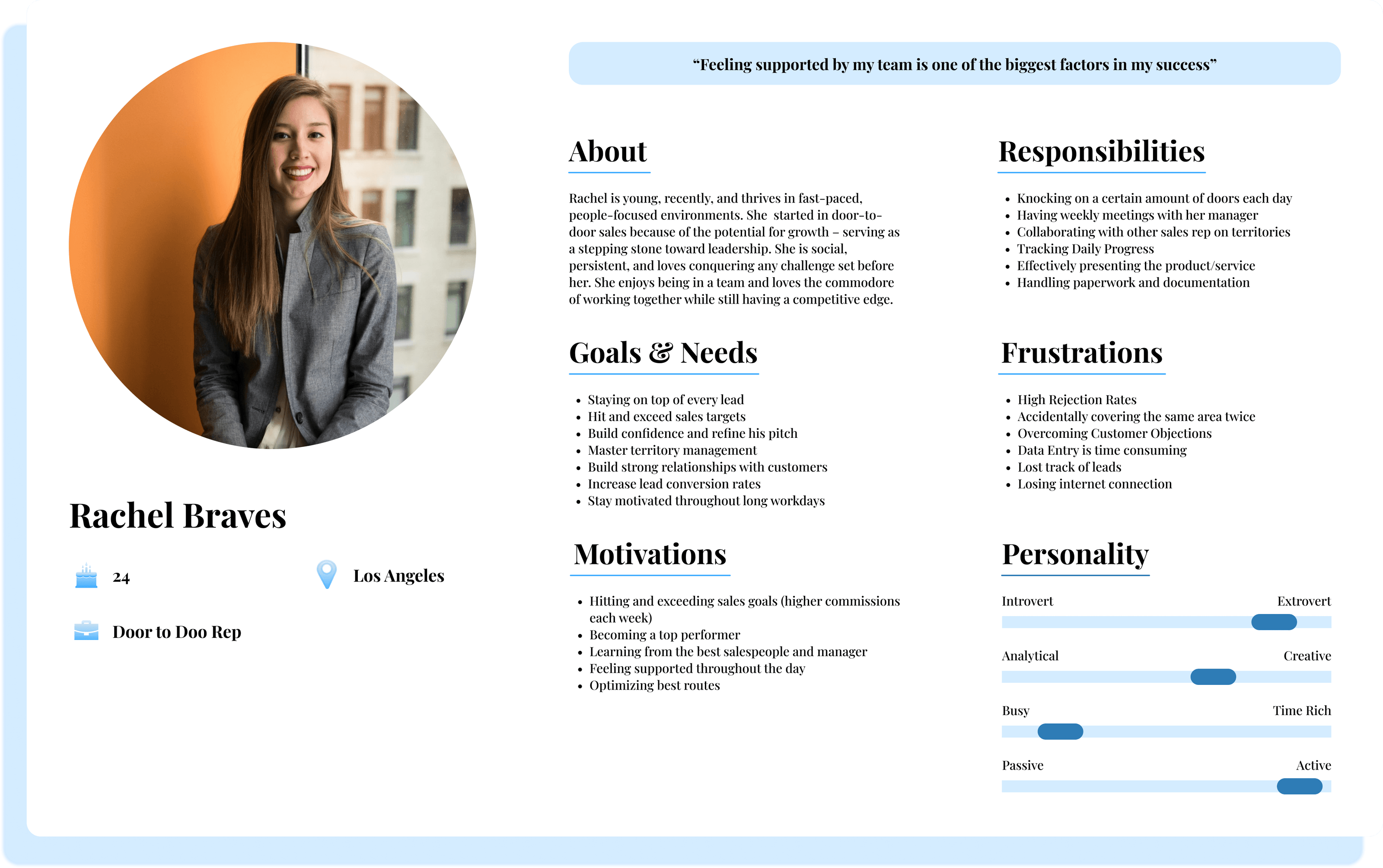
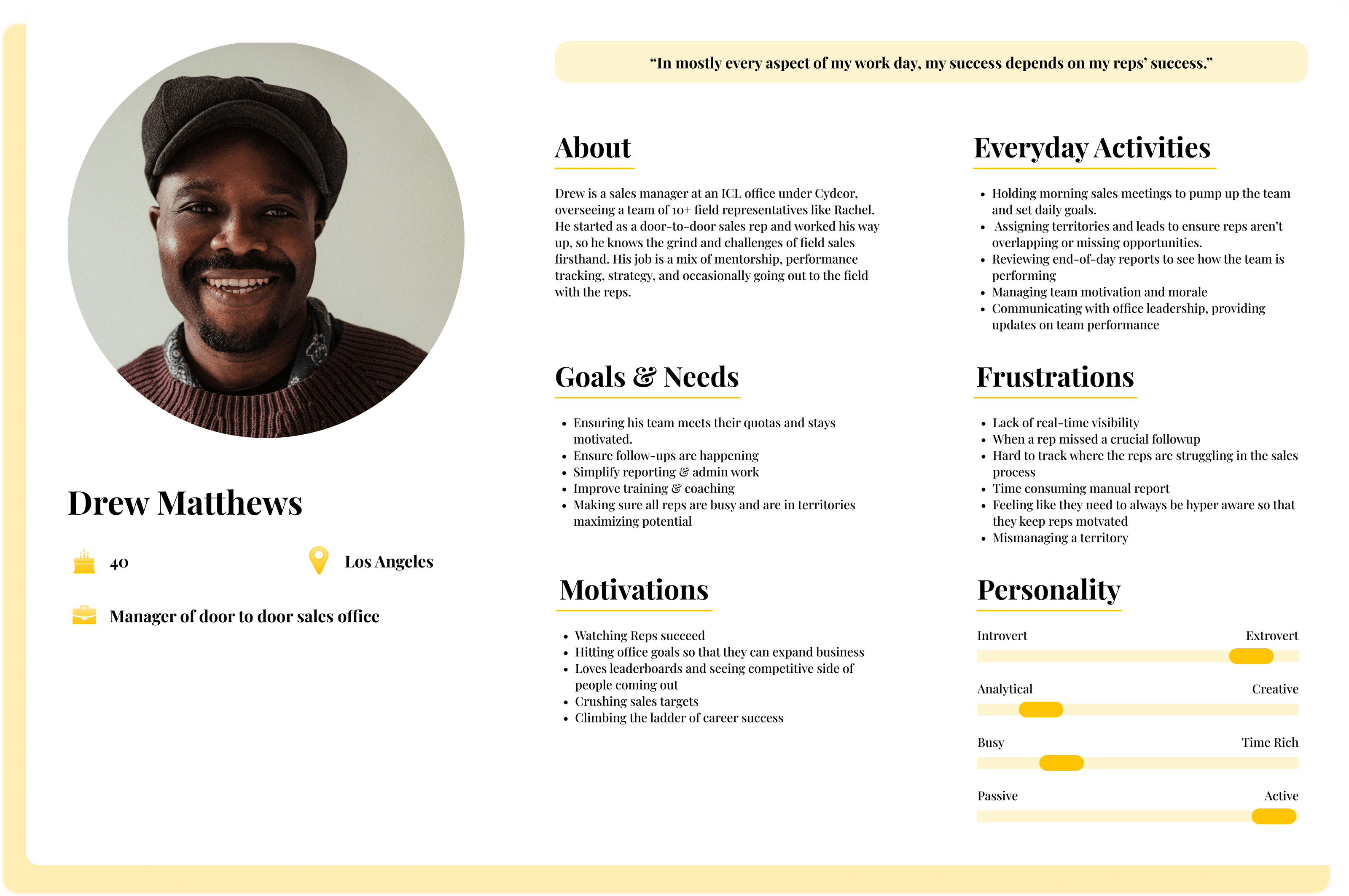
To ensure myT meets the real needs of field sales reps, we developed user personas based on interviews, competitor analysis, and rep feedback.
These personas outlined job roles, experience levels, pain points, and goals that guided our design to address challenges like lead tracking & route optimization.
Throughout ideation, wireframing, and testing, we consistently referenced these personas to keep the app intuitive, reliable, and efficient, making myT a seamless tool for sales professionals.
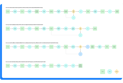
I believed that we needed ways to ground ourselves during this ideation phase. I felt we had to have flows that seemed fundamental to the many avenues of what we thought myT could become.
Thus, we created user flows based on key pain points shared by field reps, with the goal of turning those daily struggles into streamlined, intuitive experiences out in the field
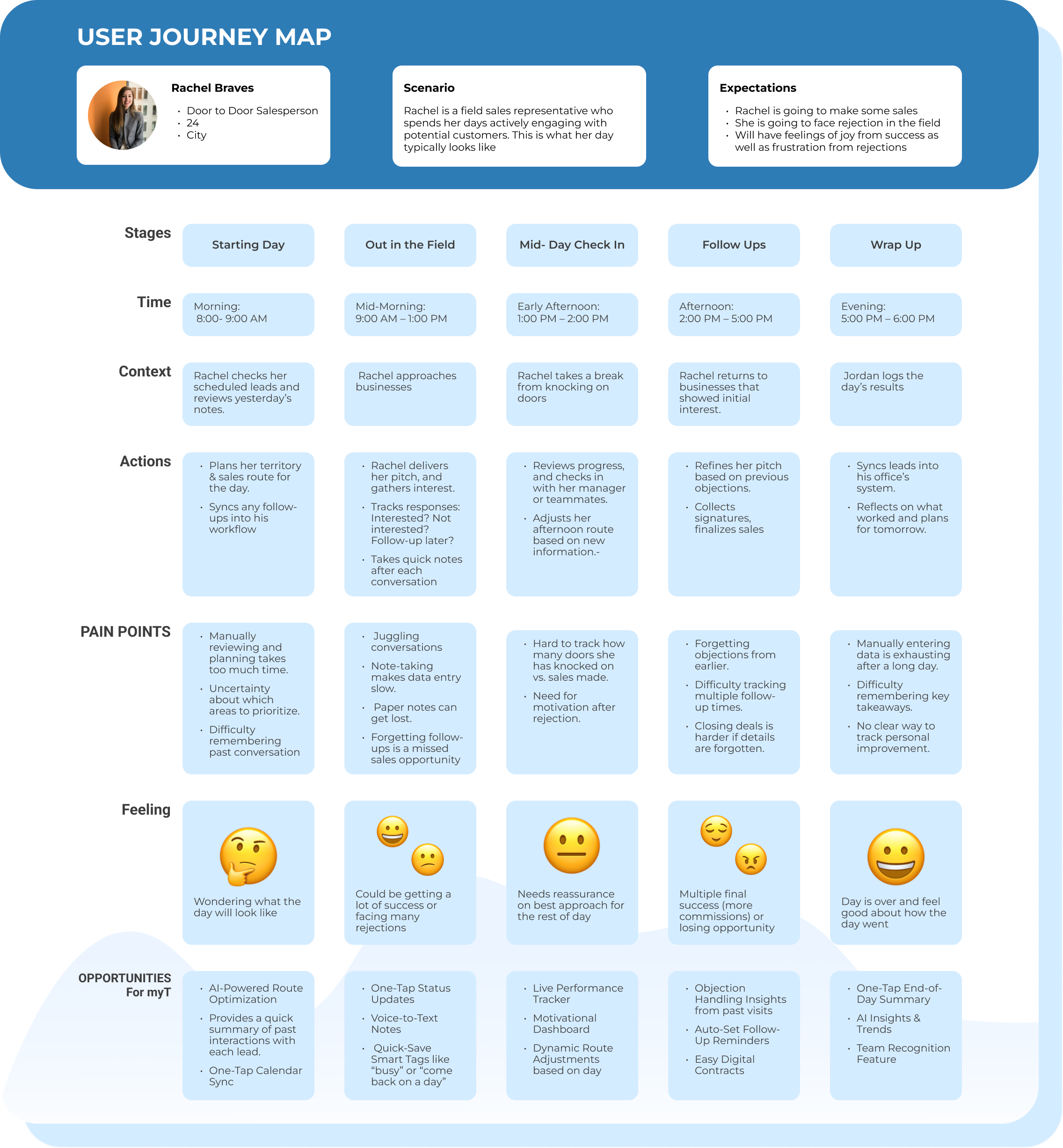
We wanted to develop a map that tracks the behaviors, thoughts, and emotions that a user would go through when exploring myT
Our objective was to proactively uncover any potential user pain points before fully committing to ensure we can create a clear foundation for identifying opportunities for improvement.
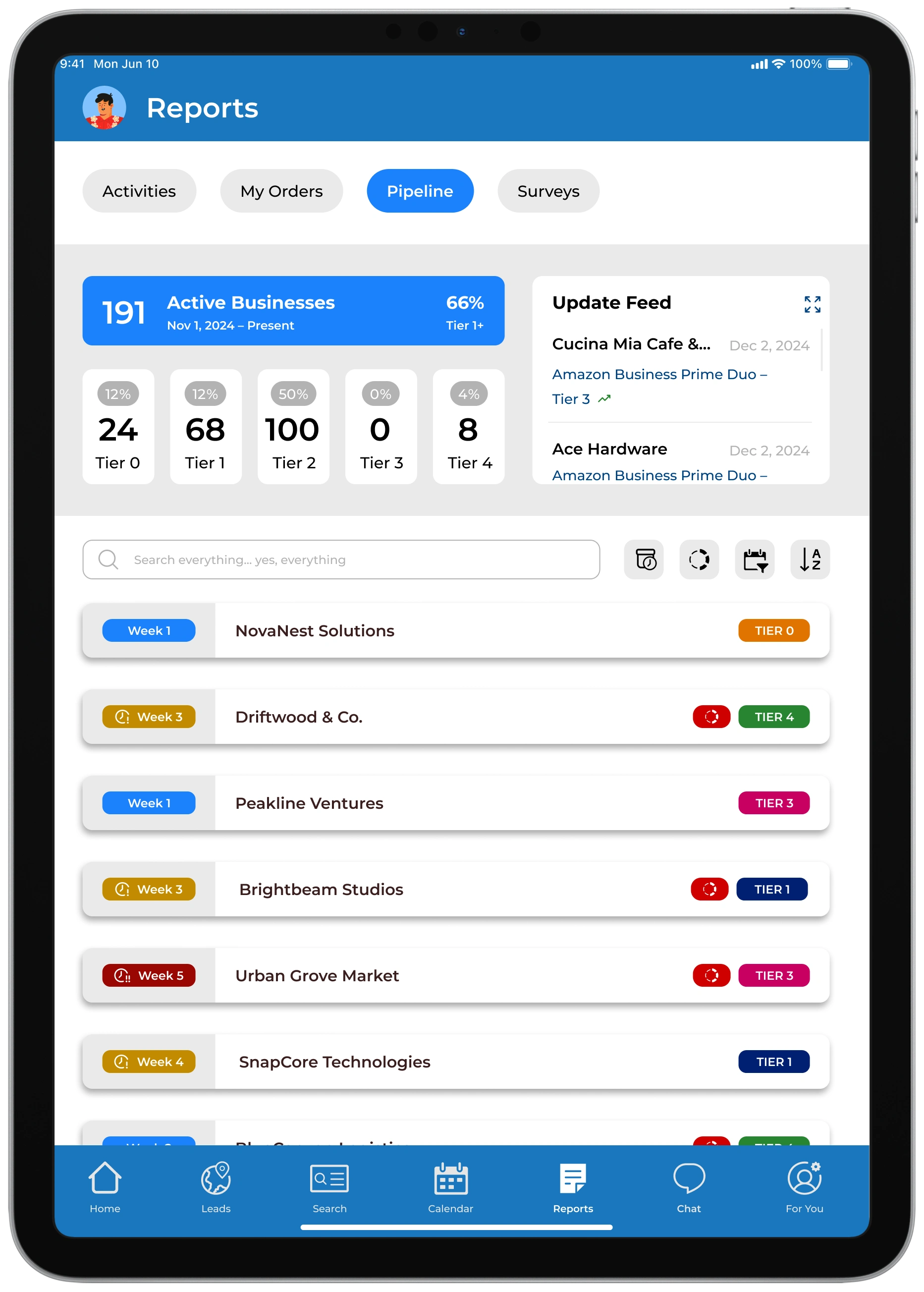
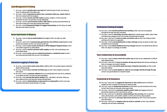
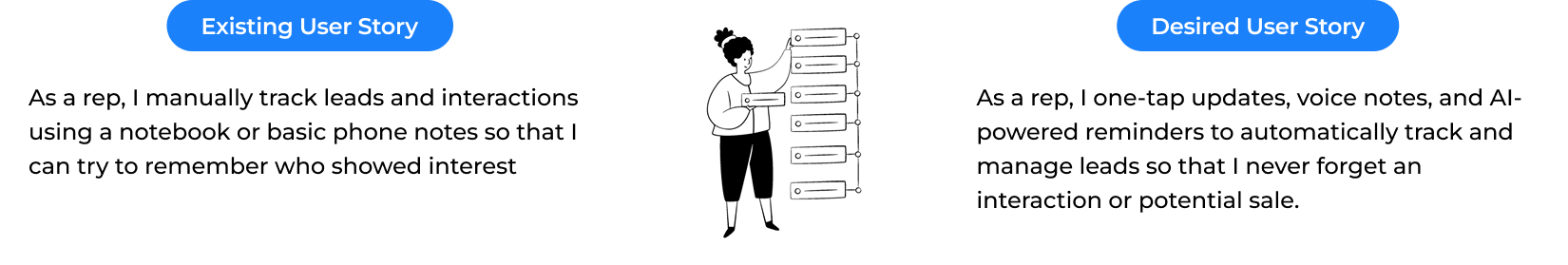
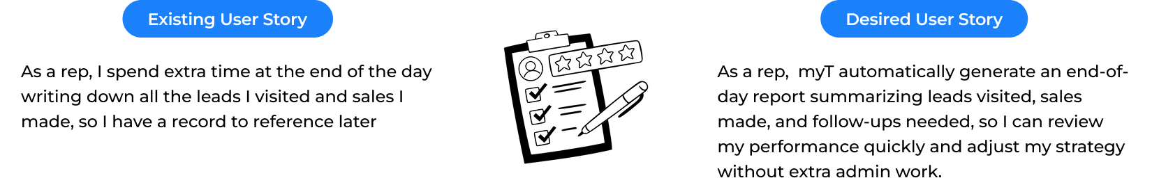
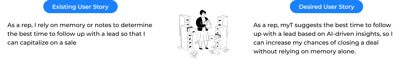
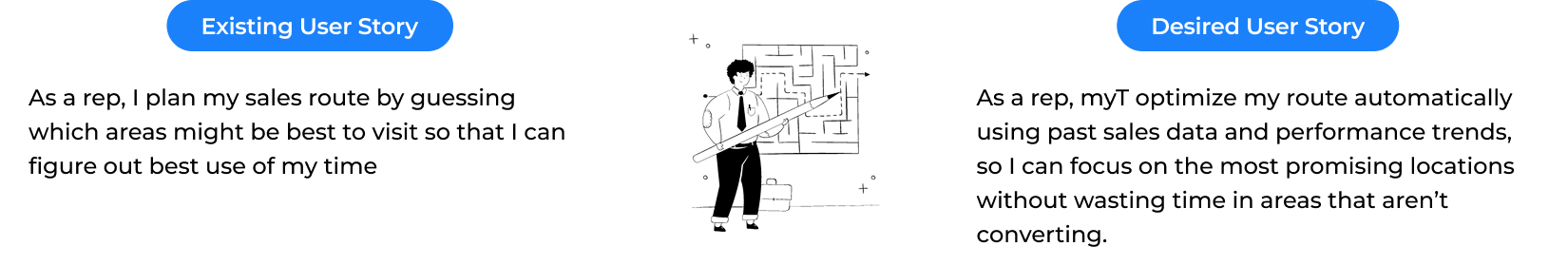
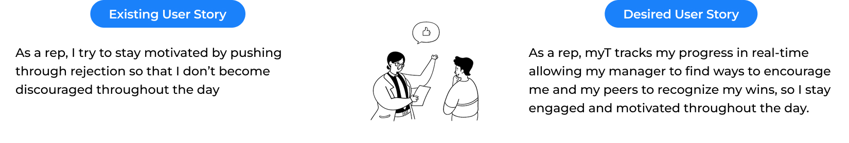
Based on our conversations with field reps and internally, we translated current frustrations with lead tracking into more focused and outcome-driven user stories that reflect how reps want to track leads
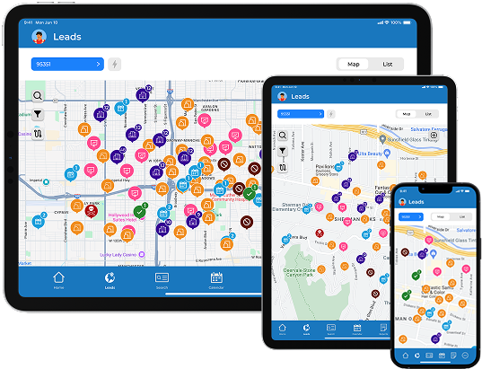
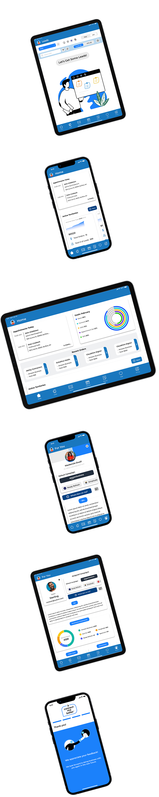
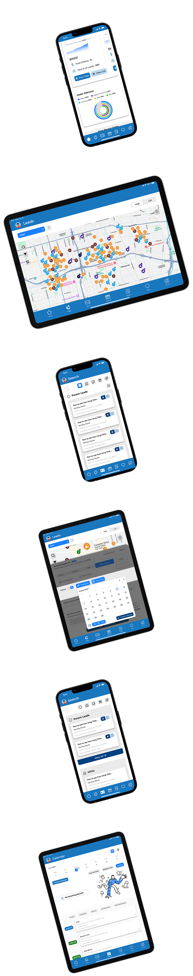
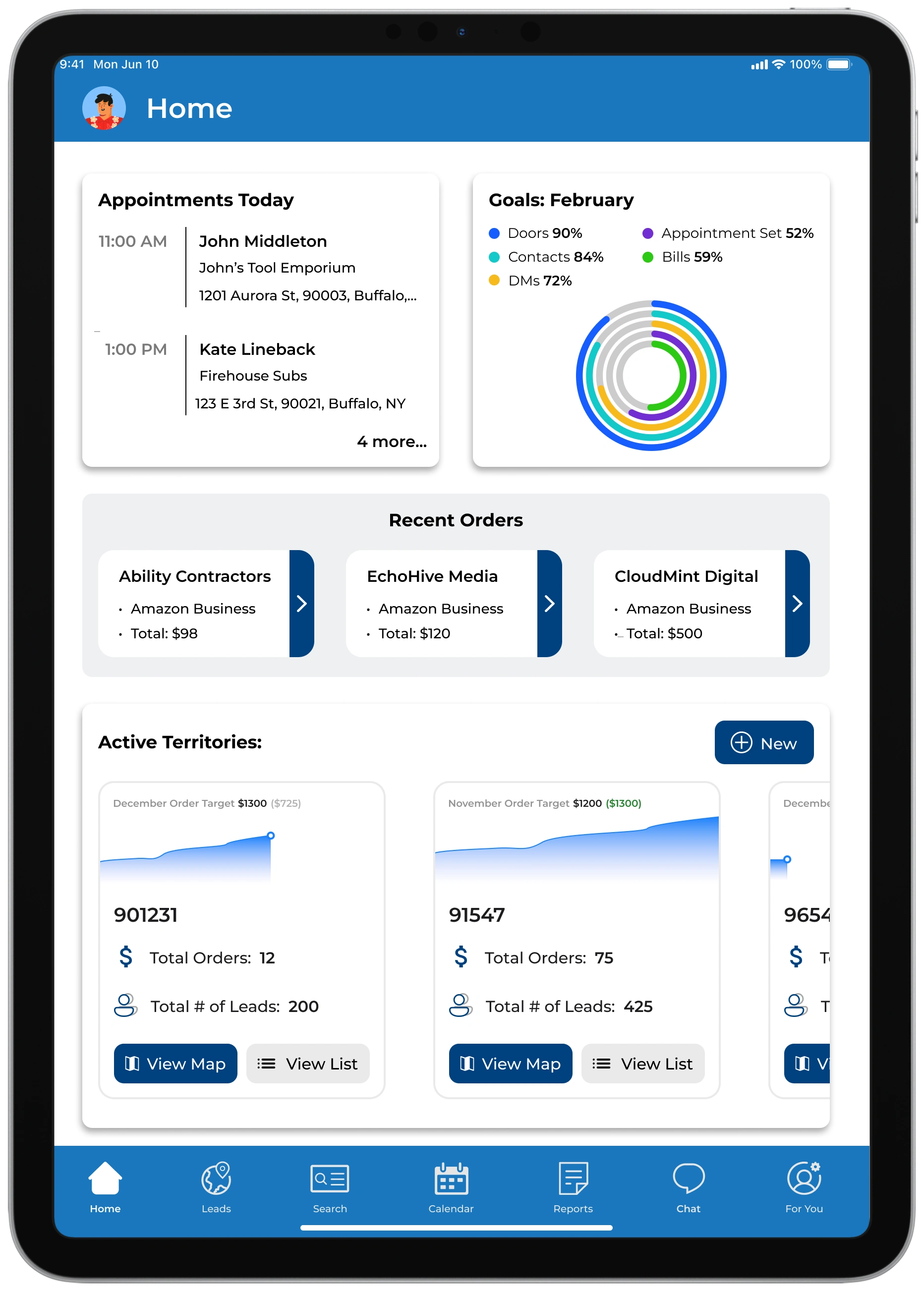
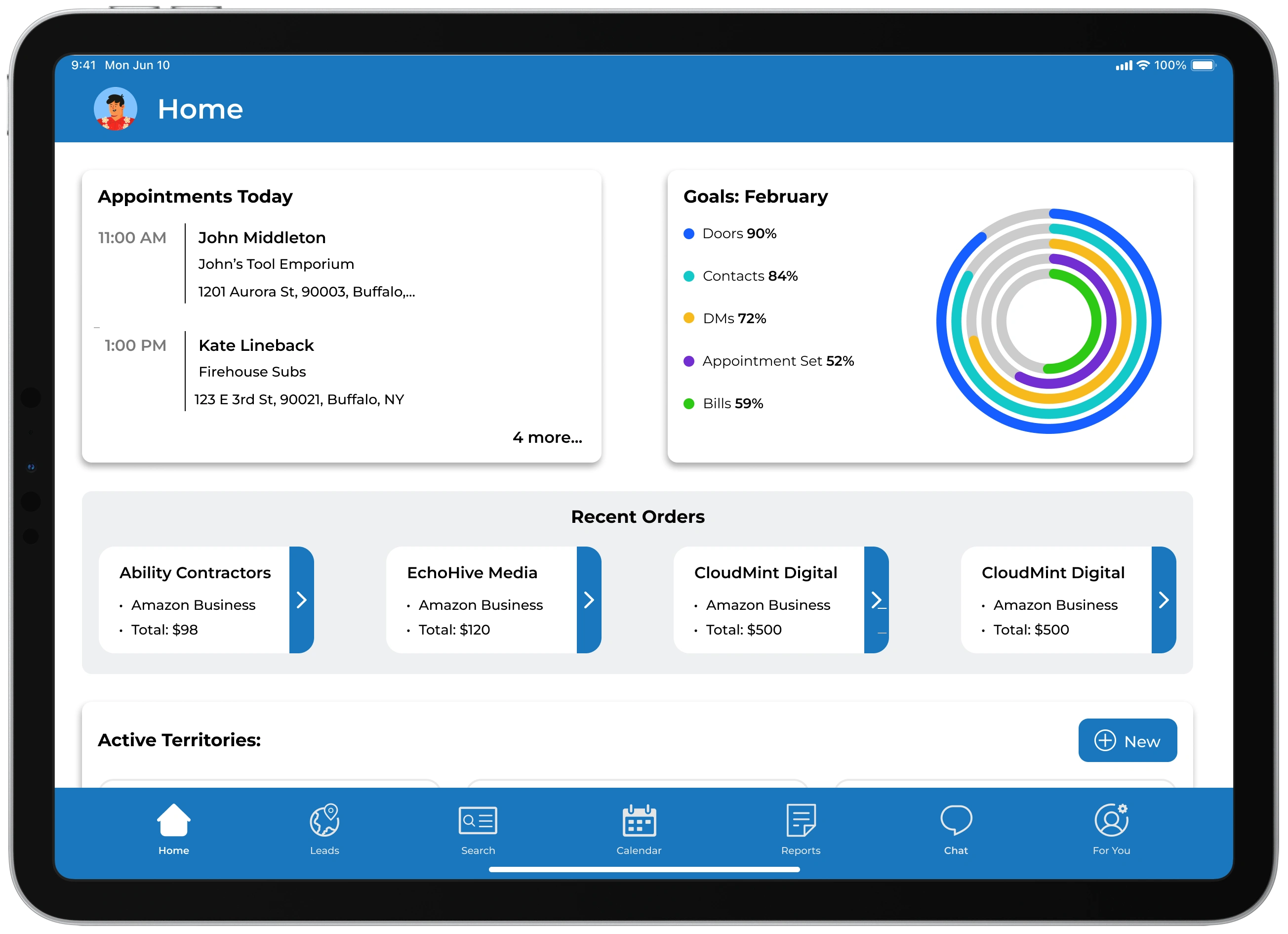
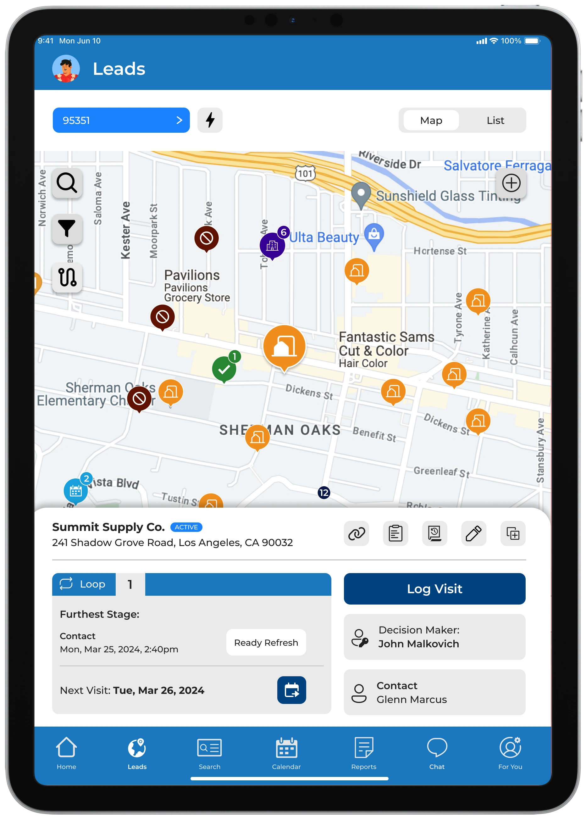
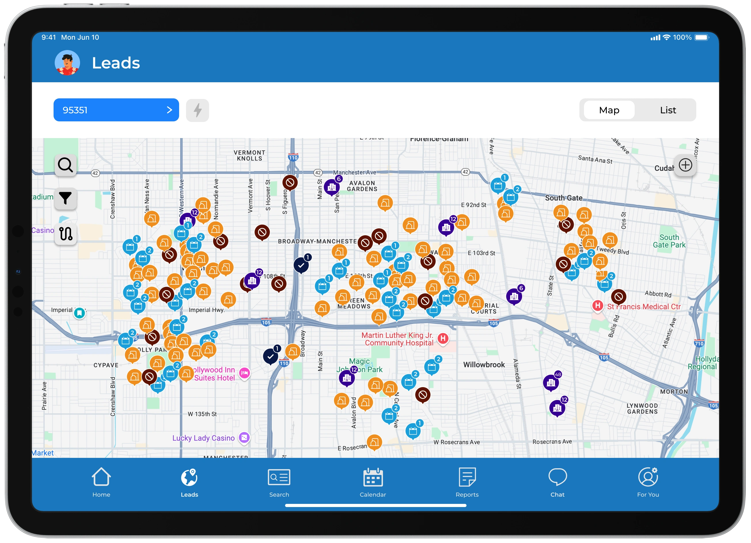
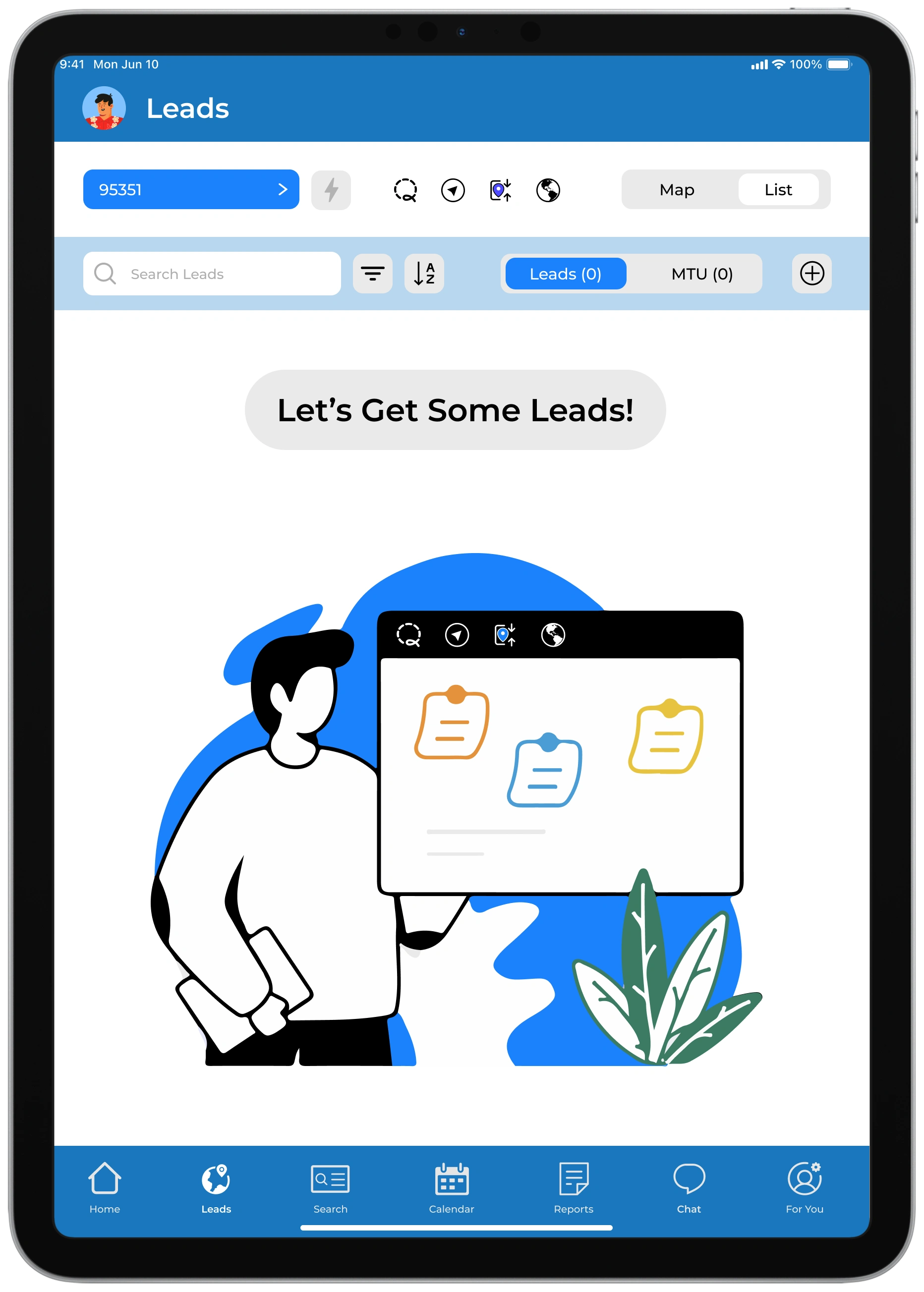
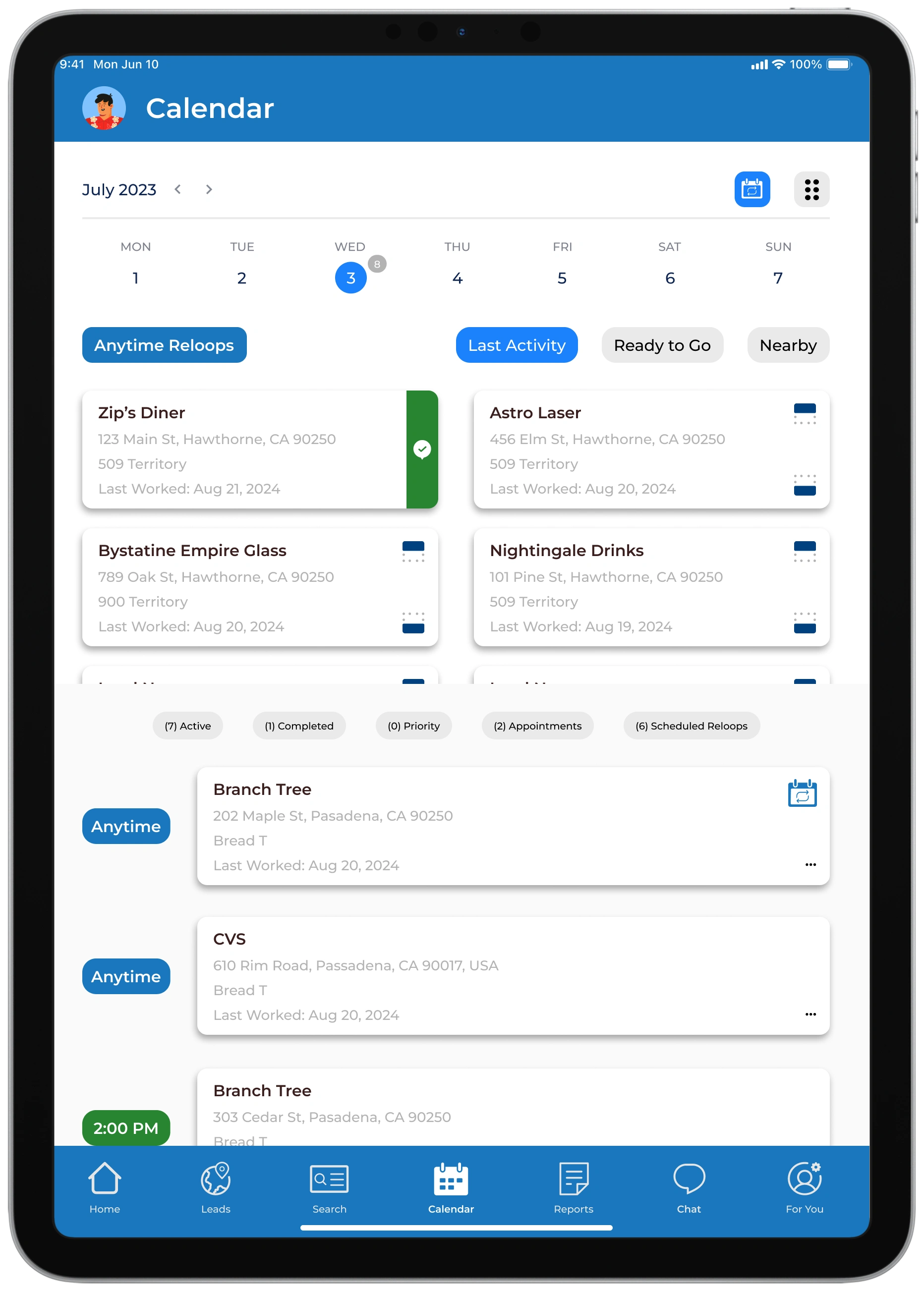
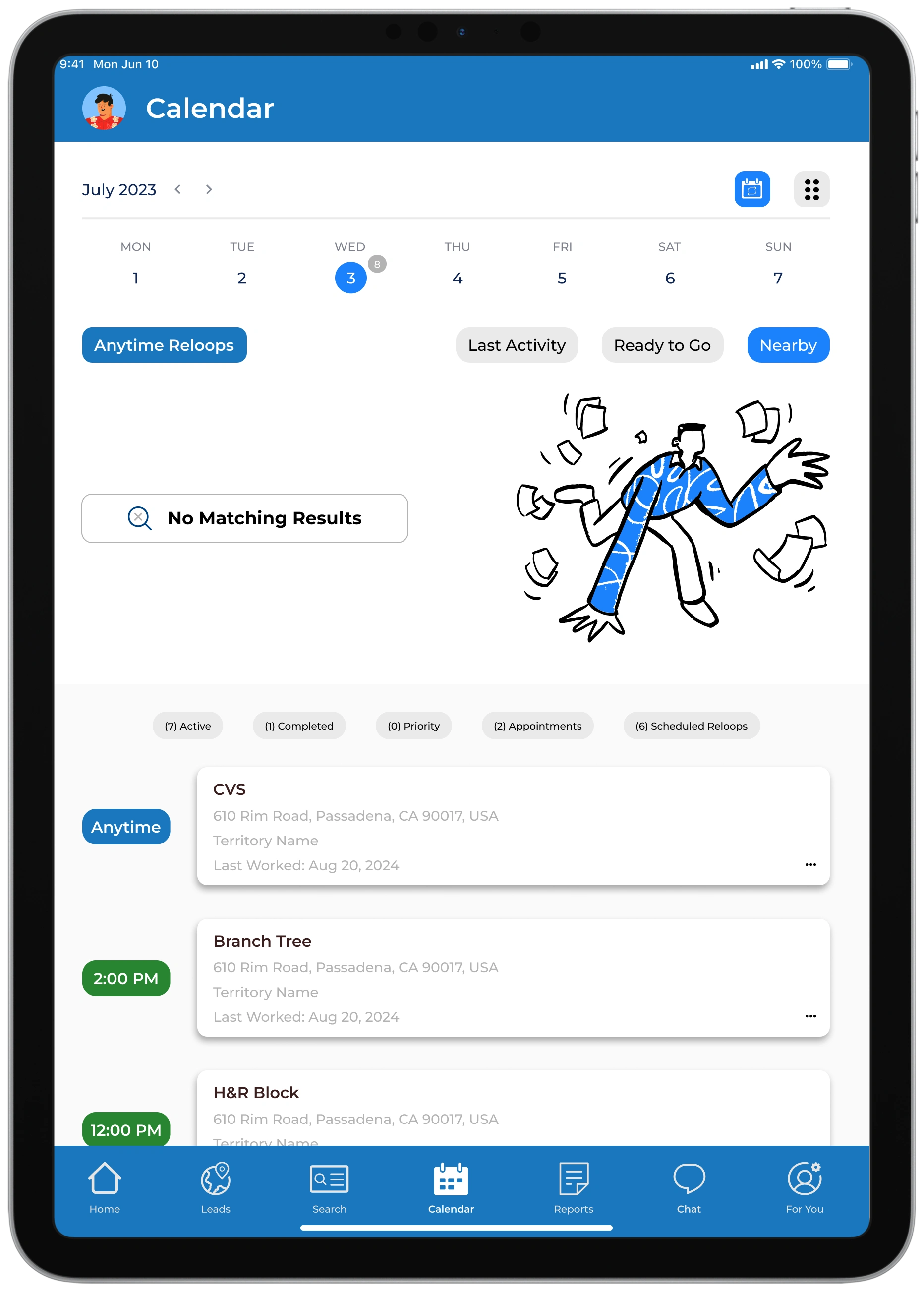
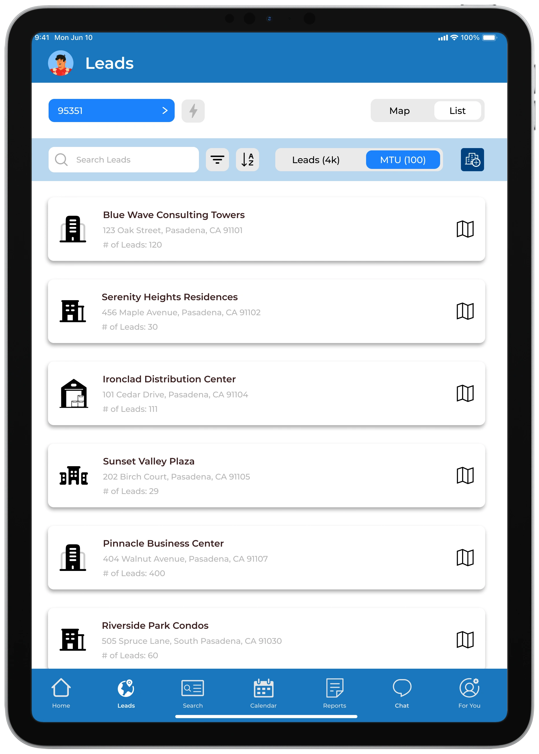
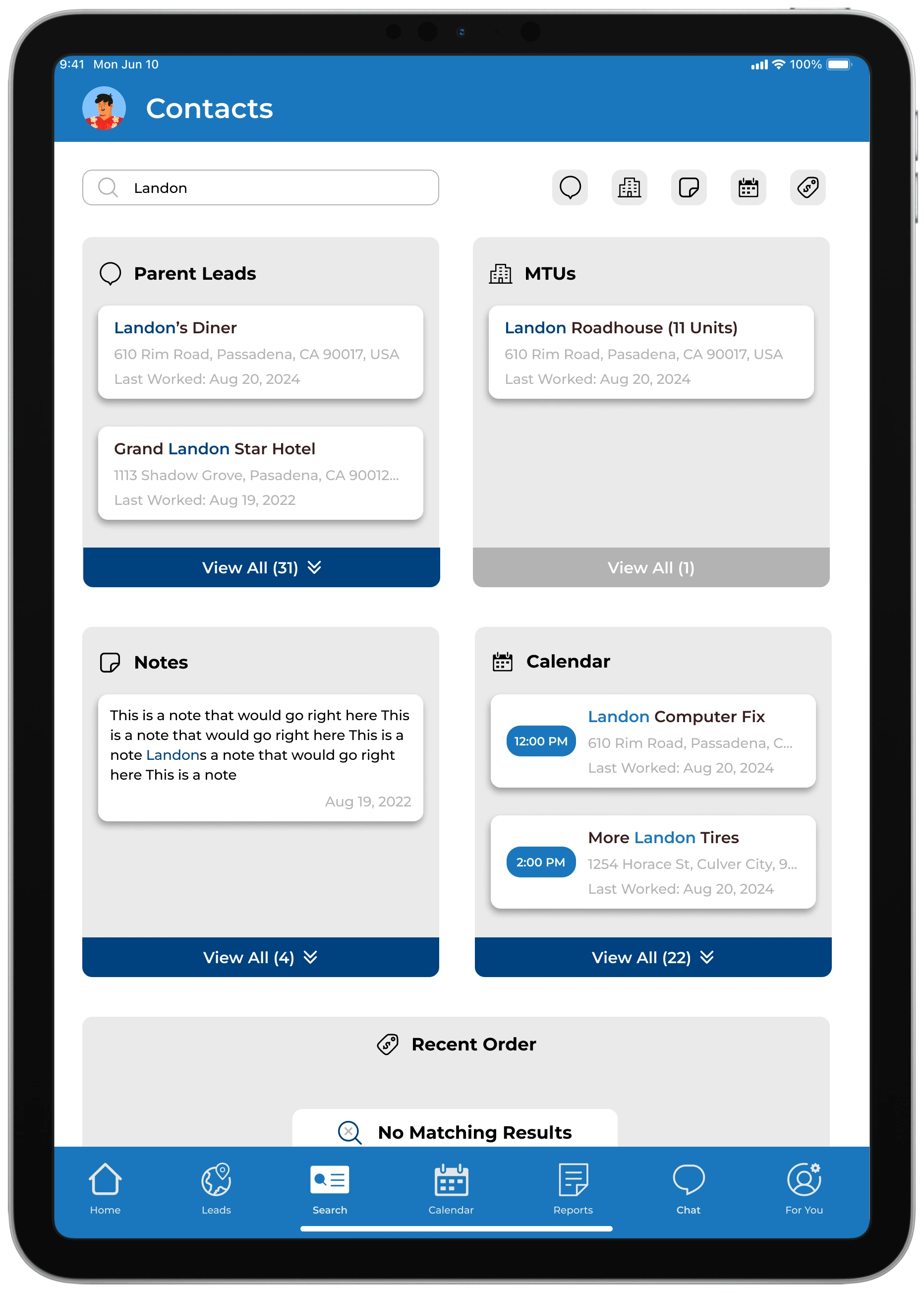
Our main goal was to get the ball rolling on how leads are displayed in the app as we knew all actions on creating & finishing a sale comes from how a user can navigate to exactly where they need to go.
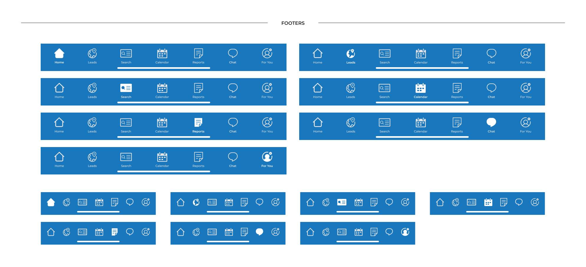
We wanted to go for a clean and simple look while also paying attention to the variety of feature and content we believed a rep would need to feel successful.
Other important functions we considered and designed were:
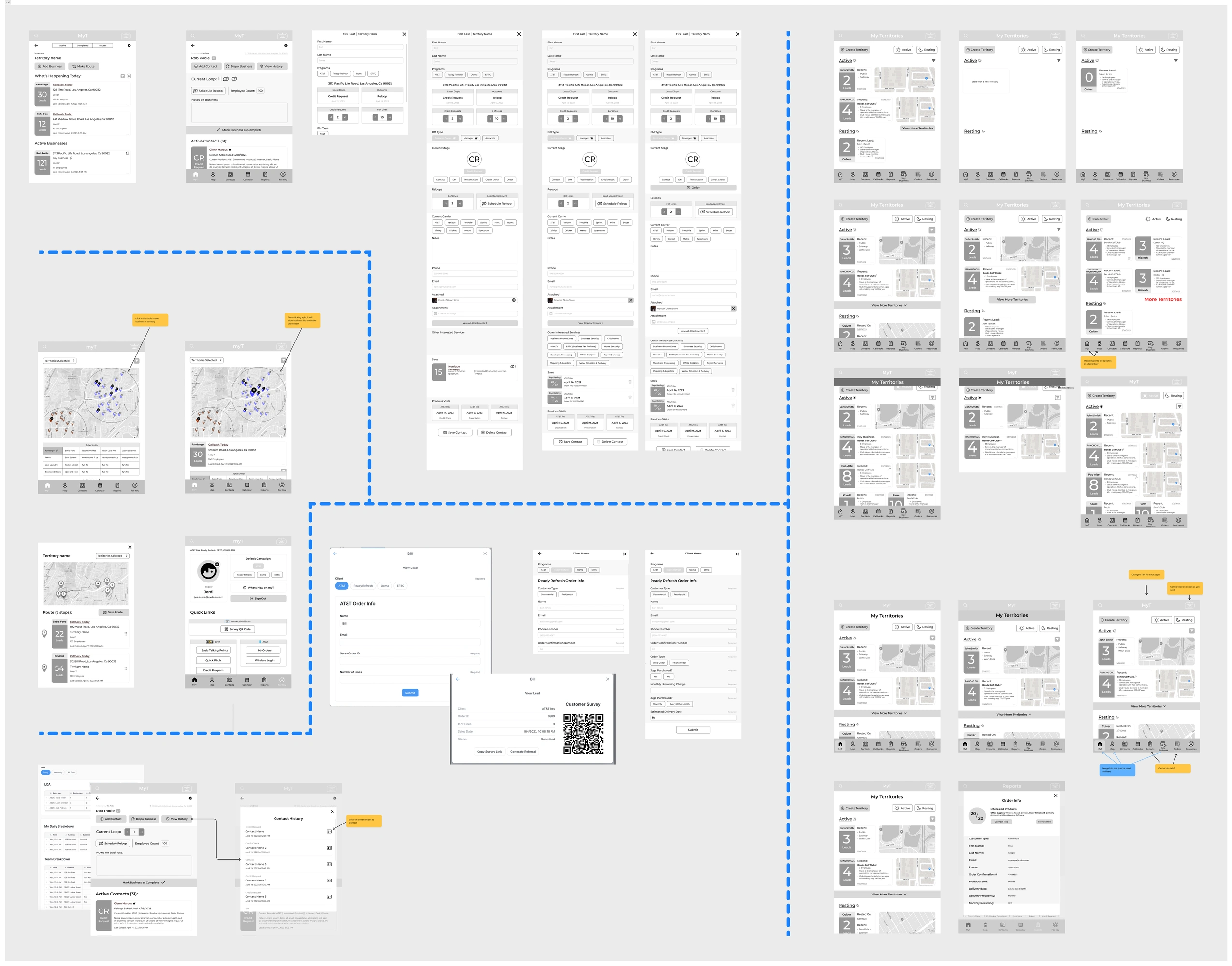
Once we presented some our vision to reps, they came back with some comments, which prompted dialogue amongst our team. Though we were actively questioning what they felt were missing, we also wanted to capture behaviors that were not considered
A few of our insights were:
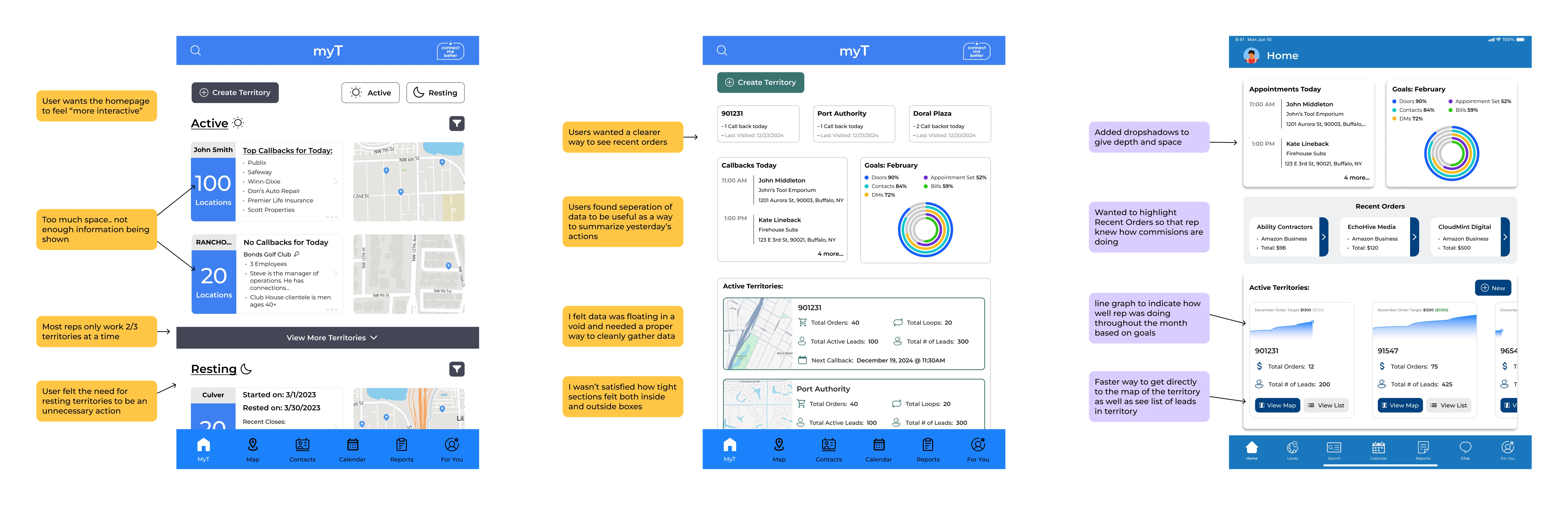
Reps didn't really rest territories so there doesn't need to be a high priority in resting territory
Solution: A more subtle way to rest territory in myT and backend tool where manager can rest a territory for a rep depending on data
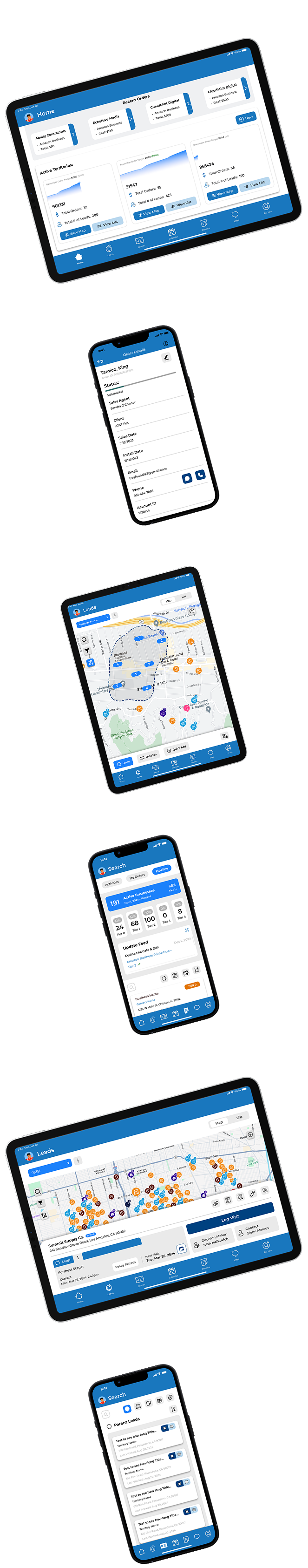
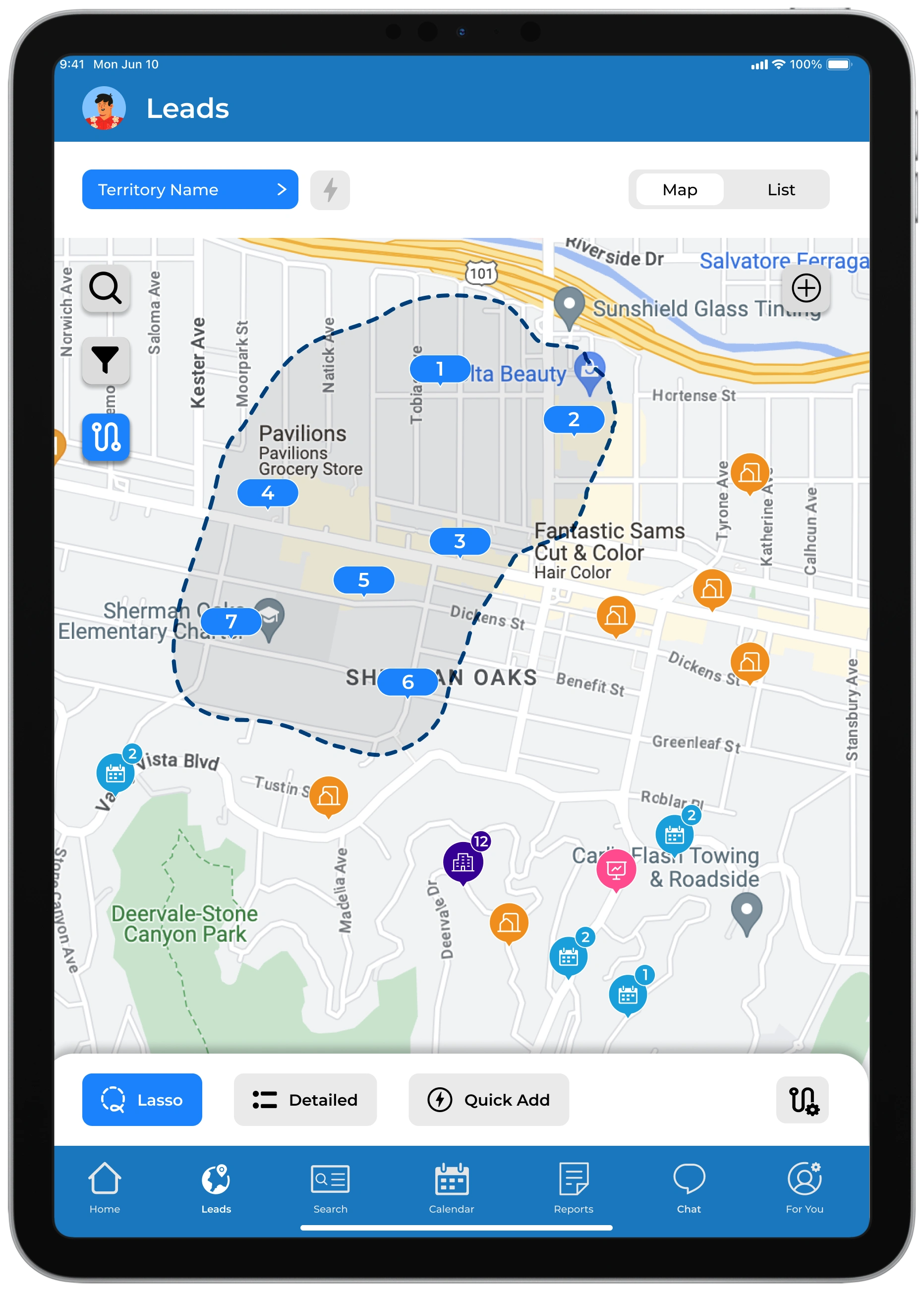
A rep always wants a view of a map when navigating leads
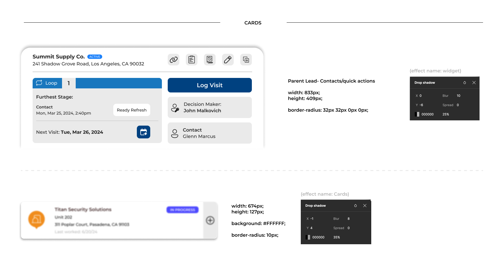
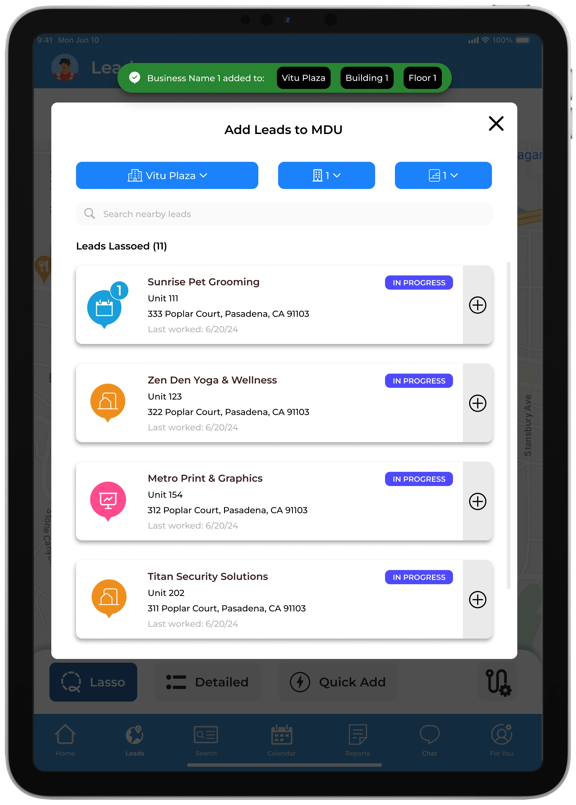
Solution: redesign how a lead gets displayed within a widget format
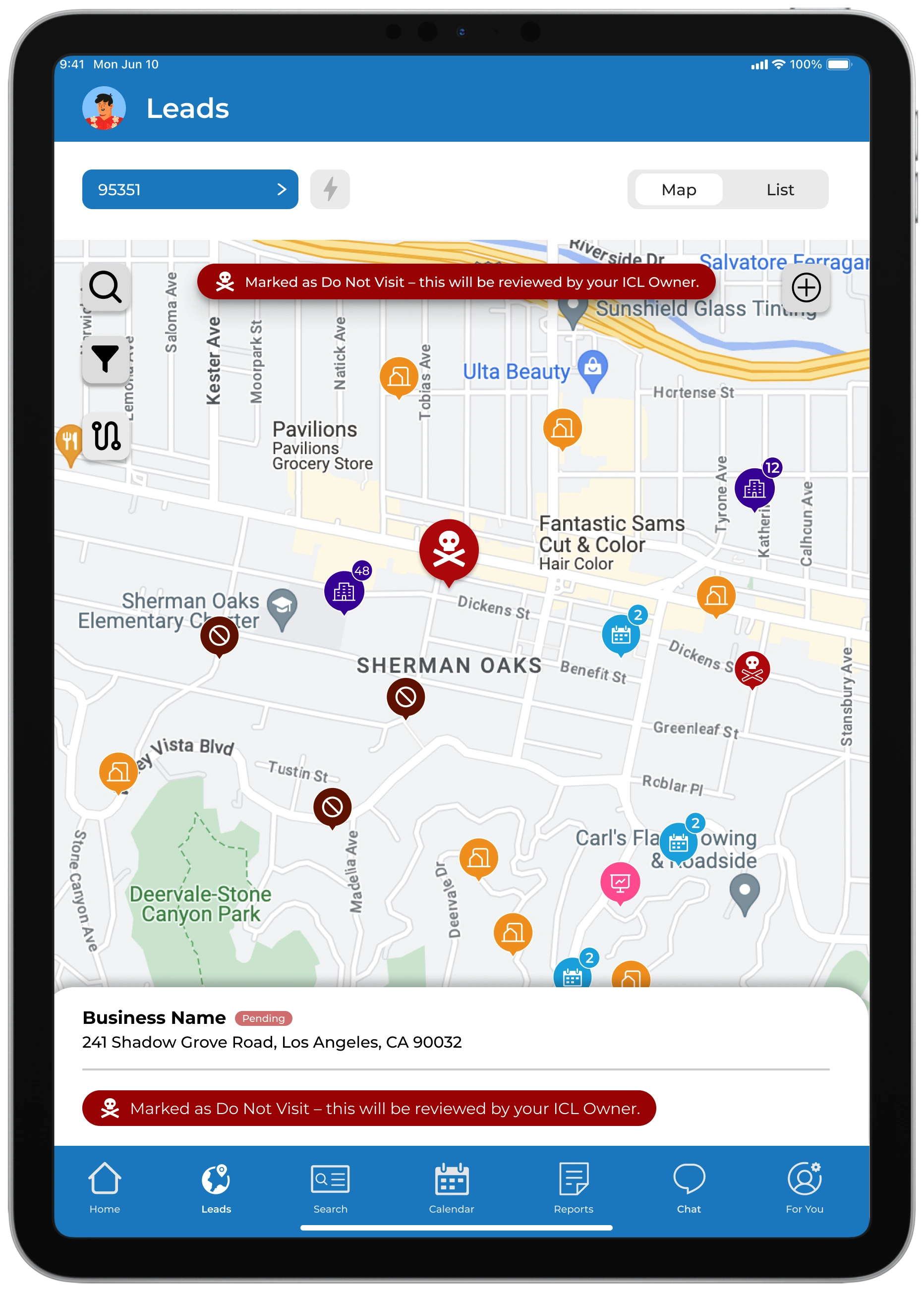
Reps found create route useful, but found it hard to navigate if they made a mistake
Solution: design routing in a way to interact with the map rather than making decisions solely on the lead
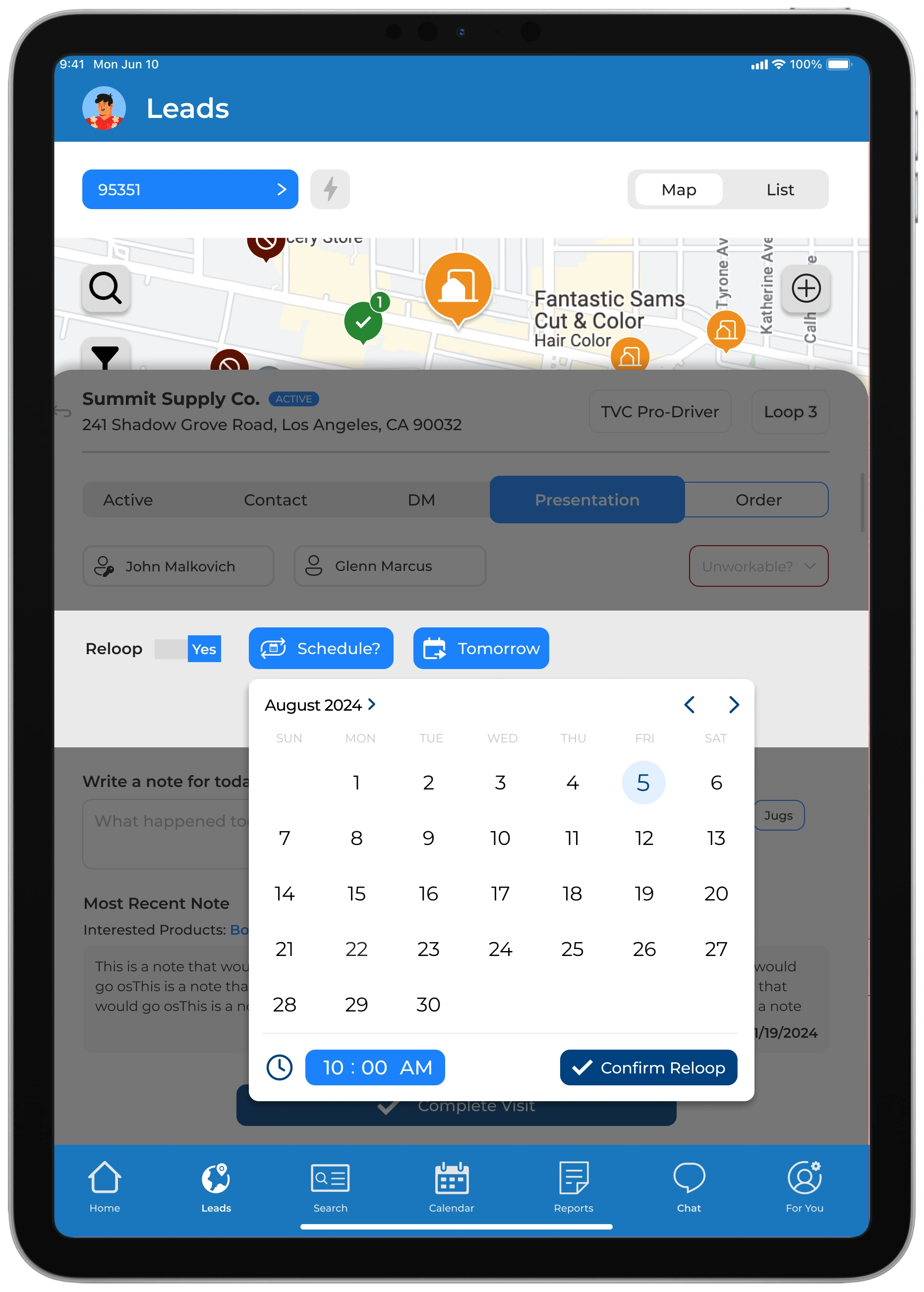
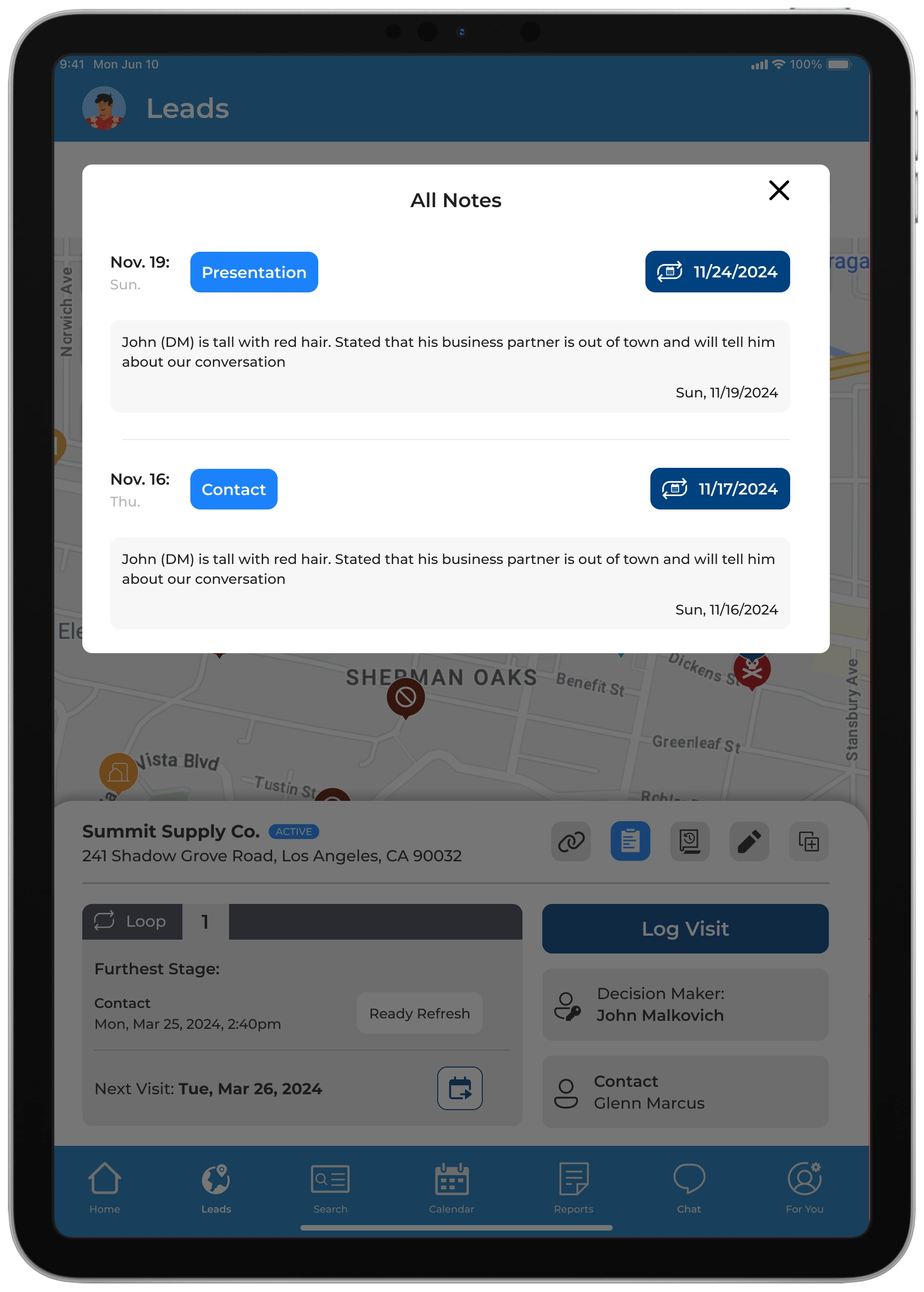
There are too many steps to know the history of the lead
Solution: Following ideas of map being an anchor point for the rep, design screen showing critical lead info followed by a focused action screen where reps can quickly update or build on that lead
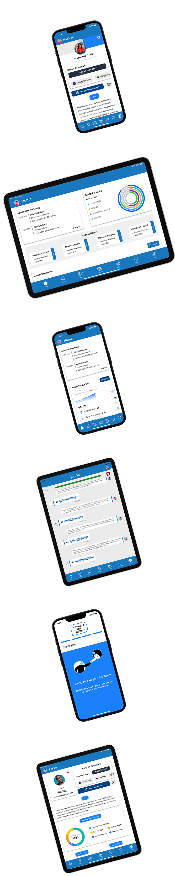
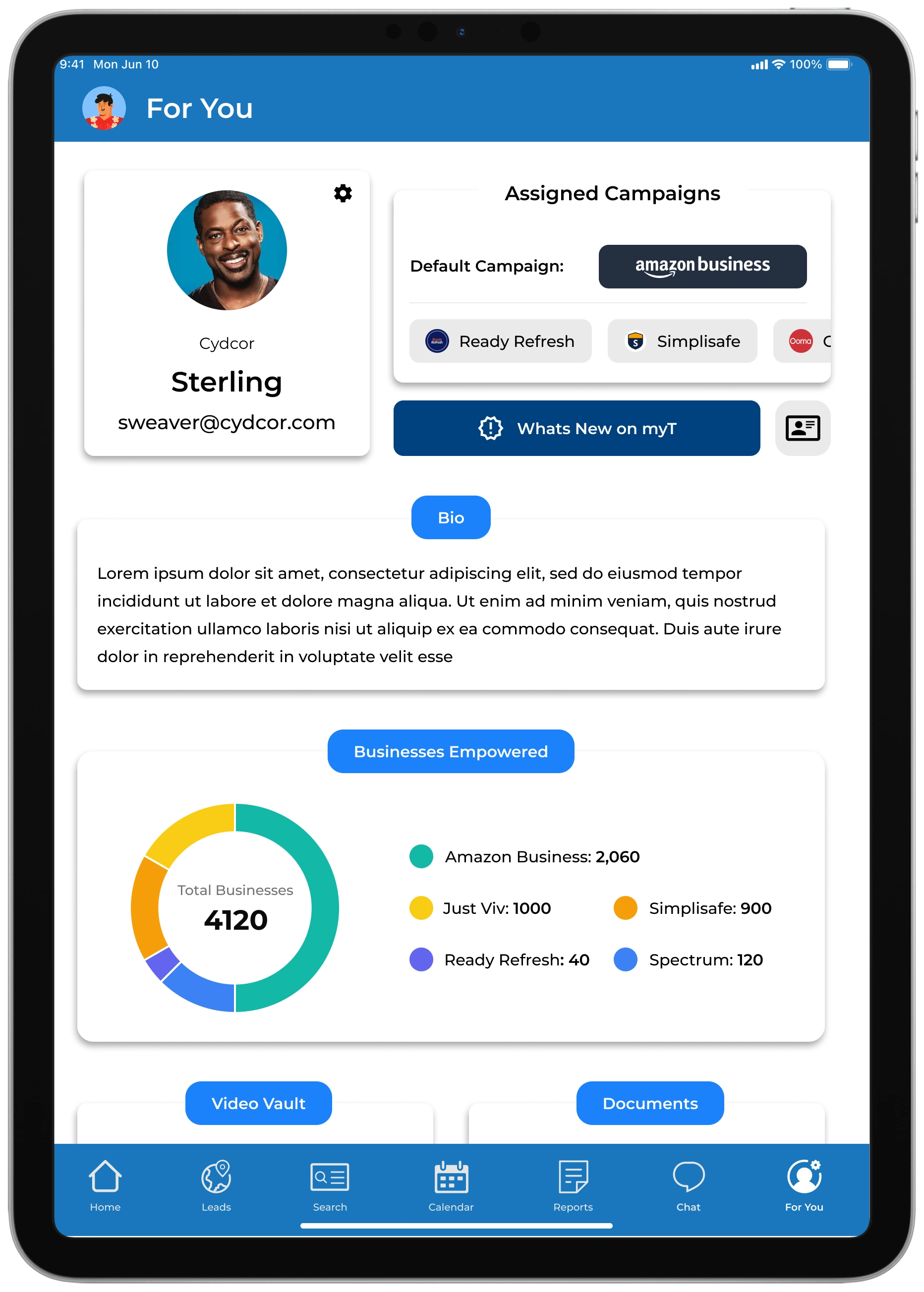
A quicker way to get to customer survey and options to send survey
Solution: build it right into the profile page and quick CTA on parent lead information page that displays QR code & a way to send survey link through email or phone
Overall, we tried to make all these actions a simple and clean as possible so that any rep can use it with ease
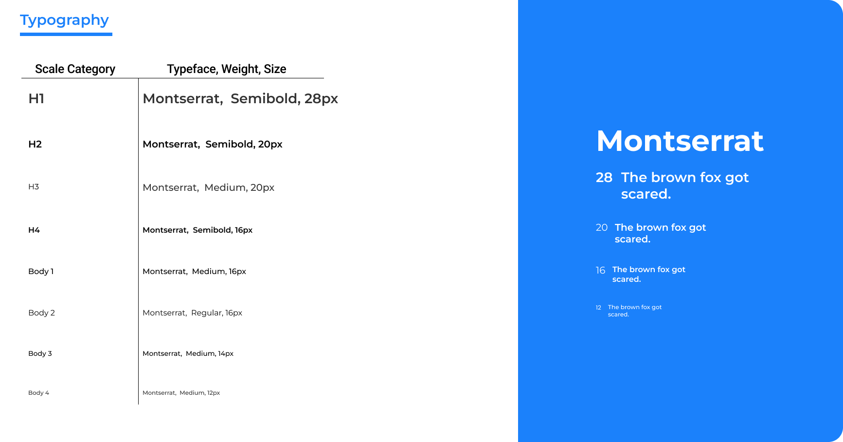
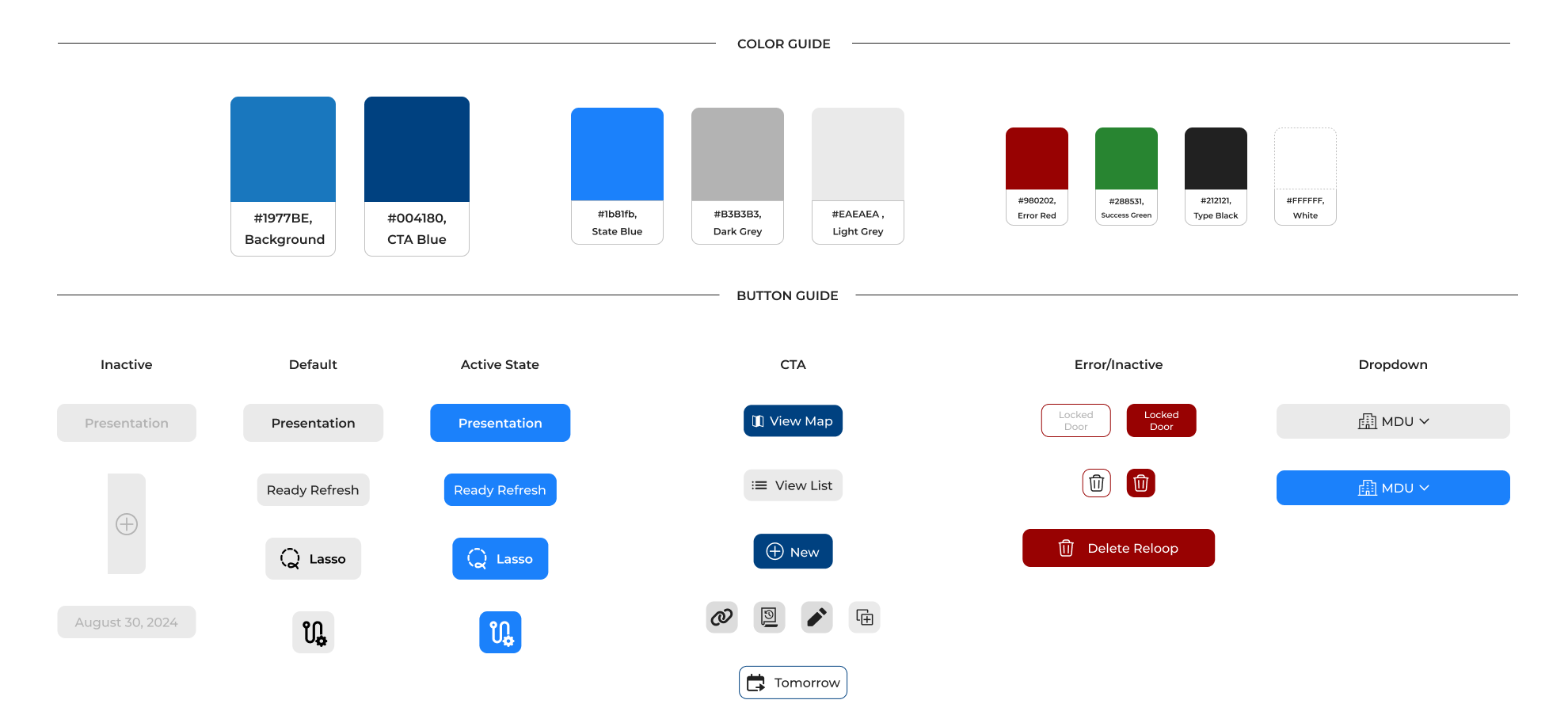
We had some direction from Cydcor about what the brand guidelines would be, but we were encouraged to push the envelope to figure out how we can make myT stand out within the company's brands
I had constant discussions with the marketing and development team to discuss progress and experimentation. These conversations helped us critically analyze what we wanted the look of myT to be and helped us finalize our style guide.
The guide contains desired color palettes, typography, iconography, input fields, components, and images and graphics.
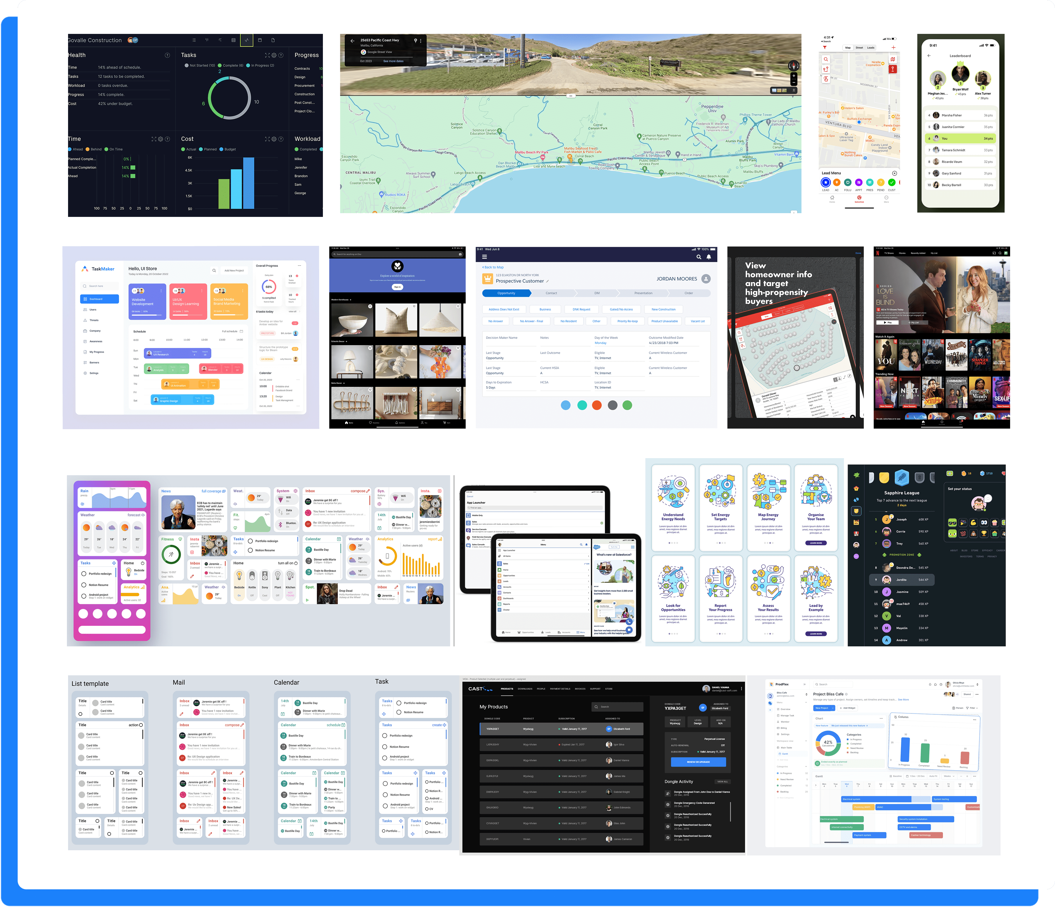

As we moved into high-fidelity screens for myT, we ensured every interface aligned with the app’s core purpose: clarity, efficiency, and usability for field reps. Visual assets were kept consistent across the platform, while thoughtful use of color and graphics introduced subtle brand personality without distracting from functionality. While we referenced iOS design guidelines for visual harmony, we also maintained creative flexibility to ensure our color choices met accessibility standards and supported a clear, user-friendly experience in the field.
For every stage of the design process, we would have a few beta office to try out new features. We sent the reps an onboarding video discussing new changes and let them run with it out in the field.
For about a week or two, we would work on bug fixes and ultimately encouraged reps to document their issues/ interests with the new designs. We built a feature within the beta versions of myT that allowed users to directly write and speak to us about anything they felt was important to their experience.
Additionally, we would go out in the field with them and be their shadows as we would see them naturally interact with myT and get instant responses of how they were enjoying and/or getting frustrated by the app.
Below are a few examples of notes team by me or the team about the changes we felt needed to be done in order to deliver a more responsive and easygoing experience.
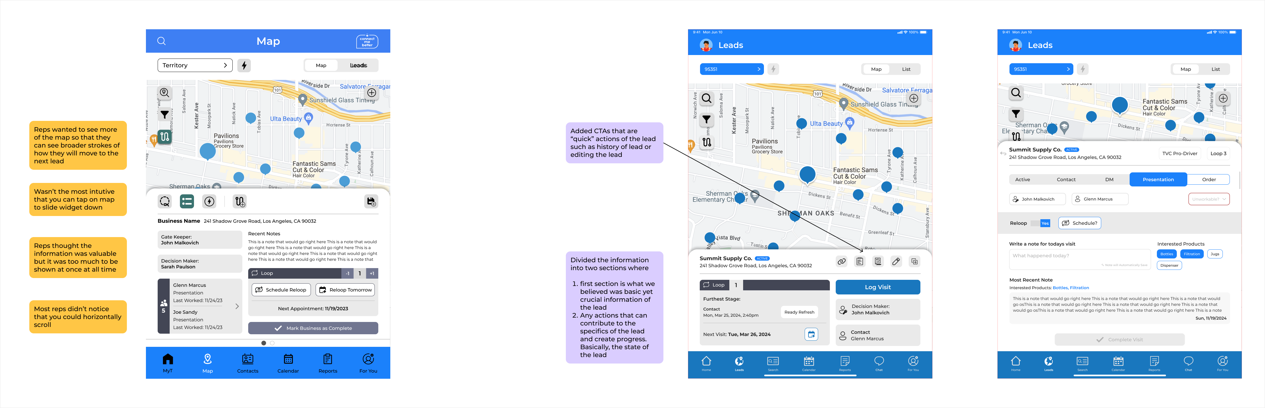
One day, we got a call from an owner stating that many of the reps enjoy myT but often they are in areas where the cell reception isn’t great so they are using their phone to use myT in order to track the sale
Once we heard this, we decided to go an office visit and go to the field with reps – something we often do when we implemented something new on myT.
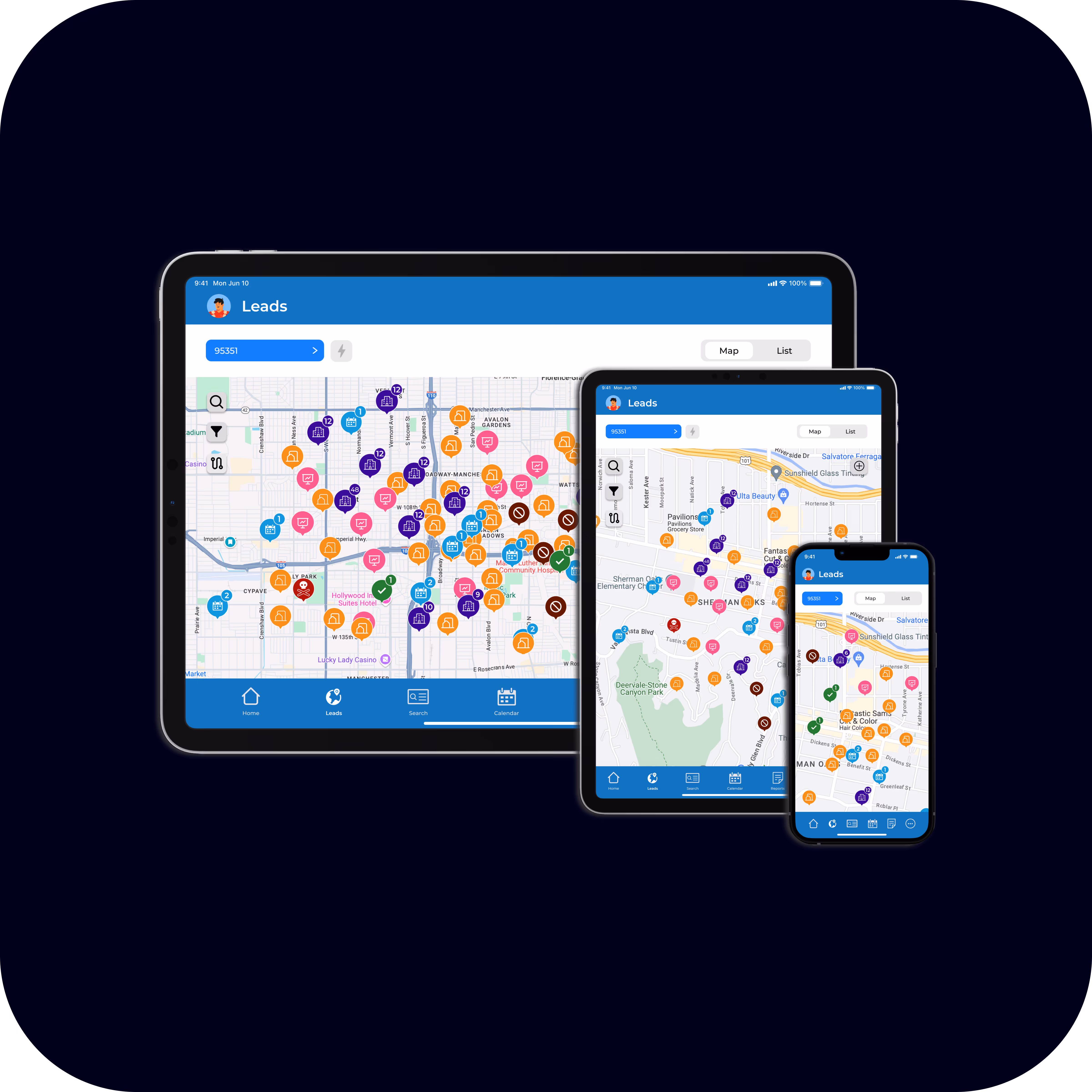
The development team focused on optimizing app performance through improved load times and streamlined backend processes, while I explored responsive design solutions to ensure myT delivers a seamless and adaptive user experience across mobile devices
This whole project wouldn't be possible if it wasn't for the openness and collaboration of every developer, field representative, and office managers. It was an ongoing effort to continually improve in all aspects of this project
Throughout the project, I found that my strongest skill was in collaborating effectively and aligning stakeholders around a shared vision. My leadership evolved as I facilitated check-ins, delegated tasks thoughtfully, and maintained a steady cohesive workflow. My goal was to ensure everyone stayed on the same page and that the final product reflected our collective goals while also keeping a sense of joy through the building process
One of the biggest challenges throughout the process was managing and consolidating all of this complicated information into a neat, simple, and effective flow. Constantly being pushed to find new ways to expand flows and being humbled in the process.
This project is still ongoing and always looking forward to the future of myT
As the days go and myT continually gets new updates, we are trying to design a mobile experience that is engaging and proactive to what the tablet version has. This side of the project is actively ongoing and provides a new set of challenges that drives us to create a more seamless experience