Discovery
•
Ideation
•
Design
•
Dev Handoff
•
Reflection
•

Furniture design often favors the physically able and hardly considers the disabled. In the current design education system, inclusive design is not nearly talked about enough and completely negates a totally new way of design thinking that could revolutionize the world of furniture.
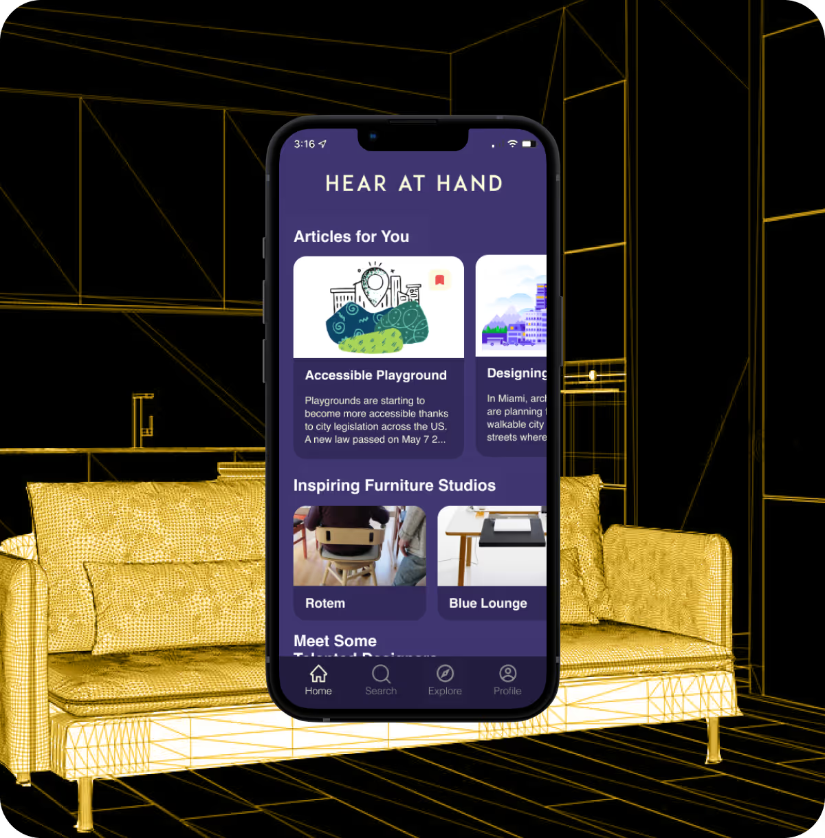
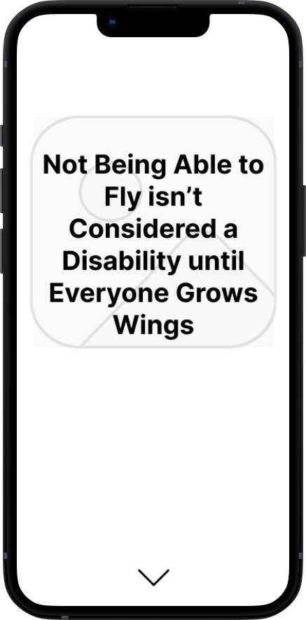
Hear at Hand is an inclusive design furniture app focusing on gathering inclusive design resources and ideas to to help designers start thinking of an accessible and innovative world
By giving managers a clearer, more actionable view of rep performance, the Owner’s Portal improved daily operations, boosted team motivation, and helped drive sustained increases in sales
in month-over-month sales completion rates
in collaborative interactions between reps and management
in engagement with office rankings and performance standings
increase sales and lead logging accuracy
task completion across the board
in daily active usage
in time spent locating lead statuses, performance summaries, and daily goals
in reps reporting that they “feel in control of their sales pipeline”
in duplicate lead creation


Through my secondary research, I found that the idea of inclusive design and the teaching of inclusive design stems from community driven efforts where the success of the design is based on the involvement between designer and consumer. Fast Company suggests that furniture cannot be designed for “everyone” as “everyone” doesn't exist. Instead of “everyone,” designers should focus on designing for communities, which will help provide a space for inclusion.
Furthermore, The lack of understanding for inclusive designs comes from implicit bias that goes beyond professors or schools and extends to community lack of understanding of issues that have always been active but never examined in a critical lens.
Based on insights from Cielo 24, the absence of inclusive design in furniture comes from the lack of discussion and involvement with the disabled community and designers avoidance of discussing these issues.
.avif)
To get insight as to how users navigate, perceive, and critique the furniture world, I used screener surveys to recruit furniture designers who have an interest in inclusive furniture design. After interviewing them and collecting more data, I was able to synthesize my findings into affinity groups, empathy maps, and a persona.
When creating the screener survey, the main objective was to find participants who were furniture designers that have an interest in inclusive furniture design.
The designers were not judged by degree and/or level of experience but rather a self described genuine interest in learning more about inclusive design.
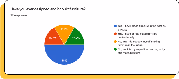
I conducted user interviews in order to get a better understanding of how users feel about inclusive issues within the furniture community, how they discuss with other designers about inclusivity, how they interpret their inherent biases when it comes to design, and how they see ideas of inclusivity plays in the future of furniture design.
Something I found extremely interesting was that all participants were them trying to figure out where they stood in playing a role in inclusive design within their workspace and to what extent inclusivity must factor in their work process.
Screener Survey
Responses
Interview Questions
Participants
Rigid Boundaries: Constrained on how data is filtered and displayed.
If there was a task specific insight that needed to be investigated, it would be hard to track it.
Limited Granularity: tend to favor macro-level data.
Limited ability to drill down into individual employee data
Data-driven organizations needing high-level analytics and strong visual customization but less focused on rep-level granularity.
Rigid Boundaries: Constrained on how data is filtered and displayed.
One-Dimensional Reporting: While it excels in aggregate reporting, it lacks depth in user-level analytics
Reduces its value for performance management.
Teams needing a polished, all-in-one overview of business metrics without requiring deep comparative or individual analytics.
Complex Setup: User needs a bit of technical knowledge to create a dashboard
not the most accessible
Steep Learning Curve: felt the onboarding process wasn't friendly to new user.
Felt "Jump into the pool and figure it out for yourself"
Teams with technical expertise or data analysts who need extensive control and real-time tracking across custom data sets.
Limited Data Complexity: struggles with advance datasets so makes it hard to do in-depth analysis
Smaller teams seeking a straightforward, simple dashboard tool for light tracking and real-time notification
With my interviews I was able to categorize and organize issues, experiences, and questions designers have in the furniture community. The map serves as a way to identify what common traits and motivations the participant's answers had.
Collected are the thoughts, motivations, and inquiries from the 5 participants
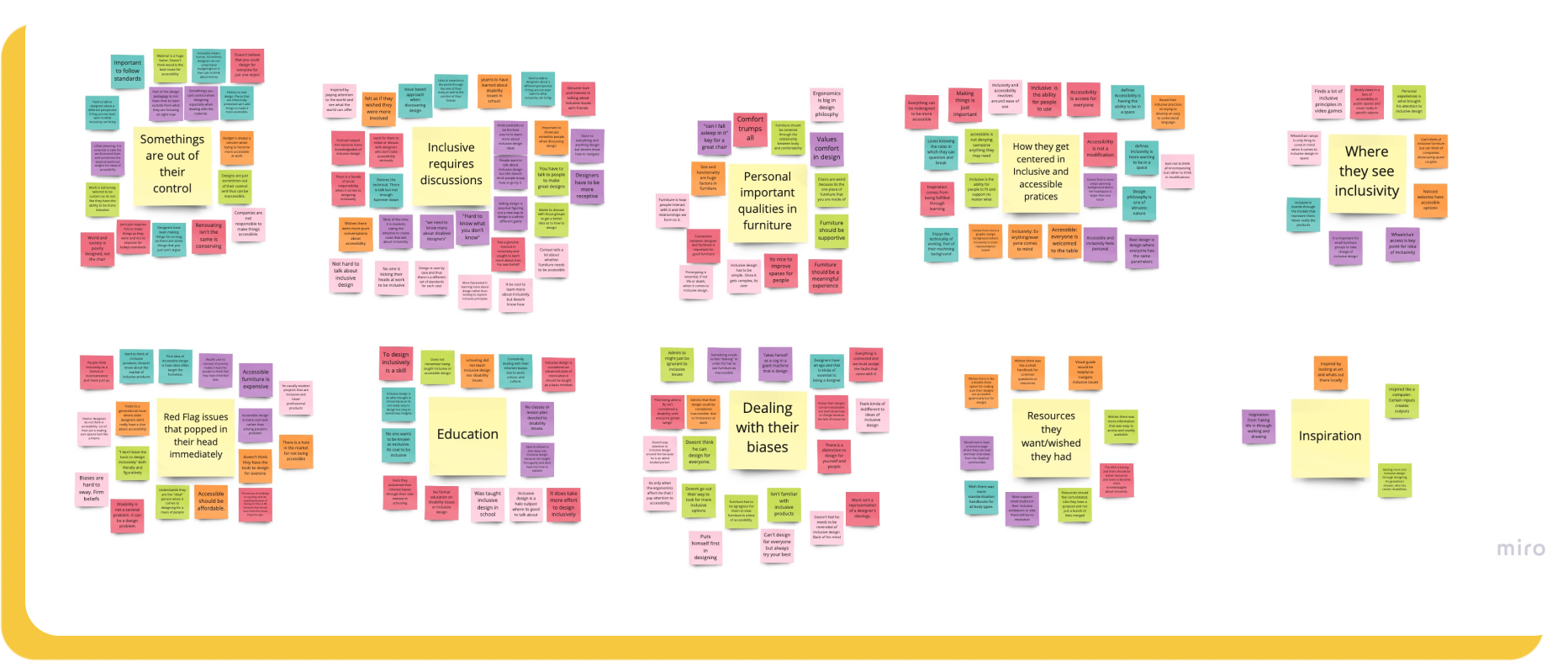
Affinity maps were then categorized into an empathy map. The map highlights the core belief in all the participants:
Designers had an active interest in inclusive design but do not know to begin learning more
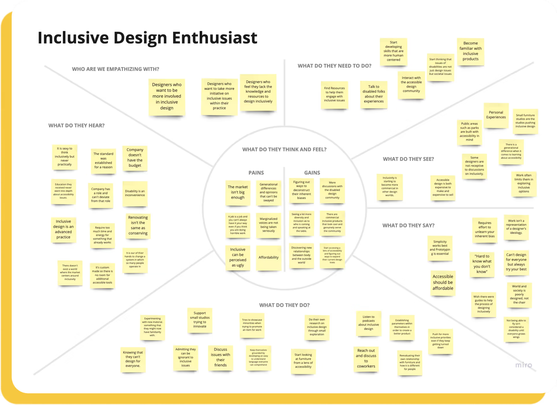
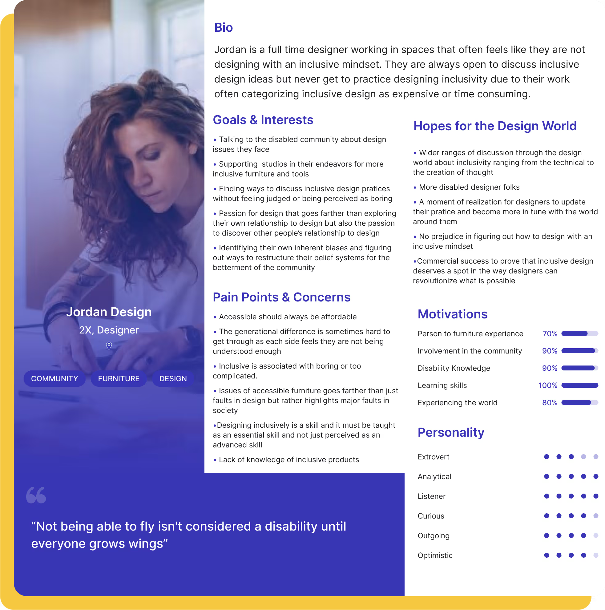
After identifying some of the issues and motivations from the affinity and empathy mapping, I was able to create a persona:
Inclusive Design Enthusiast: Is a full time designer working in spaces that often feels like they are not designing with an inclusive mindset. They are always open to discuss inclusive design ideas but never get to practice designing inclusivity due to their work often categorizing inclusive design as expensive or time consuming.
The final piece of my research was to synthesize this data with How Might We (HMW) statements to clearly communicate the most important problems users want solved.
Sketching helped me bring those user flows to life. I knew I wanted a seamless experience that didn't clutter the user with information.
At the core of my sketch philosophy was understanding how users felt with an influx of information that may seem new or somewhat familiar. I experimented with different types of menus and placement of ideas and was under constant conversations with specialized UI accessible designers to make sure I was heading in the right direction.

Before designing the app, I categorized user stories by priority. The top of the priority list were crucial functions that opened the world of possibilities and understanding for users. This ideation process helped me implement a smooth user experience.

Now that I had a better idea of what my users needed I created the sitemap with the intent of simplicity.
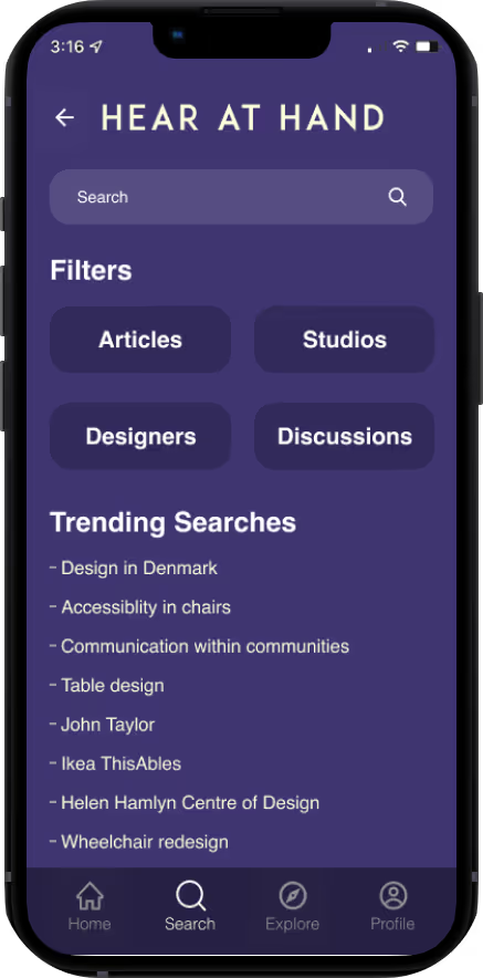
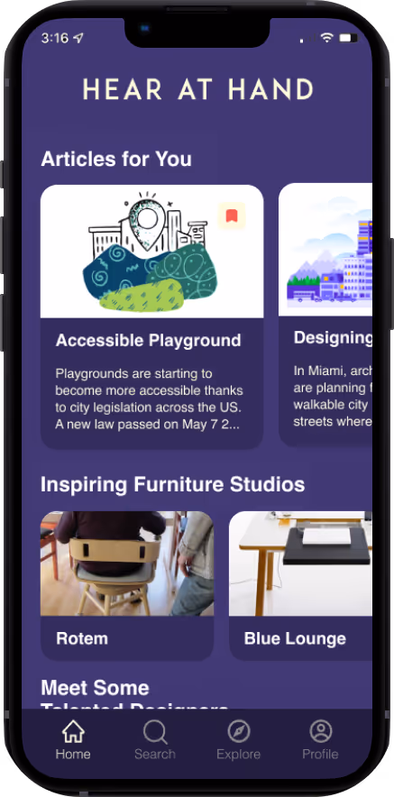
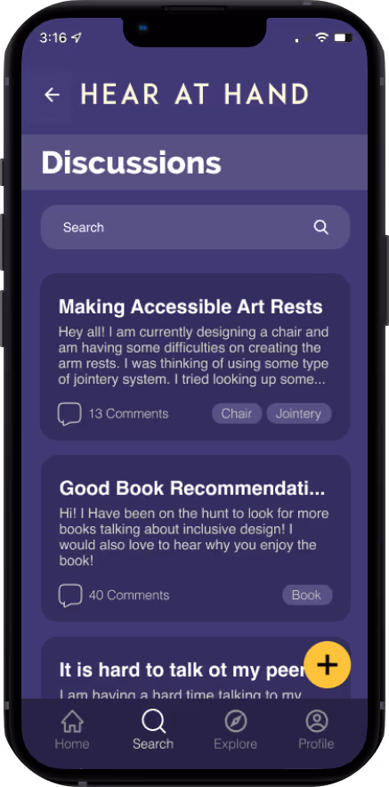
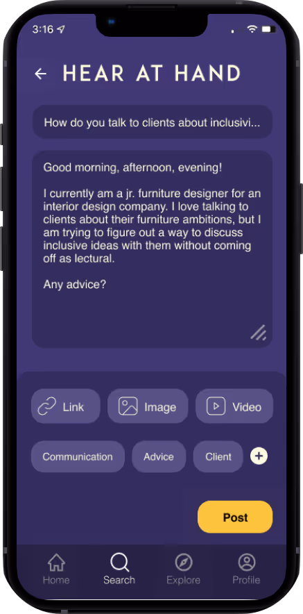
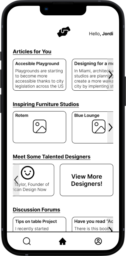
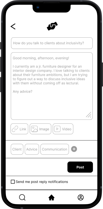
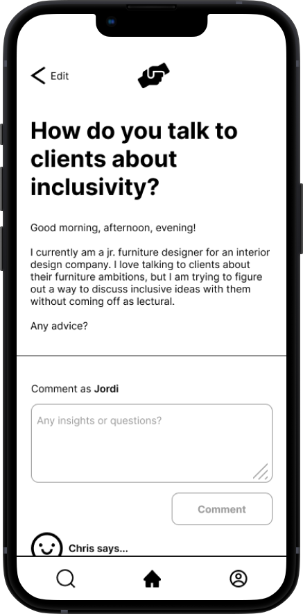
The user experience must allow the user to learn and get inspired by articles, studios, and designers through their own pace as well as feel comfortable to interact with the furniture design community through curated discussions.

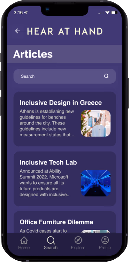
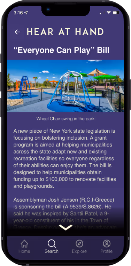
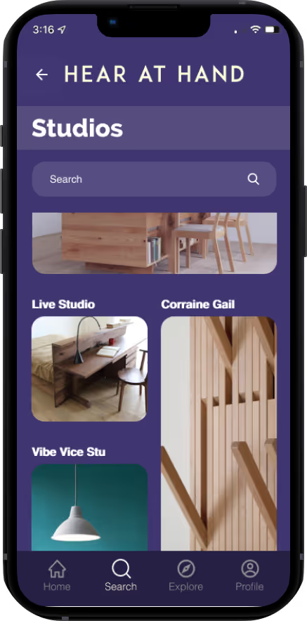
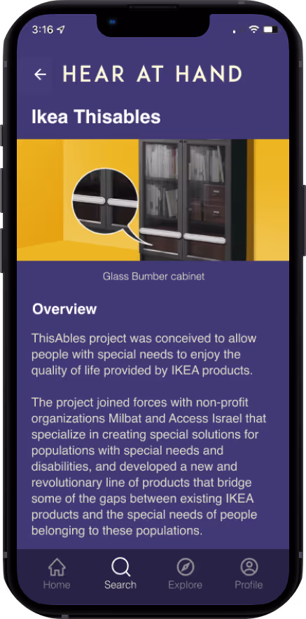
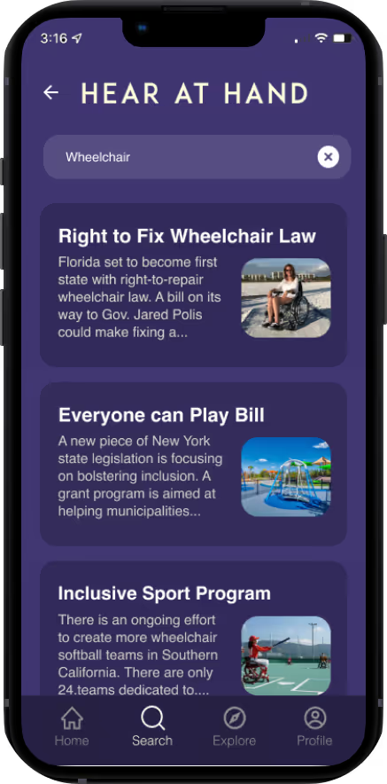
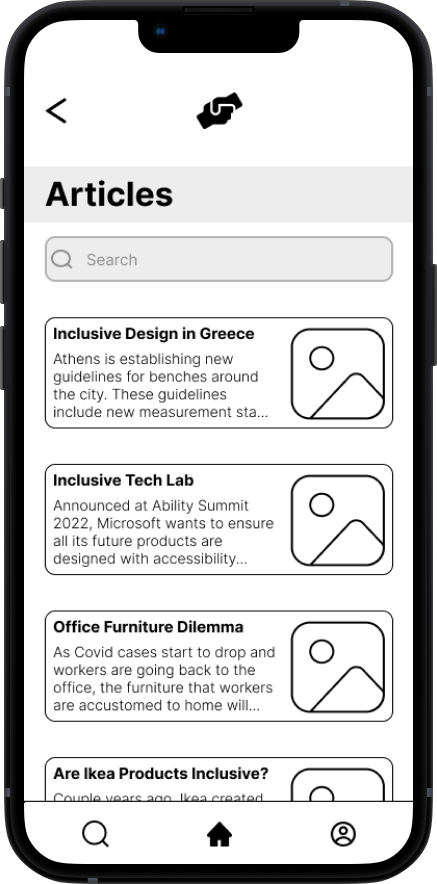
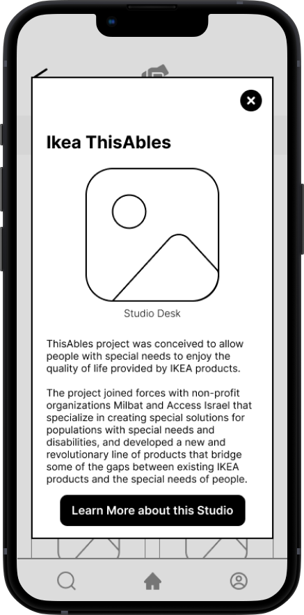
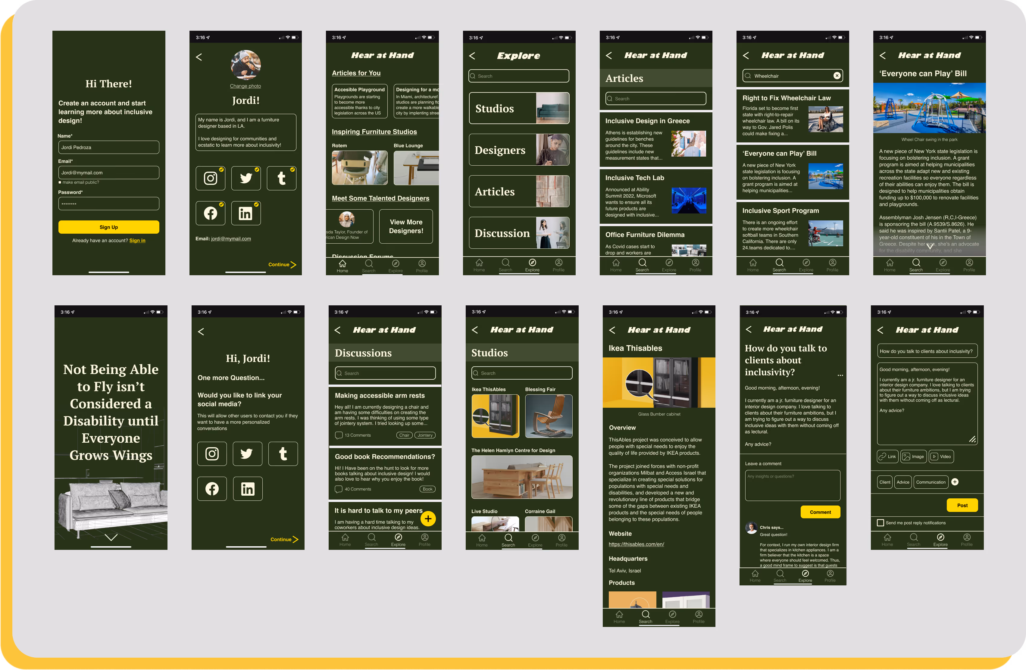
My user flows helped me understand how I wanted each screen to be laid out in order for users to complete their tasks. From my MVP’s I chose three routes that were essential to Hear at Hand and these were to read articles about wheelchairs, learn more about studios, and create a discussion post
My main focus in designing these low fidelity frames was to get a better idea of the layout of each screen and the flow from one page to the next. Working with greyscale allowed me to understand a grid system better and allowed me slowly bring my vision to life.
The entire process gave me an opportunity to experiment with accessibility features and lay a foundation to the direction I wanted to achieve. It helped clarify how I wanted functions to be formatted as to how to simplify and prioritize functions.


Now that the app has a flow and structure to it, I wanted to keep the style simple and minimal. It was of the utmost importance that the app felt personal, engaging, and welcoming.
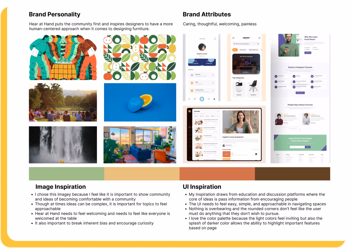
I was inspired by many apps focused on providing a wide range of information to users, so I wanted the user to feel like they can explore and navigate the app in whatever way they feel most comfortable in.
I knew from the beginning that the center of Hear at Hand was the idea of community. When exploring for ideas, I was thinking about ways people think, communicate, and express ideas of community.
I was also intrigued by educational apps that sought to educate its users through different mediums. I found it to be great inspiration when thinking about how to frame information.
My color inspiration stems from expanding ideas of warmth/comfort within our own spaces.
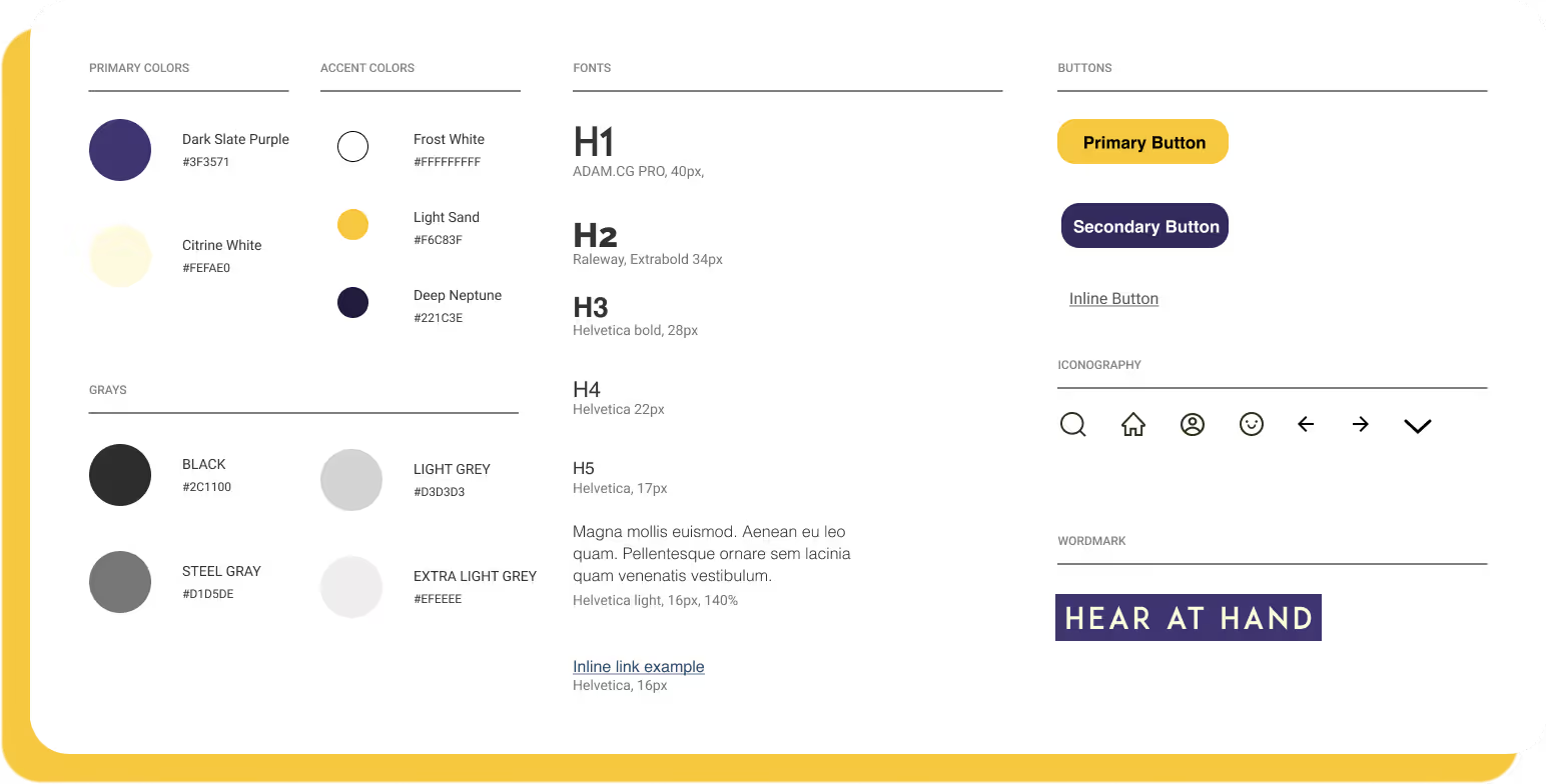
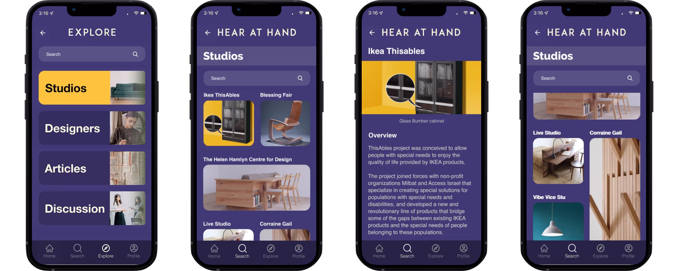
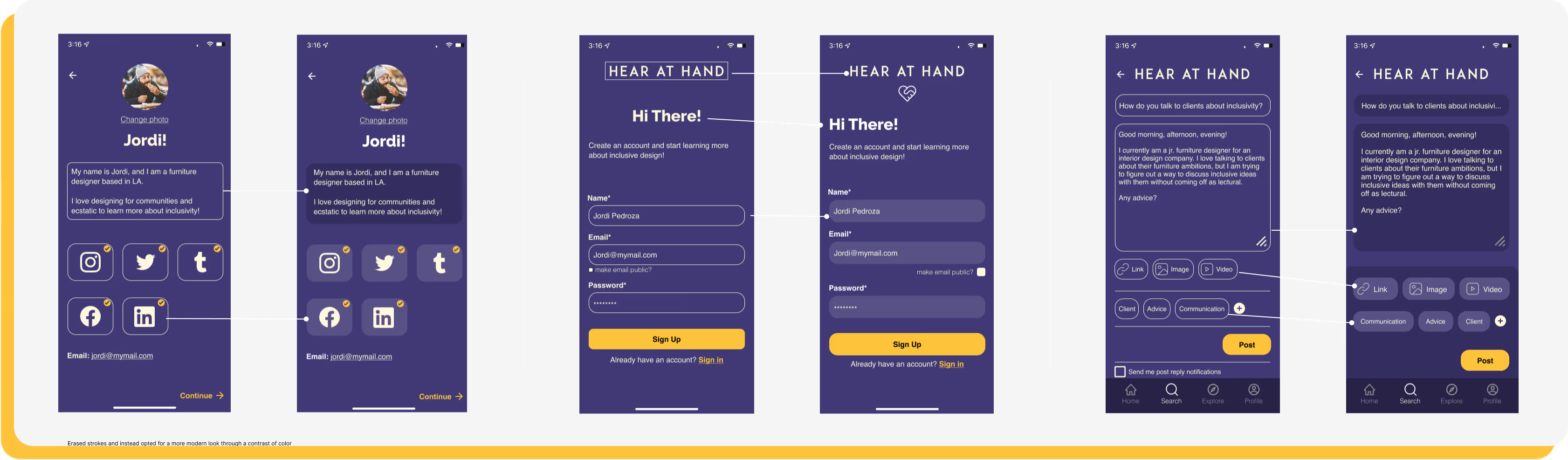
Phase 1 established the foundational UI and visual language for the app, using a green-forward color system to emphasize accessibility and clarity of information. As the product evolved, insights from early testing and real-world use highlighted the need for a more comfortable experience in low-light environments. These findings informed Phase 2 of the redesign, which transitioned the interface into a night-mode–friendly system inspired by macOS dark mode patterns.
The main goal in the design process was to make a simplistic experience for users to follow, navigate, and enjoy learning more about inclusivity and inclusive furniture design. I wanted to throw away the idea of being scared to learn something new into an experience where the user actively wants to engage with a service.
The updated UI uses deeper neutral tones and refined contrast to reduce eye strain, improve focus, and create a more modern, calming environment—allowing accessible furniture information to remain clear while better supporting extended and evening use.


Usability testing was conducted to evaluate how easily new users could engage with the app and understand its core functionality on first use.
The sessions focused on assessing accessibility, clarity of language, and navigation as users completed key tasks such as finding wheelchair-related articles, learning about studios, and creating a discussion post.
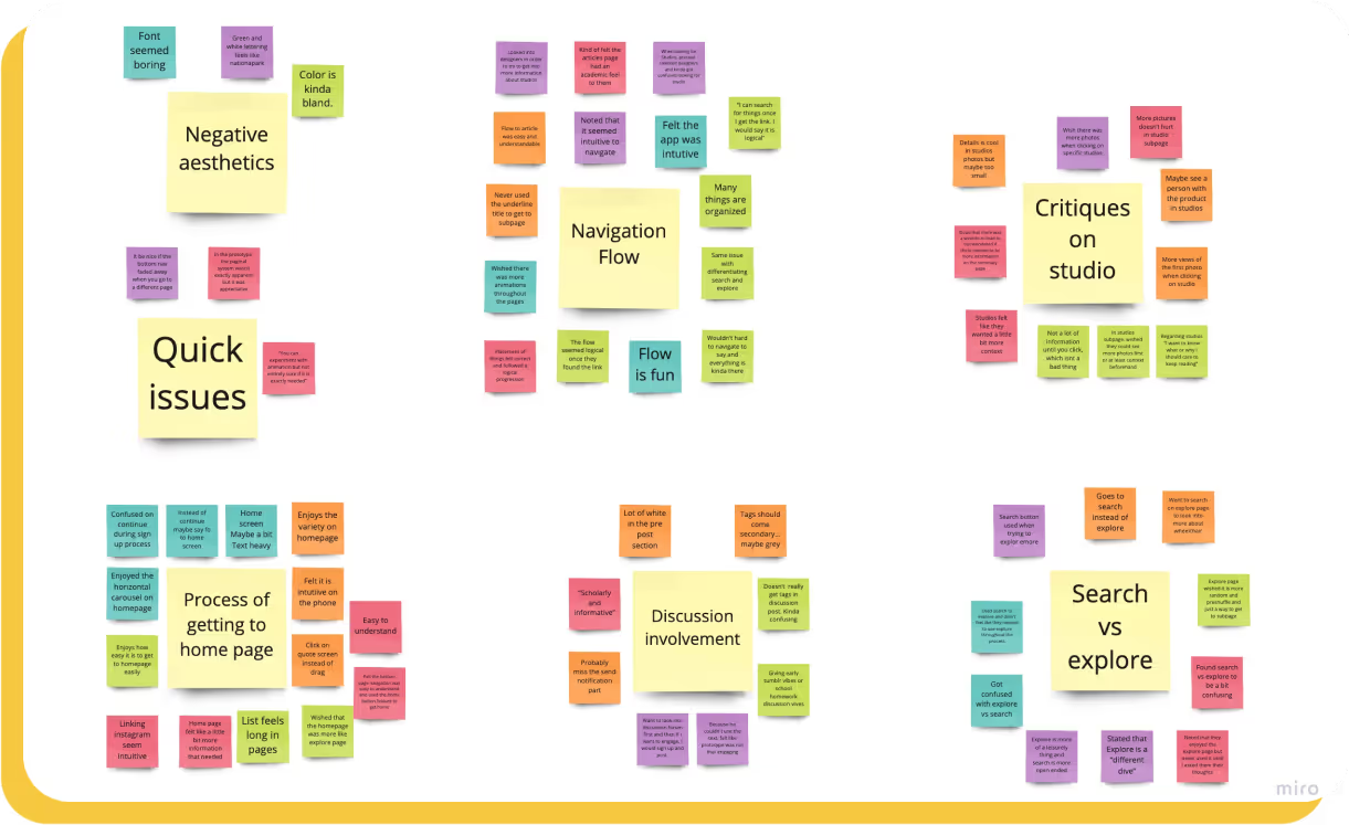
All users initially used the search navigation instead of explore navigation to get to the different subpages
Users wished there was more context for specific Studio page
Hierarchy issues in the discussion main page and pre-post page
After careful consideration of comments and critiques from not just users but the mentors and designers who lend me their eyes and ears, I synthesized and redesigned some frames that benefitted the presentation and message of Hear at Hand
What a joy it has been to work on this project! This project has made me realize how much I can improve in UI by attempting to bring real issues into a platform that is easily digestible and designed for the betterment of the community. I deeply enjoyed talking to all types of folks throughout this process as everyone had such great insights and perspectives about issues that are active in the design community and their thoughts on the app.
Most importantly, I have gained a deeper value and appreciation for all the effort that is taken and taking place within disabled communities for their voices to be heard. My app is simply a cog in a machine that I hope will operate to highlight and create spaces within disabled communities. I have learned so much about accessibility within UI design, and I am a sponge for learning more about accessible practices within the field.