Discovery
•
Ideation
•
Design
•
Dev Handoff
•
Reflection
•
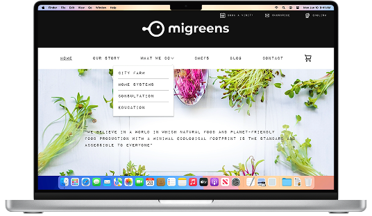
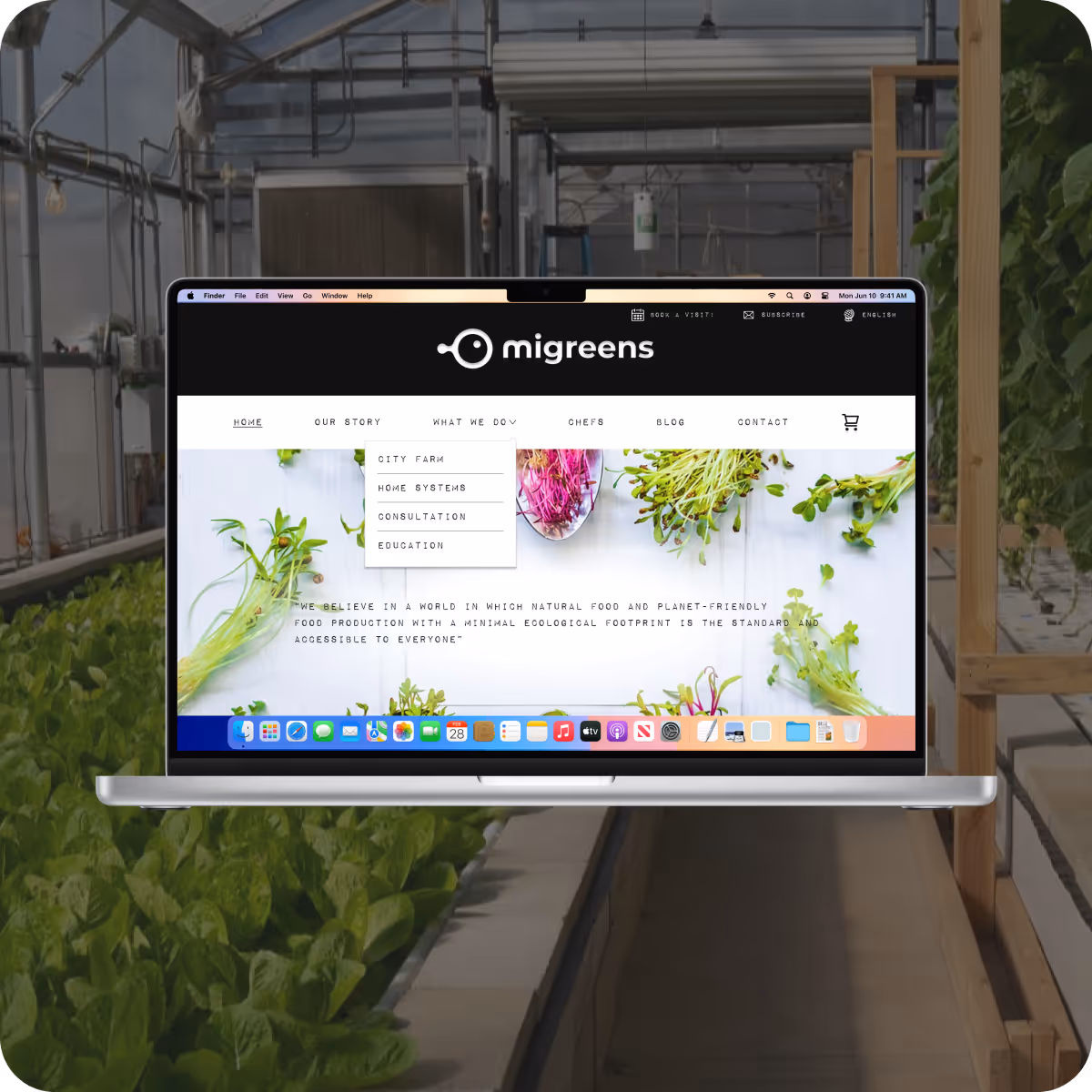
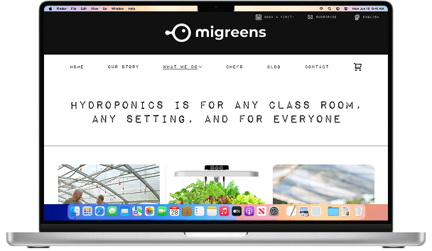
Migreens is an agricultural technology company that utilizes advanced Aquaponics technology to encourage consumers to make informed choices about their food and the environment that are both healthy and sustainable.
The project required a group to reimagine and design a website that showcases the company's values and passion for their work.
Migreens experienced measurable gains in traffic, engagement, and audience reach, reinforcing the role of thoughtful design in making aquaponics more accessible and compelling.
in organic traffic through educational content
in bounce rateent
in repeat visitors
in traffic from educators and students
in product page views
in average session duration
in conversion rate from creating account to buying a first product
design-to-launch time for new pages after implementing a shared style guide and design system
in visits to educational content (aquaponics explainers and classroom resources)


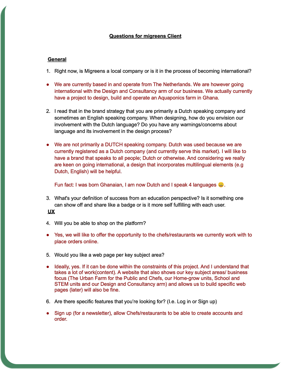
To begin our process, the team and I wrote 17 questions to the stakeholder in order to get vision as to what they desired, wanted, and needed for the website.
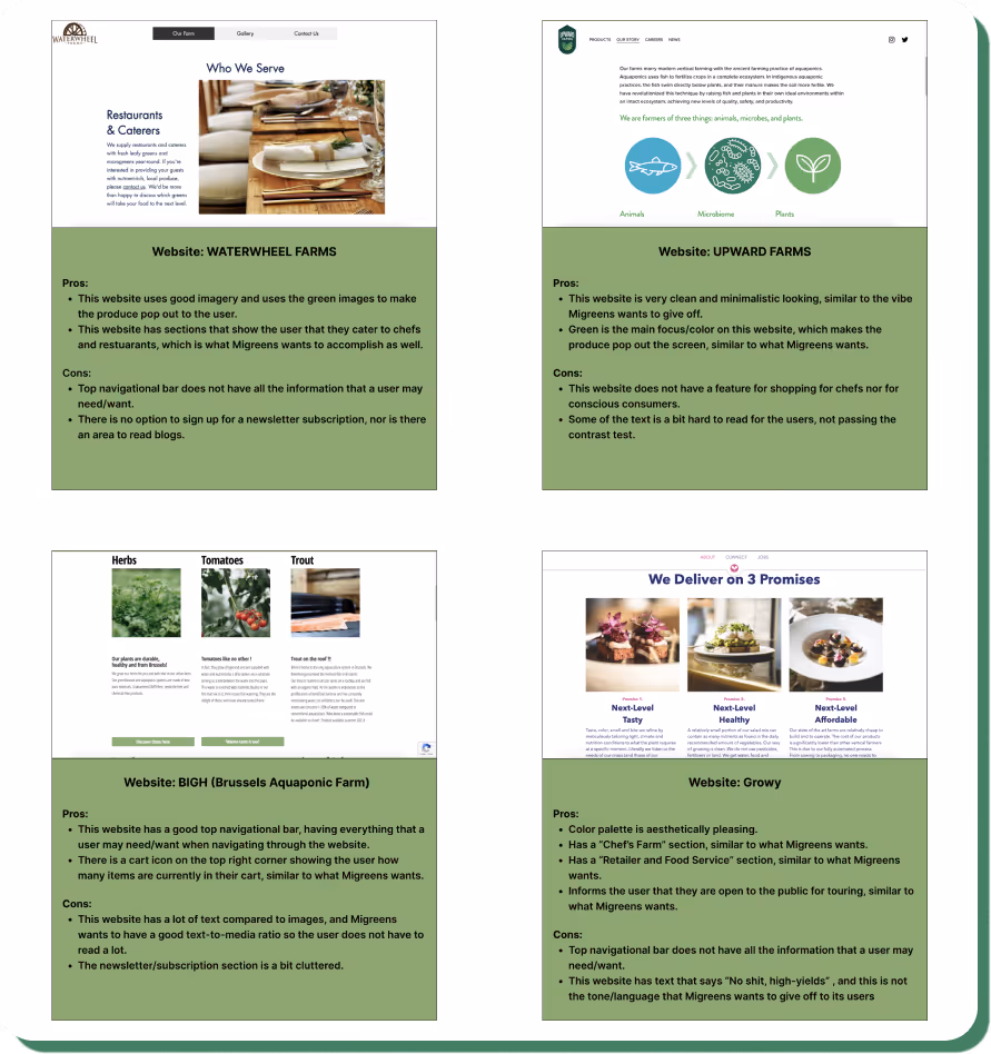
Something that was crucial for the stakeholder and for the development of the team was to critically analyze other websites to how the Migreens website can stand out and learn from the aquaponics community. While analyzing, we were primarily focused on color schemes, website layout, resources provided, and formatting
This insight allowed us to go deeper into why sustainability is an important aspect of the website and evaluate environmental movements within the Danish communities
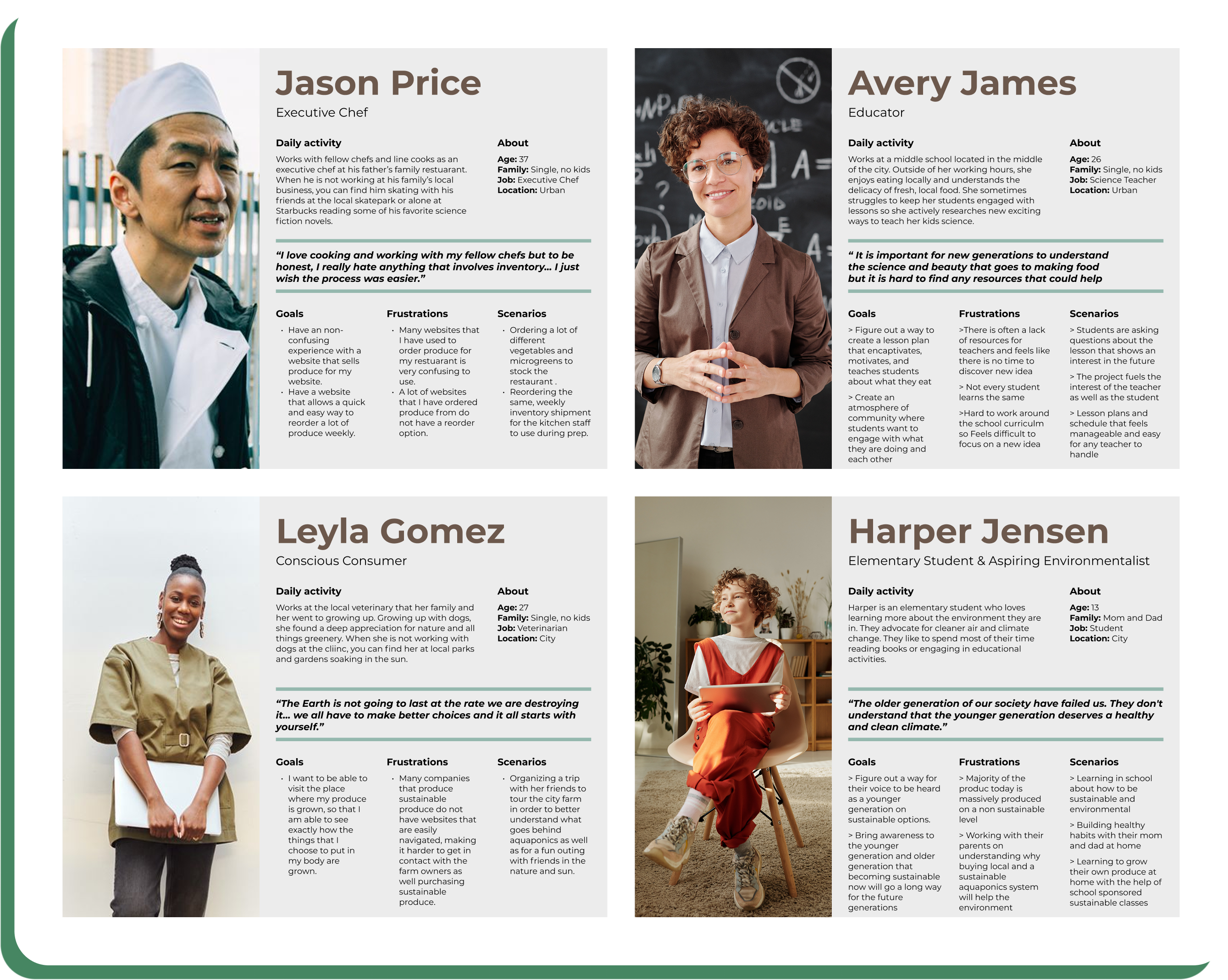
After our analysis, we divided the user stories into 4 categories.
Creating these categories helped us understand what each user would need and want to have when navigating through the website. It also helped with developing new ideas for each user and how our team could experiment with developing specific features.

All users are focused on making sustainable and local first decisions that help their community while preserving the planet.
We decided to dive deeper to the 4 types of users that help embody and elevate Migreens core
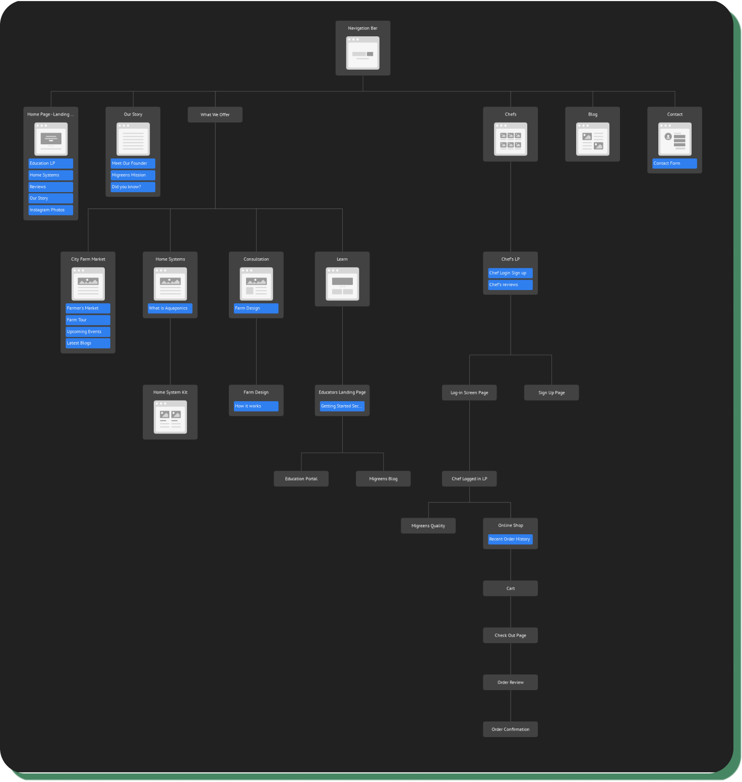
The primary use of the sitemap was to route consumer's flows as the website sought to provide services for general and specific users such as chefs
It also assisted during the process of creating the hierarchy within the website and organizing choices and drop-down menus for the top navigation bar.
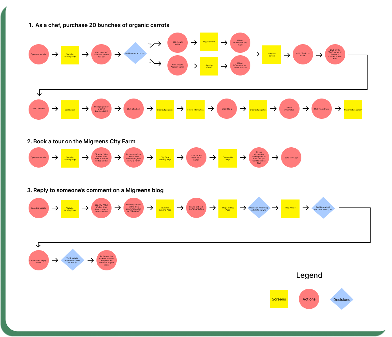
I designed three user flows to map how key personas navigate the Migreens website, capturing real customer journeys from discovery to action.
These flows reflect common paths taken by chefs, educators, and conscious consumers as they purchase products, engage with content, and book experiences.
We wanted to develop a map that tracks the behaviors, thoughts, and emotions that a user would go through when exploring our website.
Our objective was to recognize any potential user pain points before fully committing, and to establish a starting point from which we could identify opportunities for improvement.

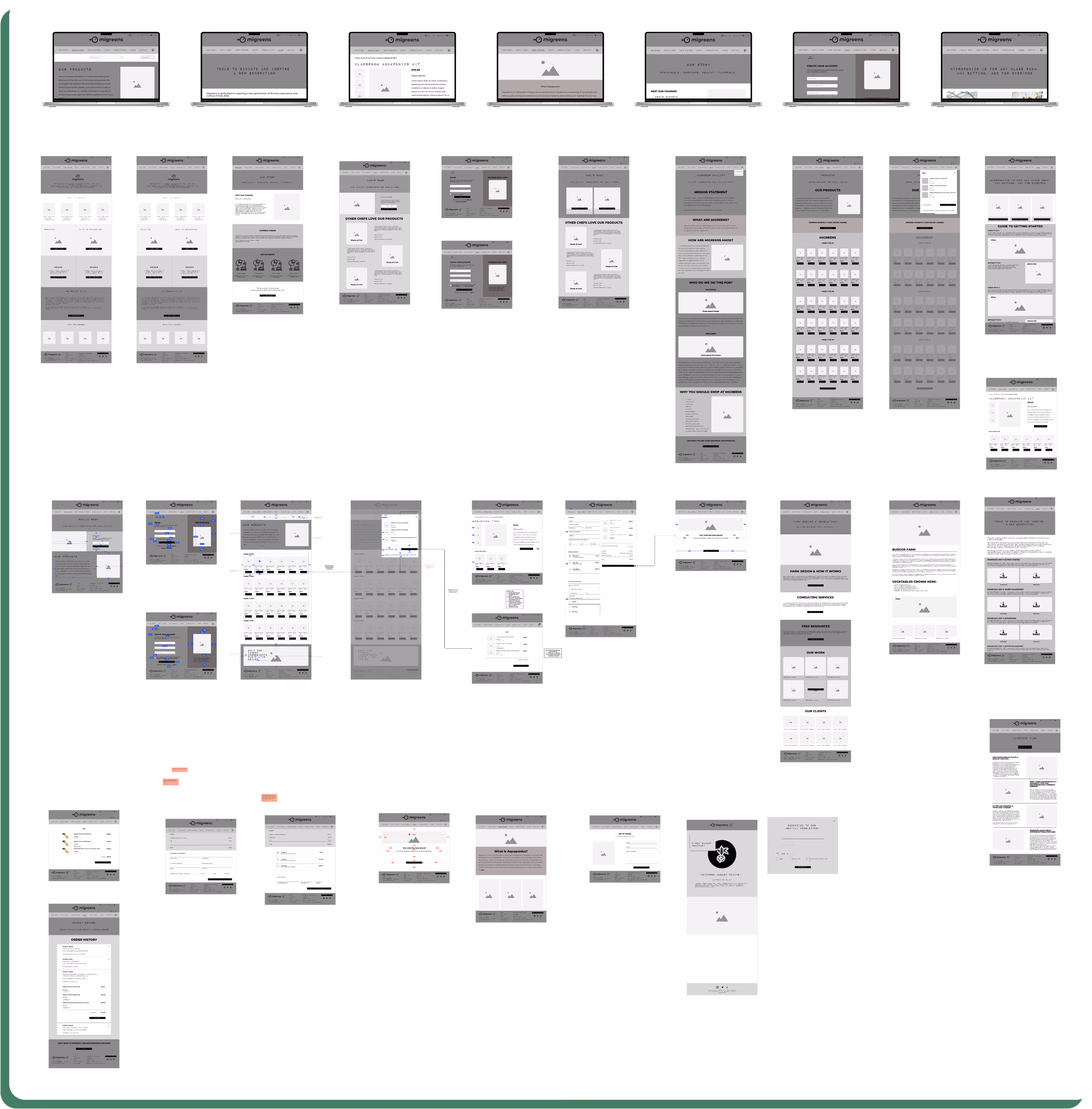
We started things off with low-fidelity wireframes to build a simple layout design for each type of user, incorporate feedback, and decide on a final layout for the high-fidelity screens.
As a team, we prioritize ease of use, accessibility, simplicity, and functionality throughout the process. For example, we wanted to make sure any login process was responsive and informative by making sure felt they knew what direction they were heading
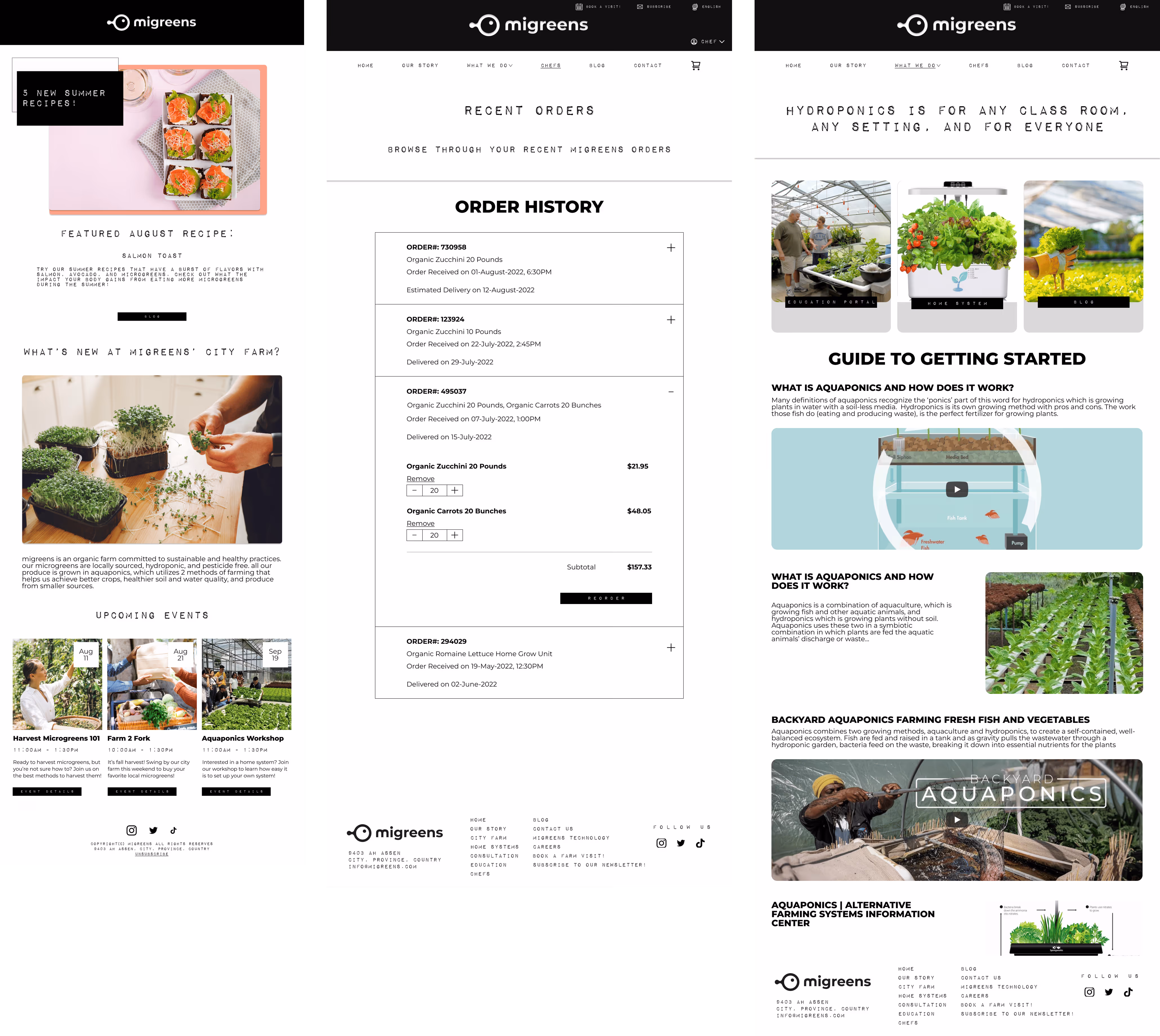
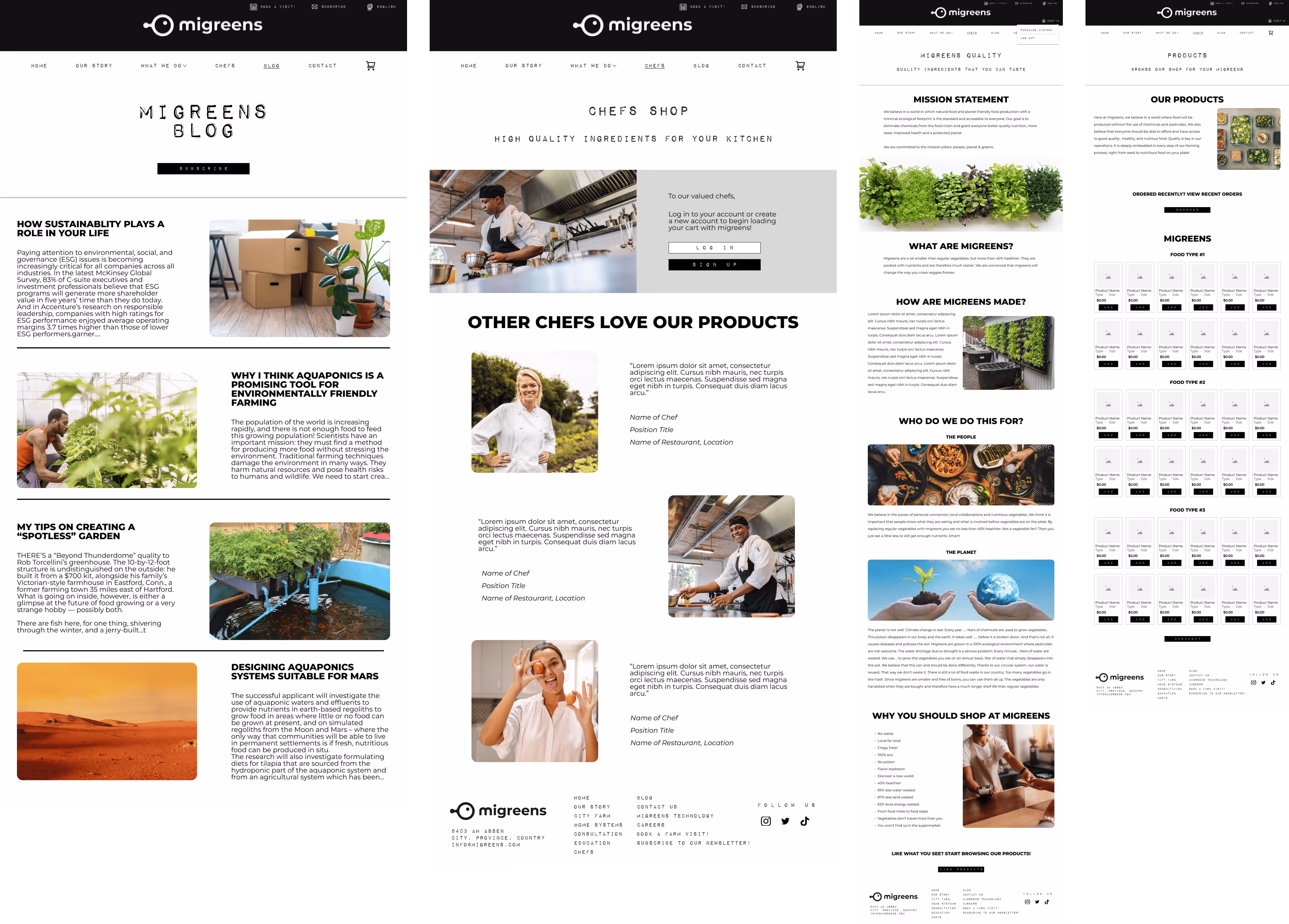
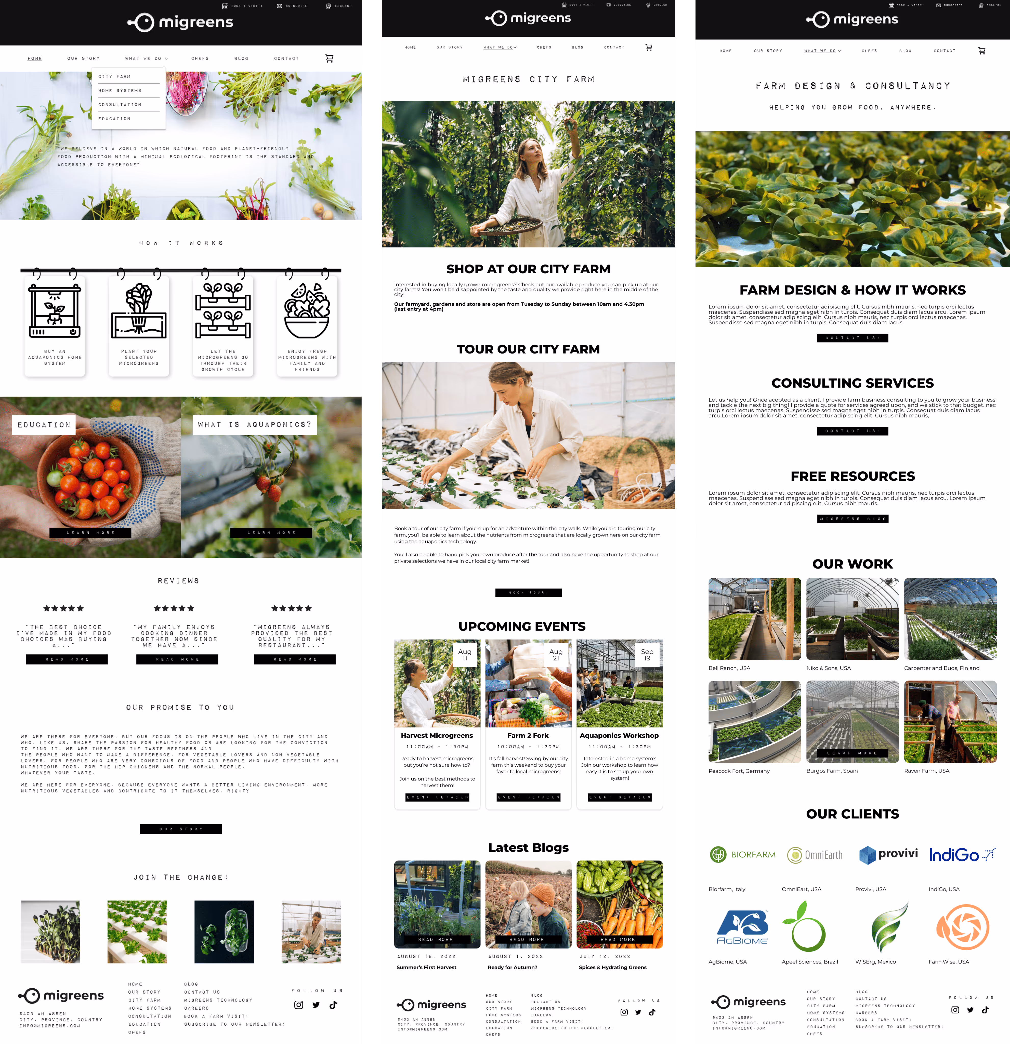
My primary role was the creation of landing page, educator screens, consulting services, blog, product layout, shop, and general organization of information.
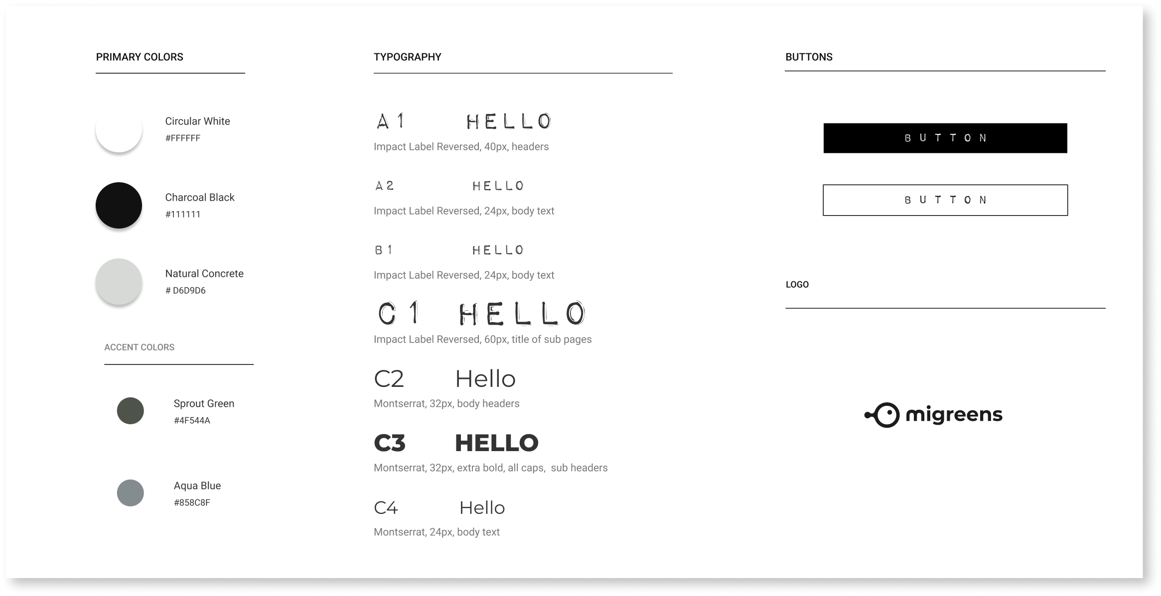
We got some direction from an existing brand template but ultimately we created a style guide that reflects the values of Migreens while also allowing us creative freedom to experiment with the concept of Migreens
Our team scheduled a meeting with our client to discuss our progress with the Migreens website and gave us feedback that we critically utilized to help us create and finalize our style guide.
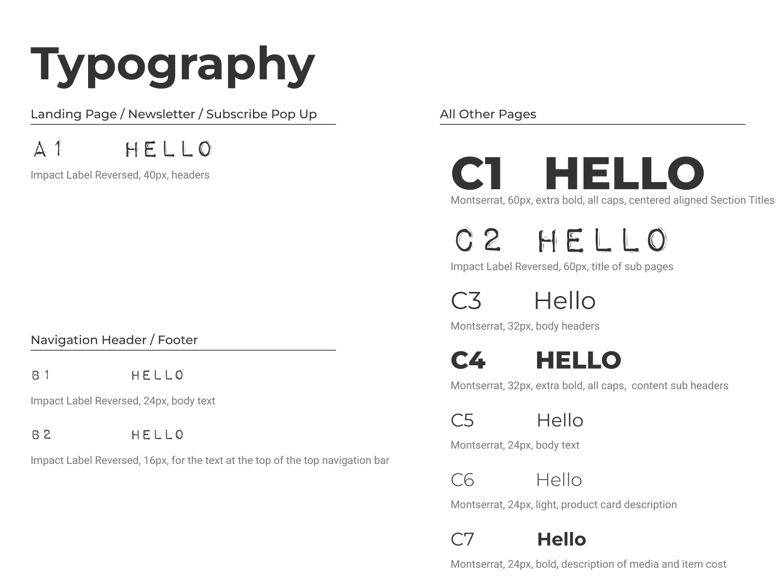
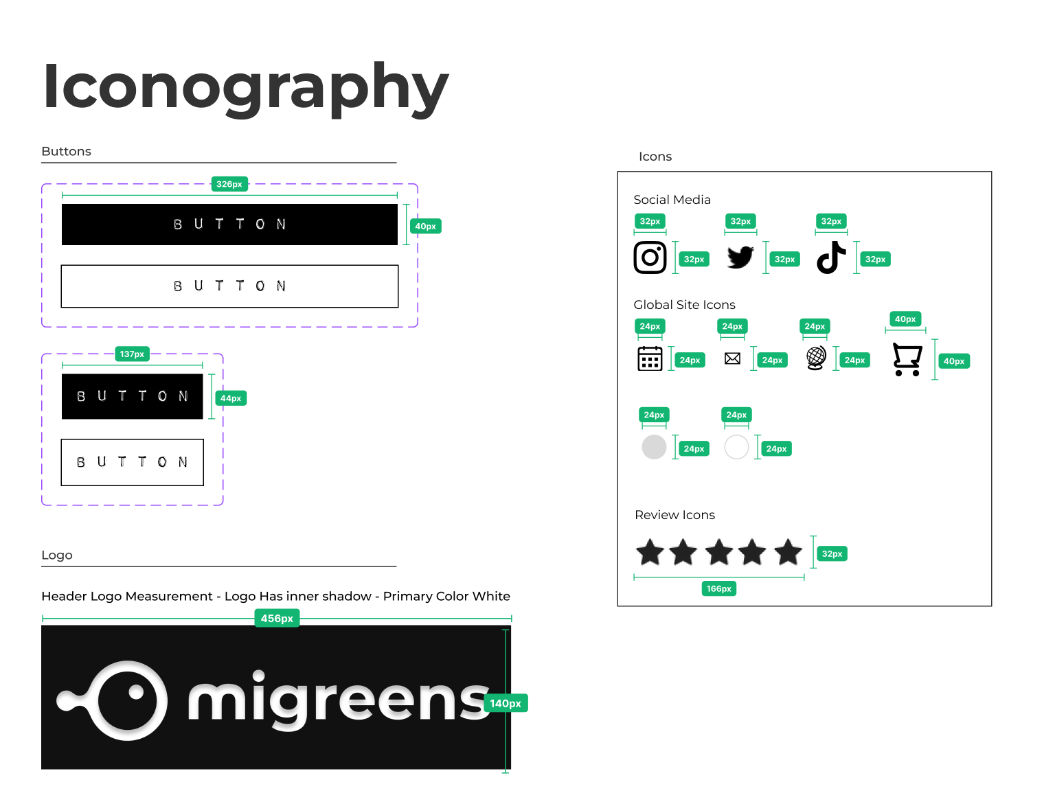
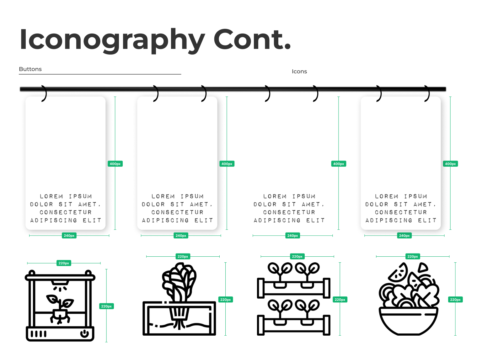
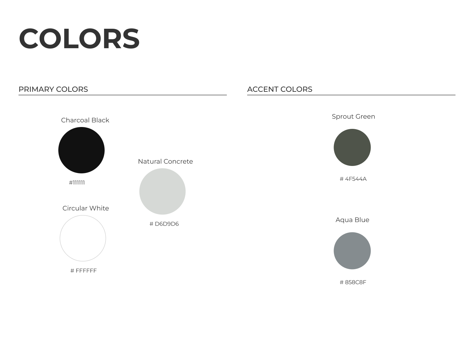
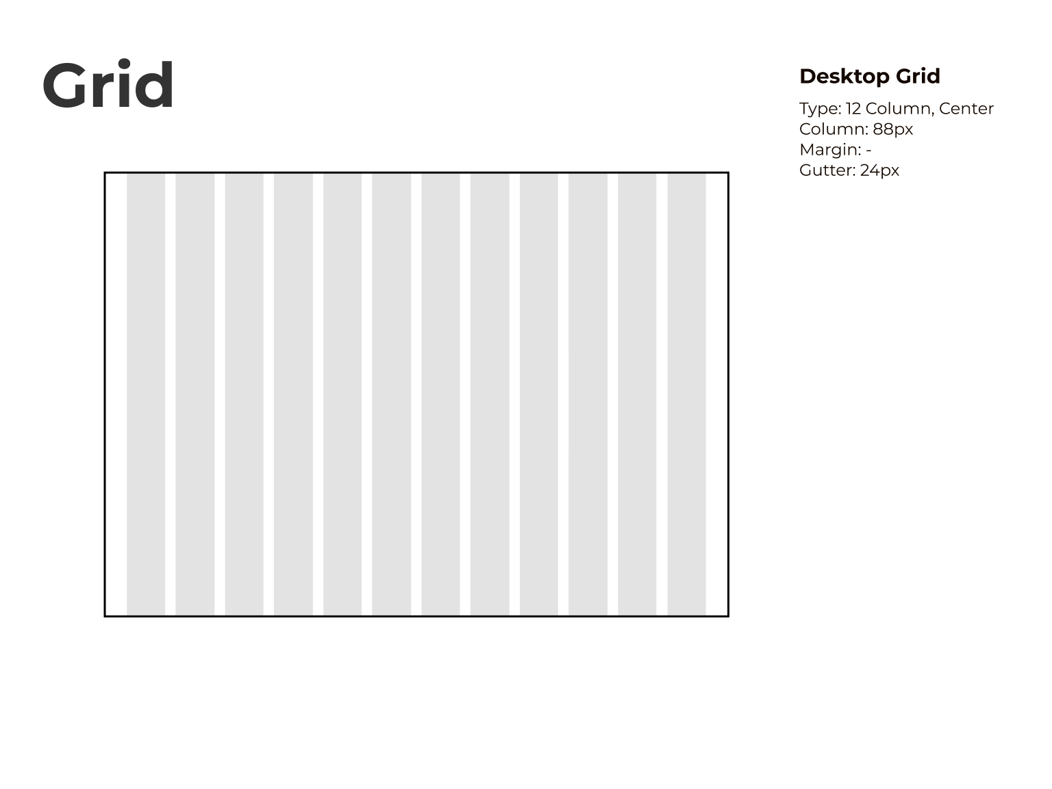
The guide contains desired color palettes, typography, iconography, grid size, input fields, components, and images and graphics.
With the wireframes and style guide as our foundation, my team and I worked compassionately to bring each and every screen to life with each user in mind.
I assisted in building out a component library for the color palette, typography, and the main elements that are used across the design pages.
The team worked as a cohesive unit and worked with open arms throughout the process. I put specific focus and emphasis on the blog pages, product page, consulting services, and education. I also provided illustrations and visual elements that were used across all the pages.


We scheduled a meeting with the client to discuss our hi-fi frames and 3 iterations for landing page.
During our call with the client, they decided that they liked elements from 2 of the iterations and we took note of what they liked and didn't like
We then, regrouped as a team after the call to bring together the elements he really loved and envisioned for his brand identity to be to create the final UI
.avif)
After presenting our high-fidelity screens to our client and getting their approval, our team created a developer hand-off file that contained all the final screen designs and provided a basis for the navigation of the website and a full list of notes on how each element is incorporated to the design.
The file was created for not just the client but also the developers. It contained annotations for the screens that explained buttons and sections, measurements for all of the screens, and sitemap using all the screens created throughout the process.
Working on this project was a monumental experience where I got to learn and grow as a designer. Pushing the ball up a hill can be daunting at times, but I am so fortunate that I got to progress with my team as I knew I can count on them as they knew they could count of me. The project highlighted the value of communication given each person’s schedule and demonstrated how to establish an advantageous workflow that is constructed by honesty and teamwork.
I felt that I demonstrated great leadership qualities as I helped facilitate work priorities and brought a sense of camaraderie through pushing and supporting my team to achieve work that they would take pride in. Every day was a new day to analyze critically about our progress and how we could achieve the client’s dream through implanting their feedback and discussion with the team. From a design perspective, I felt my background in graphic design helped tremendously navigate design decisions that greatly improved the overall quality of the product by giving more detailed notes as to why and when an asset on a page works for the overall goal of the product.
I have no doubt that the work I put into this project has evolved my ability to clearly communicate my ideas with not just my team, but also clients that put their trust in me. Its absolutely amazing to know that I helped create a resource that allows people from places far and wide to be more sustainable and more conscious of the world that we all live in. I am truly blessed by this opportunity and by delivering a project that elevated my work as a UX designer. I hope I can continue this path of education further and glad I got to be a part of this journey.